The Power of Logo Evolution in Brand Identity
In brand identity, logo evolution is a powerful tool. A logo is more than just a visual symbol — it serves as a tangible expression of a brand’s values, mission, and promise. When consumers see a familiar logo, they instantly connect it with the brand’s reputation, quality, and emotional meaning. As such, the logo plays a vital role in building long-term brand equity.
Why Do Brands Need Logo Evolution?
A successful logo evolution often aligns with a company’s major strategic transformation. Whether expanding market presence, entering new industries, or appealing to younger audiences, updating a logo serves as a key driver of brand transformation. Through thoughtful adjustments in logo design, a brand can not only attract new customers but also reignite loyalty and recognition among existing ones.
Next, we will take an in-depth look at five globally renowned brands—tech giants Apple and Windows, automotive leader Mercedes-Benz, fashion icon Gucci, and beverage powerhouse Starbucks—and examine how the evolution of their logos reflects industry trends while successfully communicating their brand values and future vision.

Apple: Simplifying Technology Through Logo Evolution
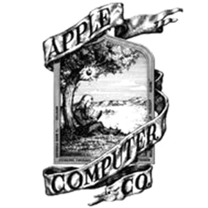
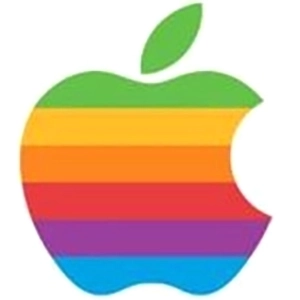
Apple’s logo evolution is a classic example of how simplicity leads to timeless brand recognition. The original 1976 logo was a detailed illustration of Isaac Newton under an apple tree — a symbol of knowledge. In 1977, it was replaced by the now-famous rainbow-striped apple, reflecting creativity and diversity. By 1998, Apple introduced a monochrome version that reflected its shift toward sleek, modern minimalism. Today’s version — clean, silver, and flat — perfectly mirrors the brand’s ethos of elegance and intuitive design.


Windows: From Classic Color to Modern Minimalism
The logo evolution of Windows illustrates its progression through multiple digital eras. Starting with a colorful, 3D-style window in 1985, the logo reflected innovation and accessibility. As the interface evolved, so did the logo — from Windows 3.1’s flatter look to the softened, rounded design of Windows XP. In 2012, the launch of Windows 8 brought a complete redesign: a single-color, geometric window that embraced simplicity and digital clarity — a bold step in its logo evolution journey.


Mercedes-Benz: Evolving from Industry to Icon
The logo evolution of Mercedes-Benz highlights its transformation from industrial engineering to luxury excellence. Its earliest logo included gears and letters — emblematic of its mechanical roots. The 1909 introduction of the three-pointed star marked a bold rebrand, symbolizing mobility across land, sea, and air. Over the years, the logo was streamlined into the polished silver star within a circle — a lasting symbol of performance, elegance, and global prestige.


Gucci: Stylish Logo Evolution in High Fashion
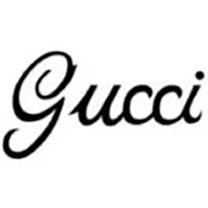
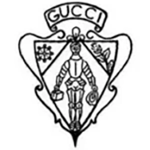
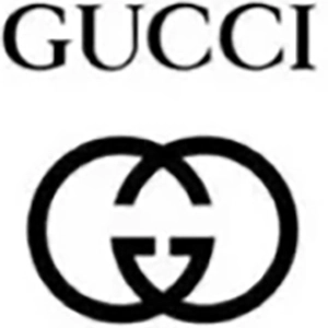
Gucci’s logo evolution reflects both brand heritage and forward-thinking design. Initially featuring the founder’s initials in a vintage style, the logo later evolved into the interlocking double G — a symbol of timeless sophistication. In recent years, Gucci has refined its typography for a cleaner, more modern look. This transformation showcases how logo evolution in fashion isn’t about losing identity, but enhancing relevance across generations.

Starbucks: Cultural Identity Through Logo Evolution
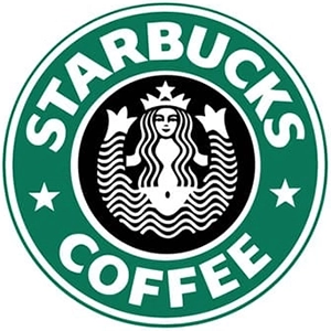
The logo evolution of Starbucks shows how a brand can maintain its soul while adapting its image. The original 1971 siren logo was rich in symbolism and maritime detail. In 1987 and again in 1992, the logo was simplified, focusing more on the siren image. The most dramatic change came in 2011: Starbucks removed all text, leaving only the iconic green siren — a bold, minimalist design now recognized globally. This example of logo evolution reinforces the brand’s global positioning and cultural appeal.



Conclusion: Why Logo Evolution Is Essential for Modern Brands
These five stories of logo evolution demonstrate that updating a logo is not merely cosmetic. It’s a strategic move that reflects brand growth, cultural relevance, and visual clarity. A simplified, well-designed logo is easier to recognize, more adaptable to digital formats, and more likely to resonate with modern audiences.
In an ever-changing market, logo evolution is not optional — it’s essential. Brands that embrace it successfully communicate agility, innovation, and timelessness, ensuring their visual identity remains as strong as their business vision.
If you would like to learn more about brand design, feel free to contact us for the following services: Taichung Brand Design Company, Taichung Logo Design Company, Taichung Website Design Company, Taichung Web Design Company, Taichung Graphic Design Company, Taichung Visual Design Company, Taichung Advertising Design Company, Taichung Catalog Design Company, Taichung Packaging Design Company, Taichung Commercial Photography Company, Taichung Video Production Company, Taichung CI Design Company