EARLYWINTER
The owner of EARLYWINTER café is a retired Chinese teacher. The brand’s Chinese name, “橙黃橘綠時,” is inspired by a seven-character quatrain by the Northern Song Dynasty literary figure Su Shi, who expressed reflections on middle age in his poem about Liu Jingwen:
“The lotus has withered, no leaves to hold the rain, Yet chrysanthemums stand proud on frost-bitten branches. Remember well the best season of the year— When oranges turn yellow and tangerines green.”
The poem conveys that although the lotus has faded, the chrysanthemums remain resilient against the frost. It reminds us that early winter, when oranges turn yellow and tangerines turn green, is the season of ripe harvest. The owner draws encouragement from this poem for a successful entrepreneurial journey in midlife. Since “橙黃橘綠時” refers to early winter, the brand’s English name was chosen as EARLYWINTER.


LOGO DESIGN
EARLYWINTER café blends the sentiments of Chinese literature with Western coffee culture. In the logo design, we incorporated concepts such as literary symbols, East-West fusion, coffee cups, and Su Shi to showcase the brand’s unique style and atmosphere. The logo’s color scheme intentionally uses black and white to highlight the simplicity of the symbols and the essence of coffee. We provided 16 different conceptual designs for the owner to choose from, ensuring the final logo best fits their needs. These designs aim to express the distinctive cultural richness and elegant spirit of EARLYWINTER café.
STANDARD FONT DESIGN
After careful consideration, we ultimately finalized a meticulously designed logo inspired by the image and essence of Su Shi, a renowned literary figure from the Northern Song Dynasty. To complement the logo, we deliberately chose the “Slender Gold Script” calligraphy style popularized by Emperor Huizong of the Song Dynasty. This choice not only creates visual harmony with the logo but also enhances the cultural depth of the brand. Additionally, we established a unified typographic system, setting a consistent visual standard for all future promotional materials and packaging.


VISUAL DESIGN
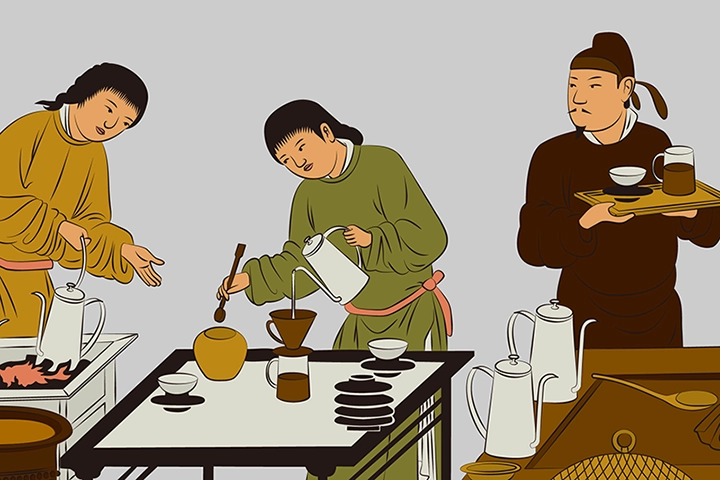
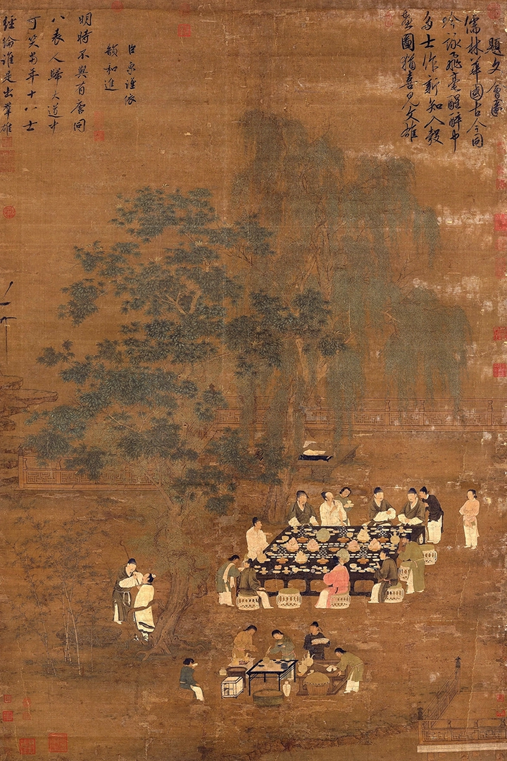
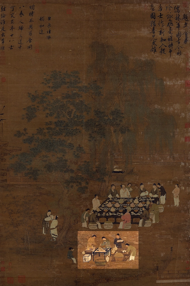
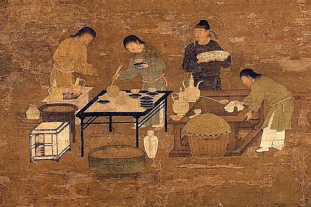
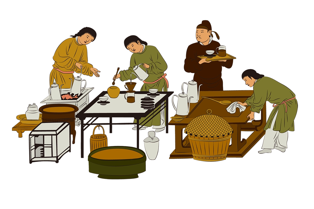
In our visual design, we drew special inspiration from a Song Dynasty painting depicting a gathering of scholars and literati enjoying a feast by a garden pond. In the original artwork, a servant is shown preparing tea utensils on a small table. We cleverly reimagined this scene by replacing the act of scooping tea powder with the process of brewing pour-over coffee. This thoughtful design not only highlights the brand’s product attributes but also elegantly blends the brand’s spirit of East-West beverage culture fusion. By bringing the modern pour-over coffee experience into the ancient literati’s lifestyle, we created a creative and engaging scene. This innovative graphic not only leaves a deep impression of EARLYWINTER café on consumers but also resonates with the brand’s connection to Song Dynasty cultural heritage.

PACKAGING DESIGN
Ultimately, we integrated the logo, custom typography, and creative graphics into a unified identity system. This system will be applied across business cards, envelopes, and packaging, aiming to enhance EARLYWINTER café’s visibility in the market and strengthen the consistency of its brand image. It allows consumers to more deeply connect with the culture and uniqueness the brand represents.
Through this cohesive identity system, EARLYWINTER café will showcase a stronger brand presence across various media platforms, making the brand more eye-catching and influential. This integration weaves the brand’s story and core values into every detail, creating a rich and meaningful brand experience for consumers.


STATIONERY DESIGN

