HOCHIN
HOCHIN has long been dedicated to promoting the cultural traditions of incense appreciation and tea ceremony. With profound academic knowledge and emotional connection to agarwood, the brand continues to offer only the highest quality products. In this collaboration, our goal was not only to enhance the brand image but also to reach a broader audience across different age groups. In the design, we creatively incorporated the flowing lines of incense smoke, forming various auspicious symbols to represent blessings for the consumer. This approach not only highlights the product’s unique characteristics but also brings a fresh perspective to traditional culture.
DESIGN ITEMS
┃ BRAND ┃ LOGO ┃ COLOR ┃ FONT ┃ VISUAL ┃ STATIONERY ┃
┃ POSTER ┃ PACKAGING ┃ PHOTOGRAPHY ┃ WEBSITE ┃
LOGO DESIGN
HOCHIN is a brand dedicated to promoting the culture of agarwood. With a long-standing focus on the art of incense appreciation and tea ceremony, HOCHIN seeks to share the depth and beauty of these traditions. In our logo design, we aimed not only to convey the profound meaning of agarwood but also to infuse a sense of Zen and artistic aesthetics. To achieve this, we carefully crafted 16 unique logo variations, each with its own form and symbolism, for the client to choose from. Every design embodies the brand’s pursuit of a Zen-inspired lifestyle and artistic sensibility, reflecting HOCHIN’s rich cultural heritage and brand spirit. Through these designs, we hope that consumers can not only experience the allure of agarwood but also be inspired by the tranquility and insight offered by a Zen way of life.
STANDARD COLOR
The chosen standard color is Rose Gold (PANTONE 8640 C), complemented by gray, black, and white. These colors are selected to convey the brand's calmness and elegant temperament. We applied this color scheme to the logo and logotype, laying a solid foundation for the future identity system.


STANDARD FONT DESIGN
For the typography, we ultimately selected a logo and designed a custom hand-drawn typeface to achieve optimal visual harmony. This unique typeface not only complements the logo but was also further developed into a unified visual identity system. The system provides clear guidelines for future applications across business cards, envelopes, promotional materials, packaging, and the website. The purpose of this system is to highlight the cultural depth of HOCHIN and enhance the consistency and professionalism of its brand image. Through a cohesive typographic style and well-defined design standards, we aim to infuse HOCHIN with a greater sense of elegance and character—allowing consumers to more deeply connect with the brand’s cultural essence and values.


VISUAL DESIGN
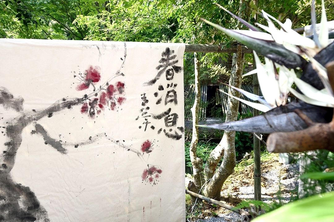
In the visual design, we thoughtfully incorporated the flowing lines of incense smoke to create four symbolically rich graphics: “Zen,” “Dragon,” “Crane,” and “Ruyi” (a traditional symbol of good fortune). Each of these designs represents a heartfelt blessing to the consumer. These meaningful graphics were applied across various brand materials, including stationery, posters, and packaging. Through this approach, we aimed to infuse HOCHIN’s brand image with a distinct sense of cultural depth. We hope that every time consumers use HOCHIN’s products or encounter its designs, they can feel the serene beauty and rich heritage of the Zen-inspired values the brand represents.


STATIONERY DESIGN
We applied the logo, standard colors, typography, and creative graphics to stationery items, including business cards, envelopes, and posters. Through the design of these materials, we integrated HOCHIN’s brand image into everyday business activities, allowing the brand to showcase its professionalism and unique charm across various occasions.

POSTER DESIGN


PACKAGING DESIGN
The main focus of this packaging design project was incense sticks and incense coils. Since these products are fragile, special attention had to be given to cushioning and protection in the design. Additionally, the project involved over 30 different product items, divided into four tiers, requiring us to consider cost-saving and inventory management solutions for the client.
To address these challenges, we developed a packaging system that shares the same structural design across all items, effectively differentiating the products using gold foil stamping. We concentrated on how to standardize packaging materials, simplify the structure, improve packaging convenience, and minimize storage space for packaging materials when not in use.
These considerations were key to the packaging design process. Our goal was to provide the client with a practical and efficient packaging solution that ensures safe delivery of products while reducing costs and space. Combined with unique creative graphics, we aimed to elevate HOCHIN’s professional brand image.


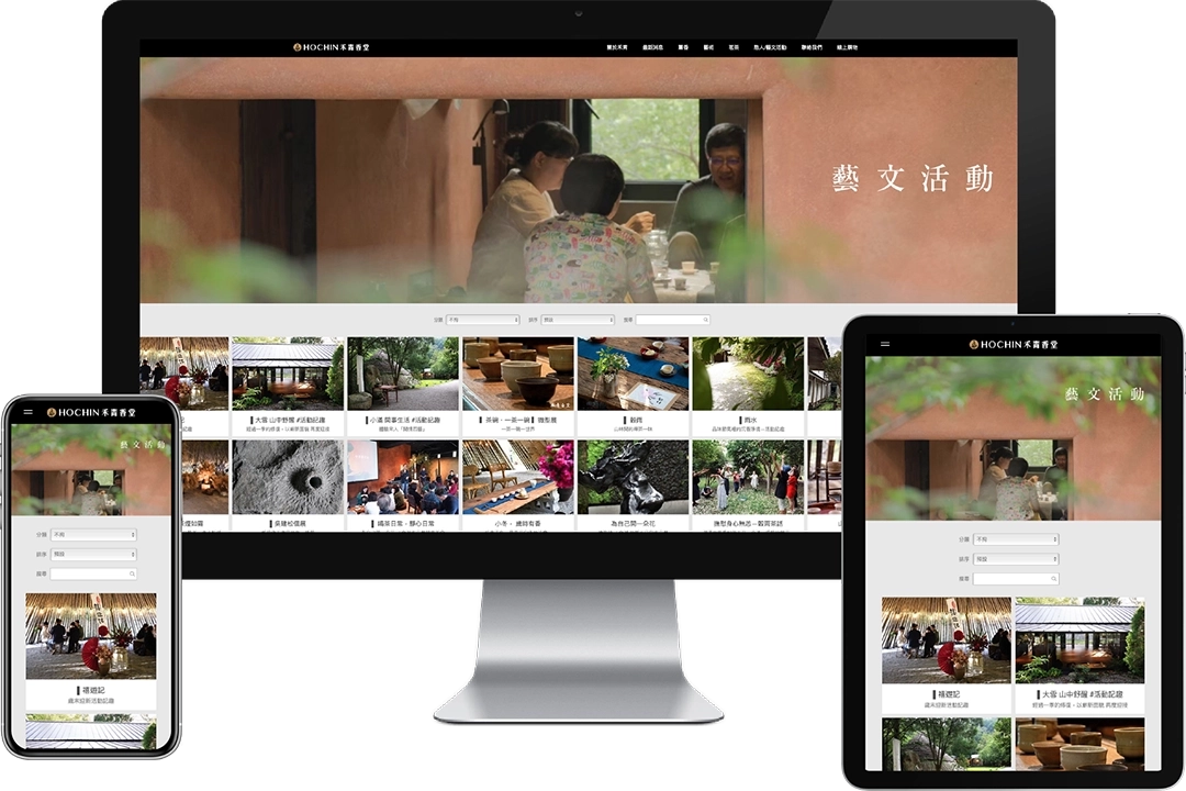
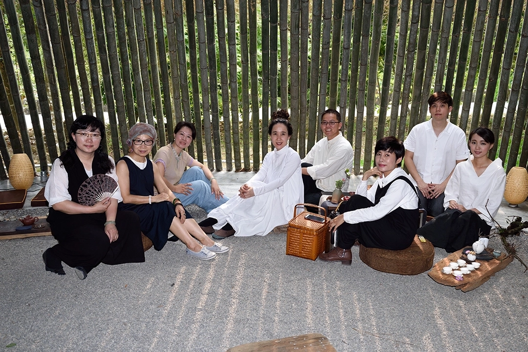
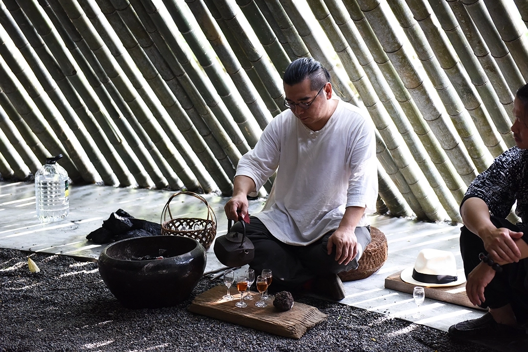
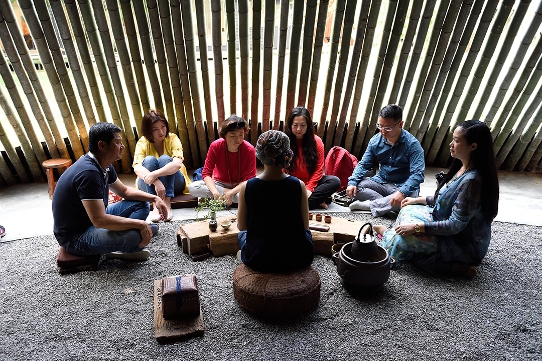
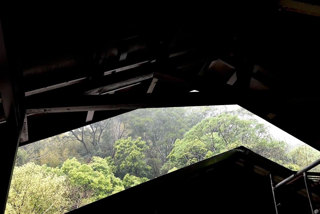
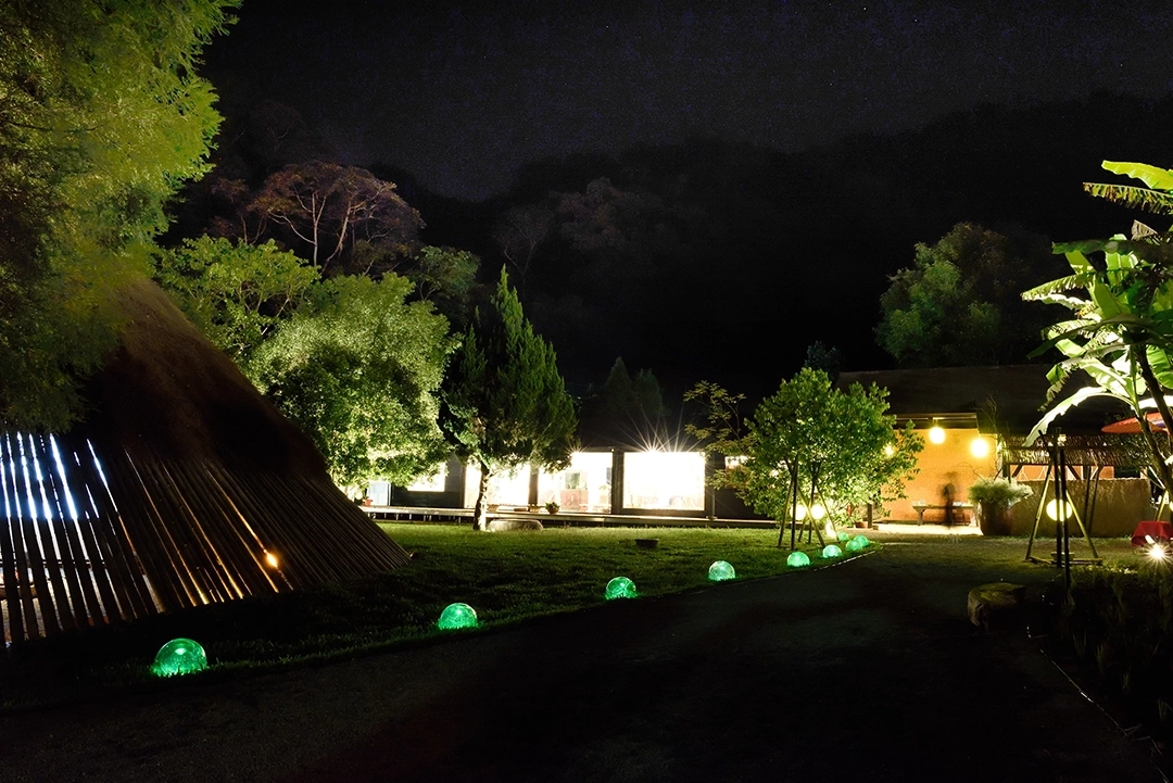
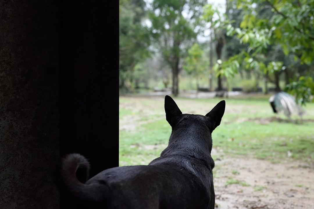
EVENT PHOTOGRAPHY
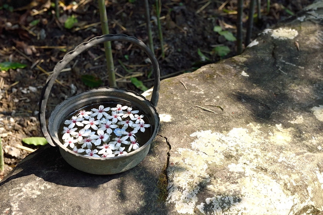
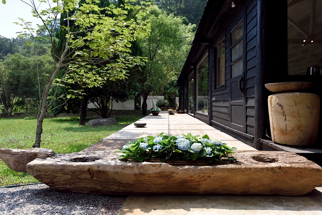
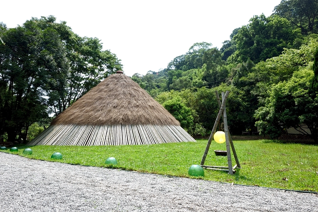
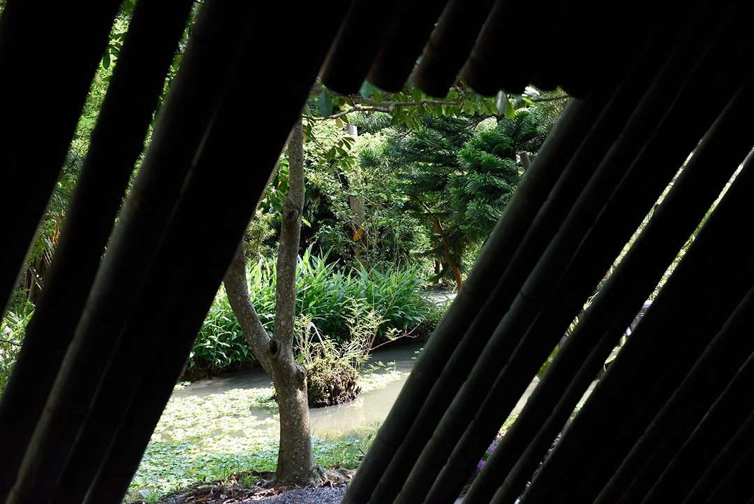
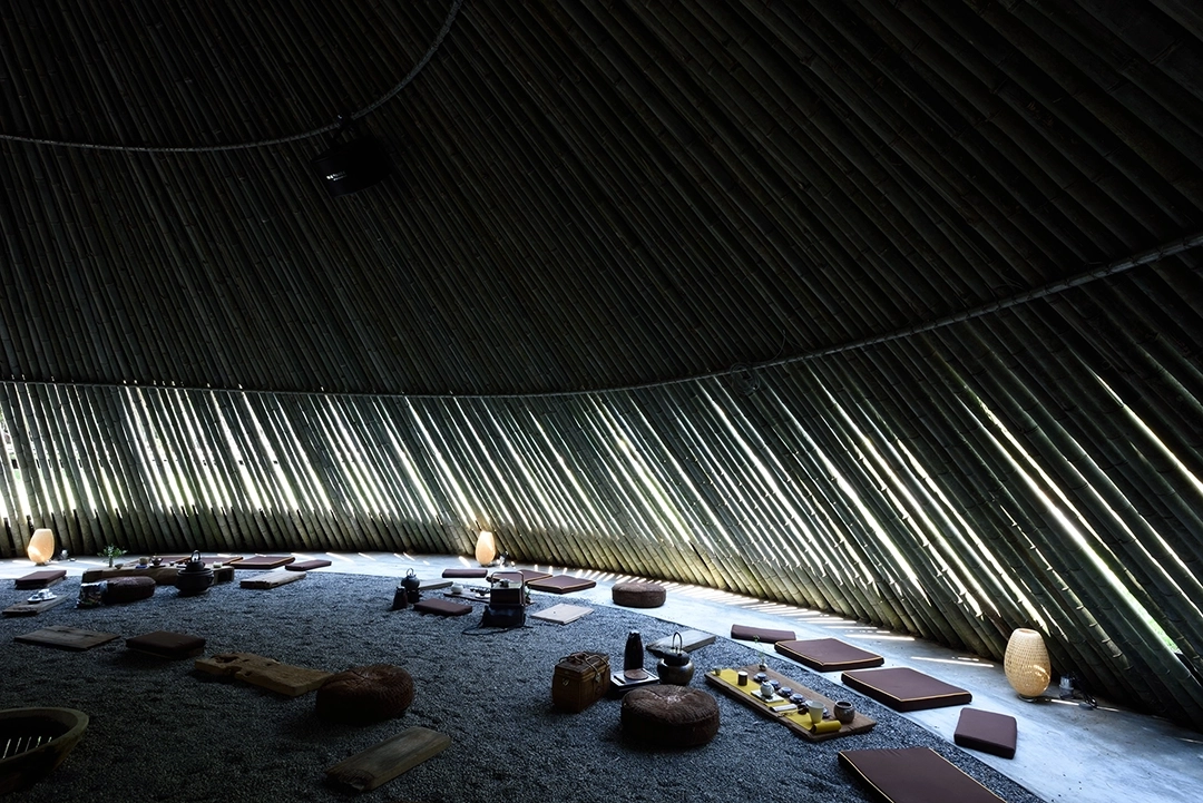
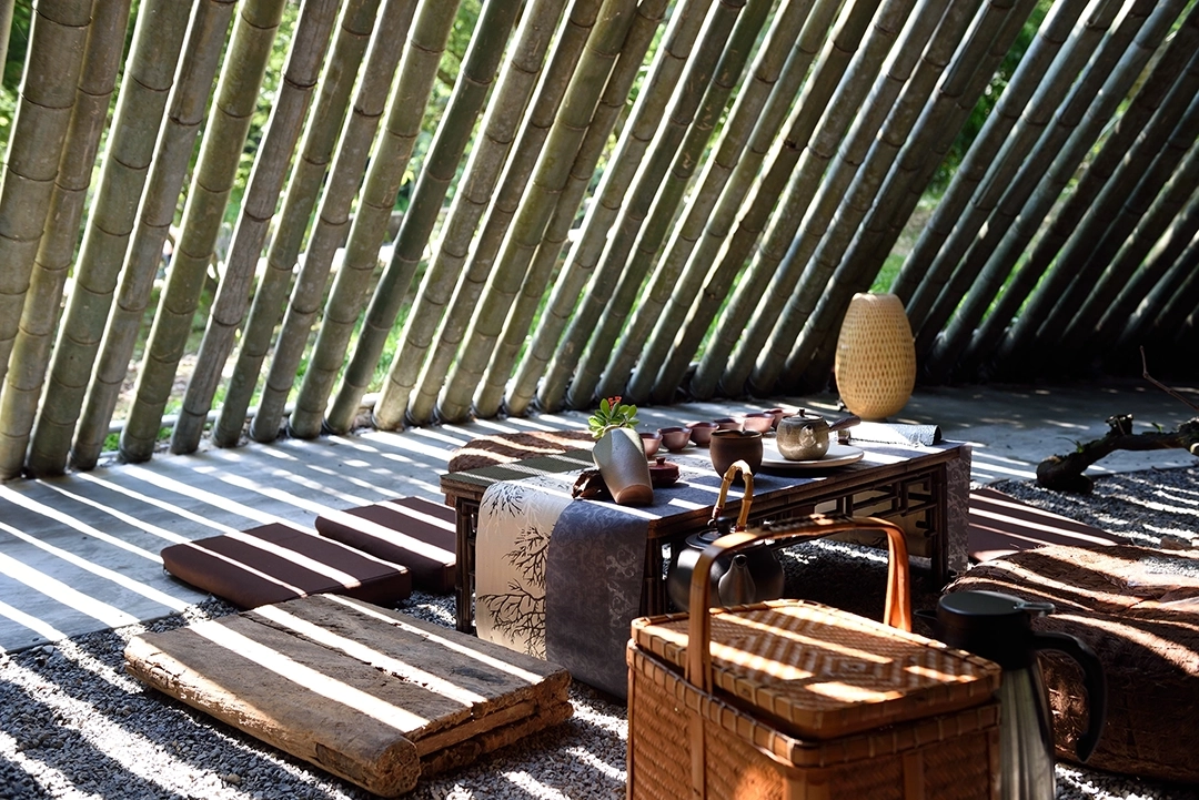
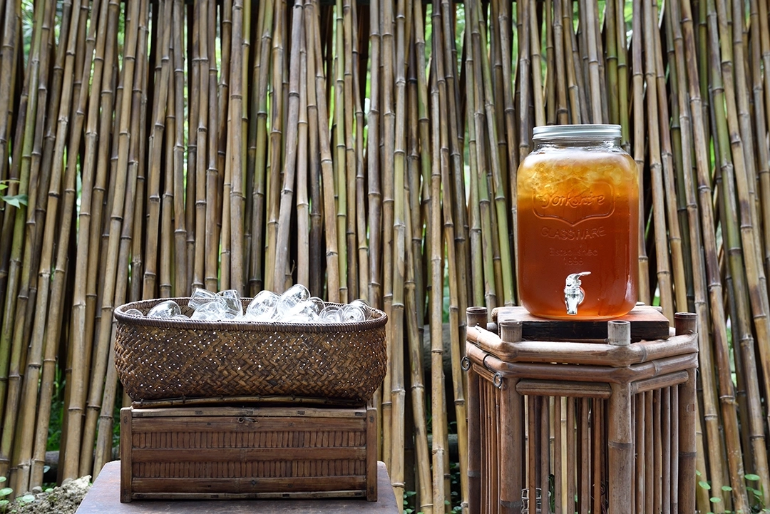
HOCHIN has long been dedicated to promoting the arts of incense appreciation and tea ceremony. In Sanyi, they established a cultural venue called “Hanren Academy.” This academy features a uniquely shaped bamboo house resembling a traditional conical hat, whose distinctive architecture and tranquil environment create a deeply Zen-inspired atmosphere. Here, visitors can fully immerse themselves in the elegant ambiance of incense appreciation, tea ceremony, and traditional Chinese music, experiencing a serene harmony with nature. It serves as a peaceful oasis away from the hustle and bustle, offering busy urban dwellers a place to find inner balance and tranquility. The establishment of “Hanren Academy” reflects HOCHIN’s commitment and passion for cultural arts. We hope this academy will become a gathering place for cultural enthusiasts from all walks of life, allowing more people to enjoy the spiritual feast brought by incense, tea, and the arts. Together, let us look forward to “Hanren Academy” becoming a source of calm and beauty amid the busyness of modern life.


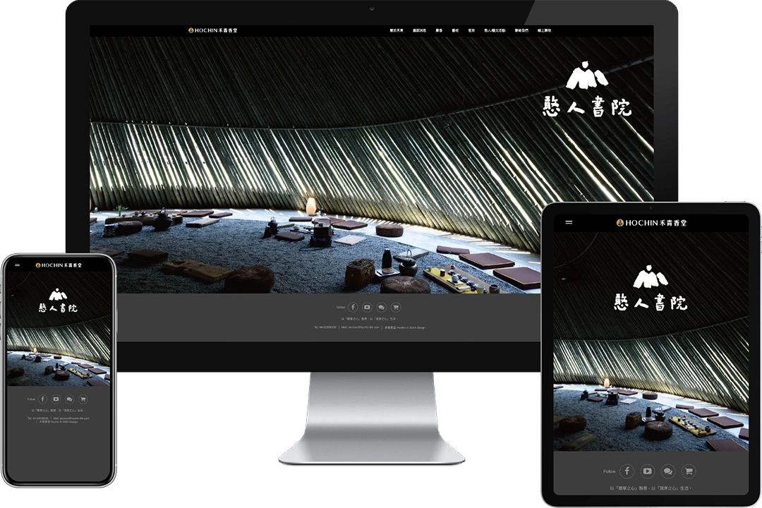
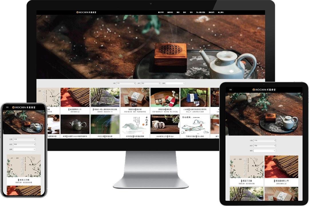
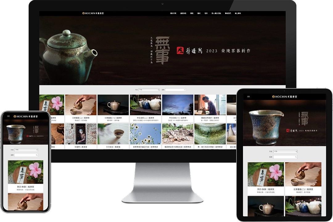
WEBSITE DESIGN
By incorporating photography, the logo, standard colors, standard typography, and creative graphics into the website design, we aim to provide users with an engaging and visually appealing web experience that showcases the brand's cultural depth and identity.