JASMIN
JASMIN is a professional brand specializing in feminine intimate care products. Its name is derived from the jasmine flower, which has long been regarded as a symbol of “purity” and “elegance.” We chose the name JASMIN to convey the product’s attributes and our commitment to quality. In the brand design, we place great importance on presenting the jasmine flower image of JASMIN. From the logo to creative graphics and packaging design, every detail is meticulously crafted. Through these designs, we aim to leave a lasting impression on consumers, fostering their trust and affection for our products.

LOGO DESIGN
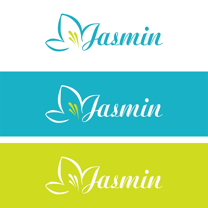
For the logo design, we drew inspiration from the form of the jasmine flower, creating 16 different styles ranging from classical and intricate to modern and minimalist. Each logo was carefully analyzed and accompanied by unique concepts and ideas for the client’s consideration. In the end, we made subtle refinements to the selected version based on the client’s needs and expectations, aiming to achieve the most visually harmonious result.
STANDARD COLOR
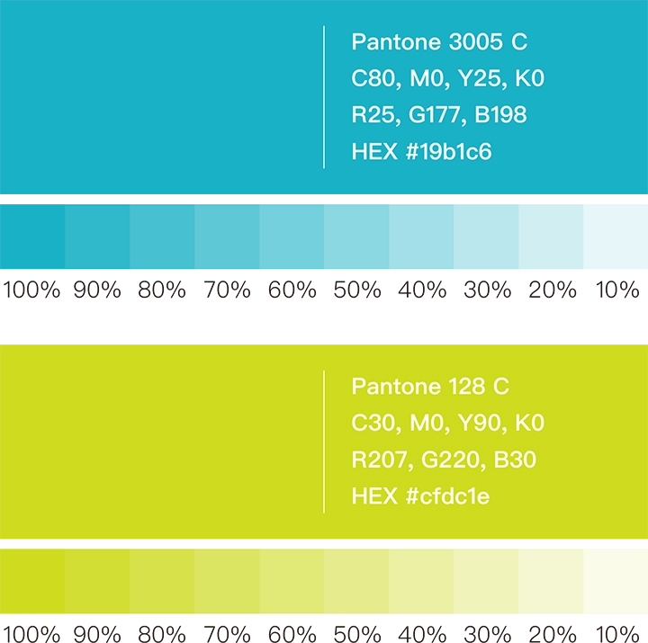
When selecting the brand’s standard color palette, we focused on creating a look that is both “striking” and “elegant.” After careful consideration, we chose Peacock Blue (Pantone 3005 C) and Mustard Yellow (Pantone 128 C) as the unified color standards for future packaging. This color combination is not only distinctive and eye-catching, but it also sets the product apart from the conventional tones typically used in personal care items—helping our products stand out in the market.
STANDARD FONT DESIGN
After careful consideration, we finalized a meticulously designed logo and created a custom hand-drawn Chinese typeface to accompany it. This unique typeface not only complements the logo perfectly, achieving optimal visual harmony, but also establishes a unified visual standard for all future promotional materials and packaging. These efforts aim to elevate the brand image of JASMIN and provide customers with a more consistent and professional experience.


VISUAL DESIGN
In the visual design, we specially hand-drew jasmine flower totems for JASMIN, aiming to highlight its elegant temperament and vitality. These illustrations were created as subtle patterns that can be applied to packaging, promotional materials, and other business items in the future, emphasizing JASMIN’s unique charm and professional image.
PACKAGING DESIGN
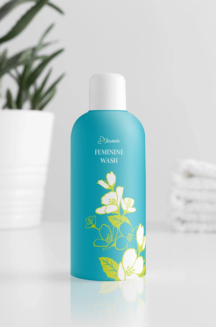
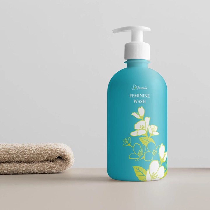
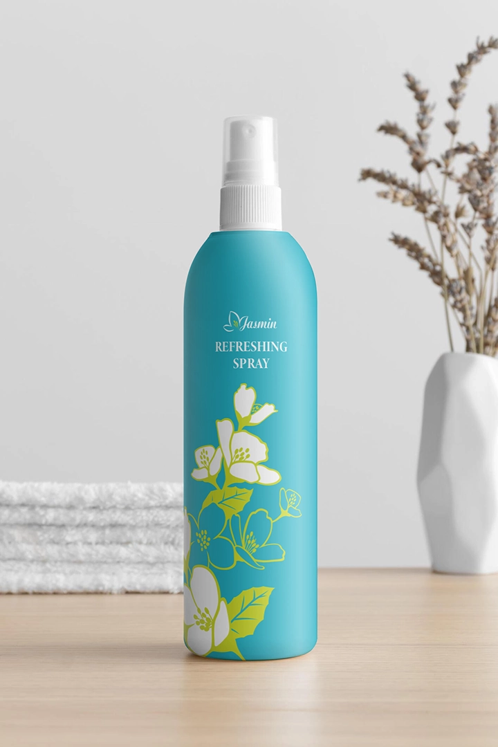
Finally, we integrated the logo, standard colors, typography, and creative graphics into the packaging and business materials, forming a unified identity system. This system aims to enhance JASMIN’s visibility in the market and strengthen brand consistency, allowing consumers to deeply feel the brand’s uniqueness and charm. Through this cohesive identity system, JASMIN will showcase a stronger brand presence across various media platforms, making its image more striking and influential.
STATIONERY DESIGN


