KINLOCH ANDERSON
KINLOCH ANDERSON is a century-old British fashion brand renowned for its iconic Scottish tartan patterns. Every product embodies the vintage charm of Scottish heritage, with the brand positioned to appeal to a premium consumer segment. This time, the brand entrusted us with the packaging design for its baby care products. We thoughtfully used the brand’s original teddy bear mascot as the central concept of the design, integrating the brand’s core values into the bear’s image and character to reflect a refined, classic aesthetic. This approach not only adds a sense of playfulness to the packaging but also highlights the unique qualities of baby care products—successfully combining function with storytelling to inspire consumer interest and desire.
STANDARD COLOR
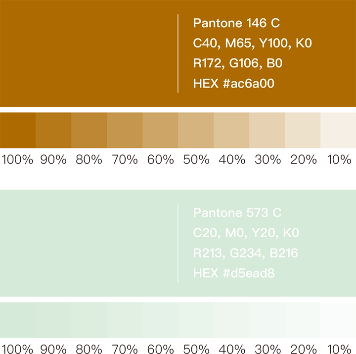
In the process of selecting the standard colors, we focused on “vintage” and “premium” as the main design goals. After careful consideration, we meticulously chose Antique Gold (Pantone 146 C) and Mint Green (Pantone 573 C) from a range of distinctive color options as the unified color scheme for the packaging. This color combination not only embodies a high-end vintage style but also injects a soft emotional tone into the children’s care products, ensuring the overall feel is not too heavy.
STANDARD FONT
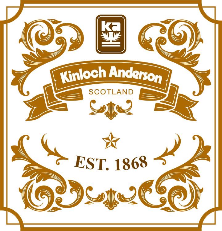
For the choice of the standard font, we selected QuentinCaps. This typeface showcases a distinctive Baroque style, infusing the product names with a premium vintage atmosphere. At the same time, we also incorporated these Baroque vintage elements into the packaging design’s motifs to create a more sophisticated visual effect.

VISUAL DESIGN
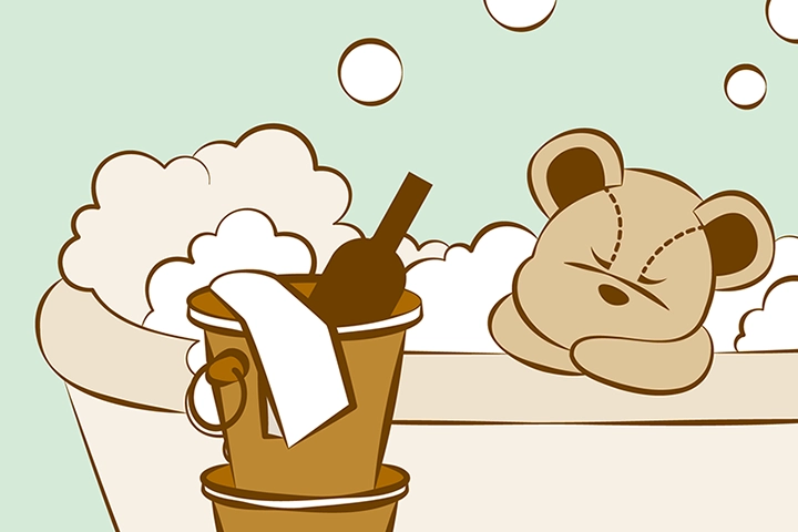
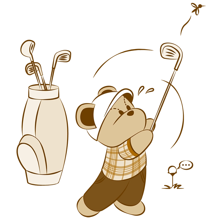
For this packaging design project, we centered the concept around KINLOCH ANDERSON’s iconic teddy bear mascot illustration. In portraying the mascot’s behavior, we thoughtfully explored how to align its personality with the refined lifestyle tastes of our target consumers. We envisioned the teddy bear as a child aspiring to live like a British gentleman—imitating adult behaviors and embracing a sophisticated lifestyle. He enjoys classical music, plays golf and the piano, sips black coffee, and appreciates the finer things in life. His daily attire includes a gentleman’s hat, Scottish attire, Oxford shoes, and vintage accessories, presenting him as a child in pursuit of elegance and quality. Through this whimsical juxtaposition, we aimed to inject a sense of playfulness into the packaging while also expressing the brand’s appreciation for refined living. For instance, one illustration features the bear using a knife and fork to eat a hamburger—a humorous and charming way to signal that the product is intended for children. This creative use of the mascot brings both character and storytelling to the design, reinforcing the brand’s premium positioning in a light-hearted, engaging way.
PACKAGING DESIGN
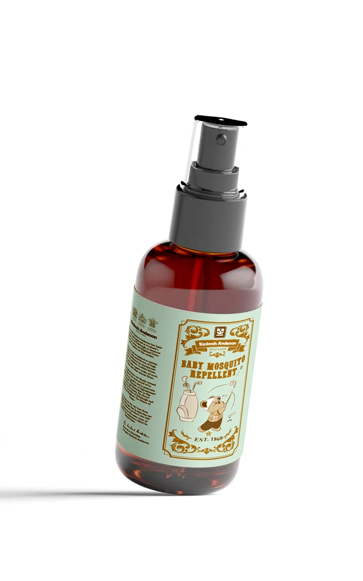
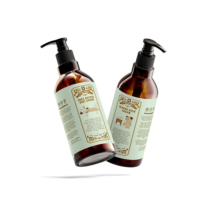
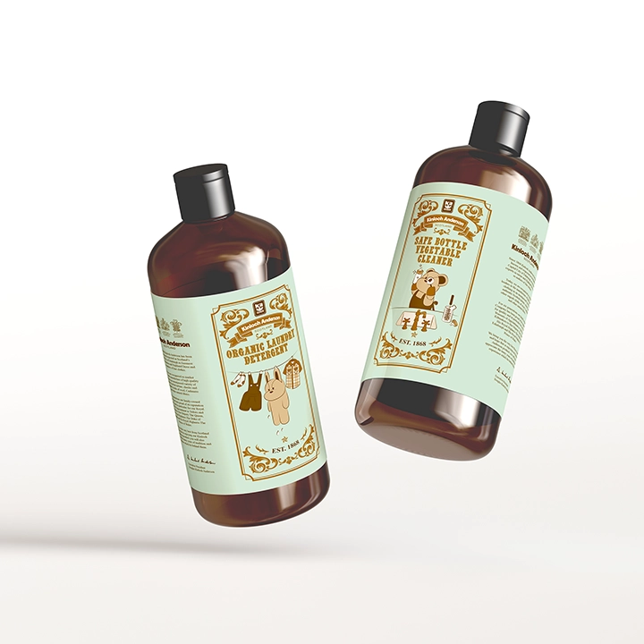
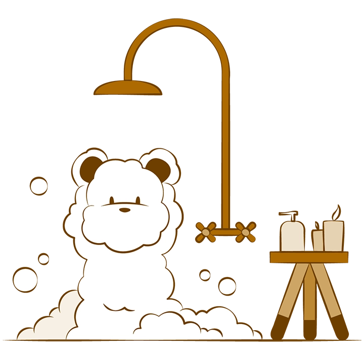
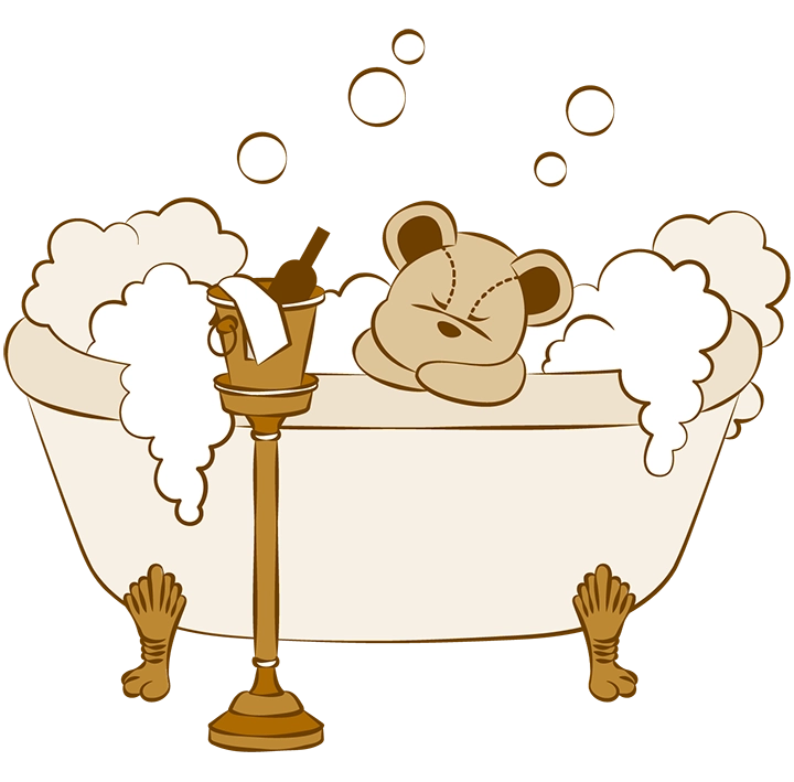
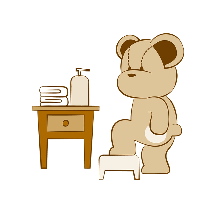
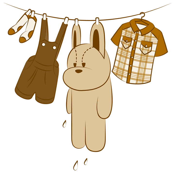
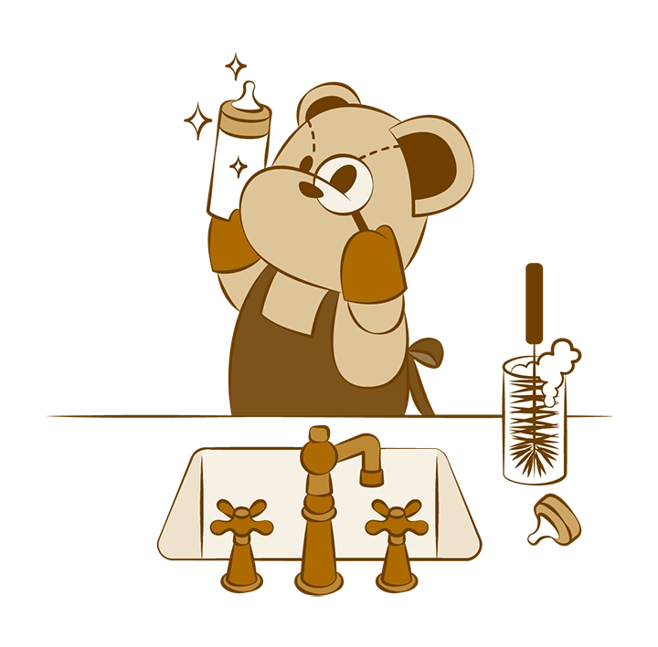
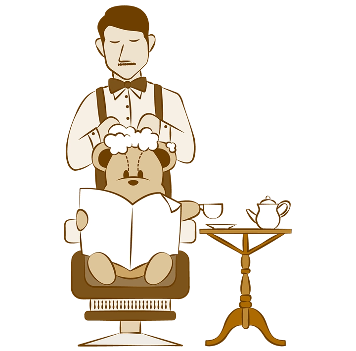
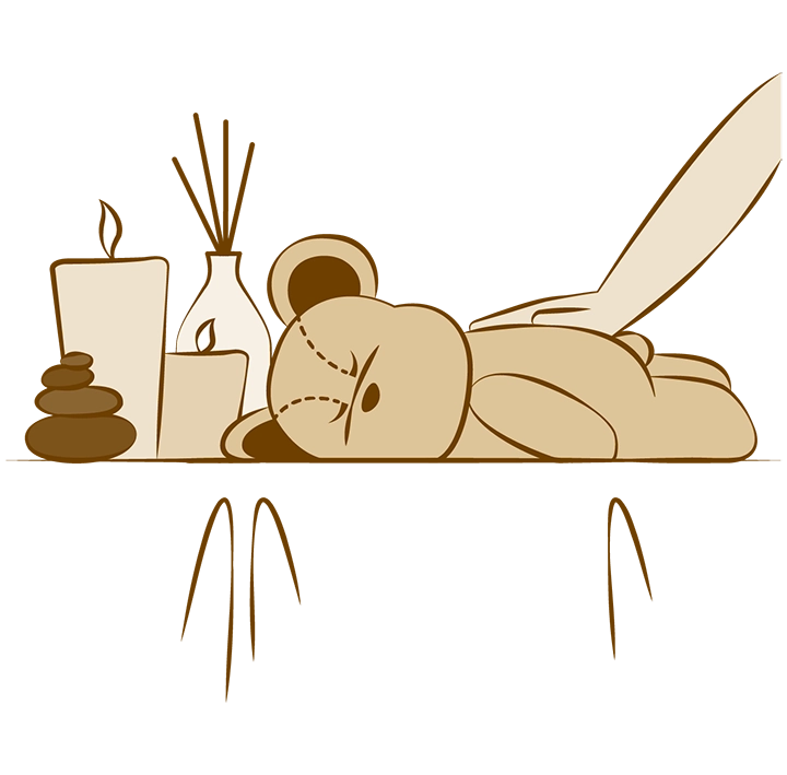
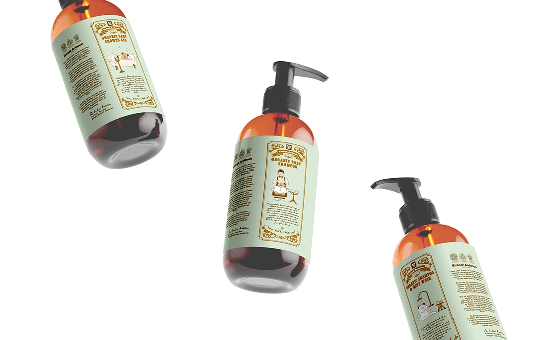
We ultimately designed eight bear mascot illustration themes, including: bathing, shampooing, taking a bath, enjoying a spa, applying lotion, playing golf, hanging laundry, and washing baby bottles. These themes will be applied to the packaging of eight infant and toddler cleaning products—body wash, shampoo, bubble bath, lotion, diaper cream, mosquito repellent, laundry detergent, and dishwashing liquid. Combined with the standard colors, typography, and totems, the designs present a playful and visually appealing look.
