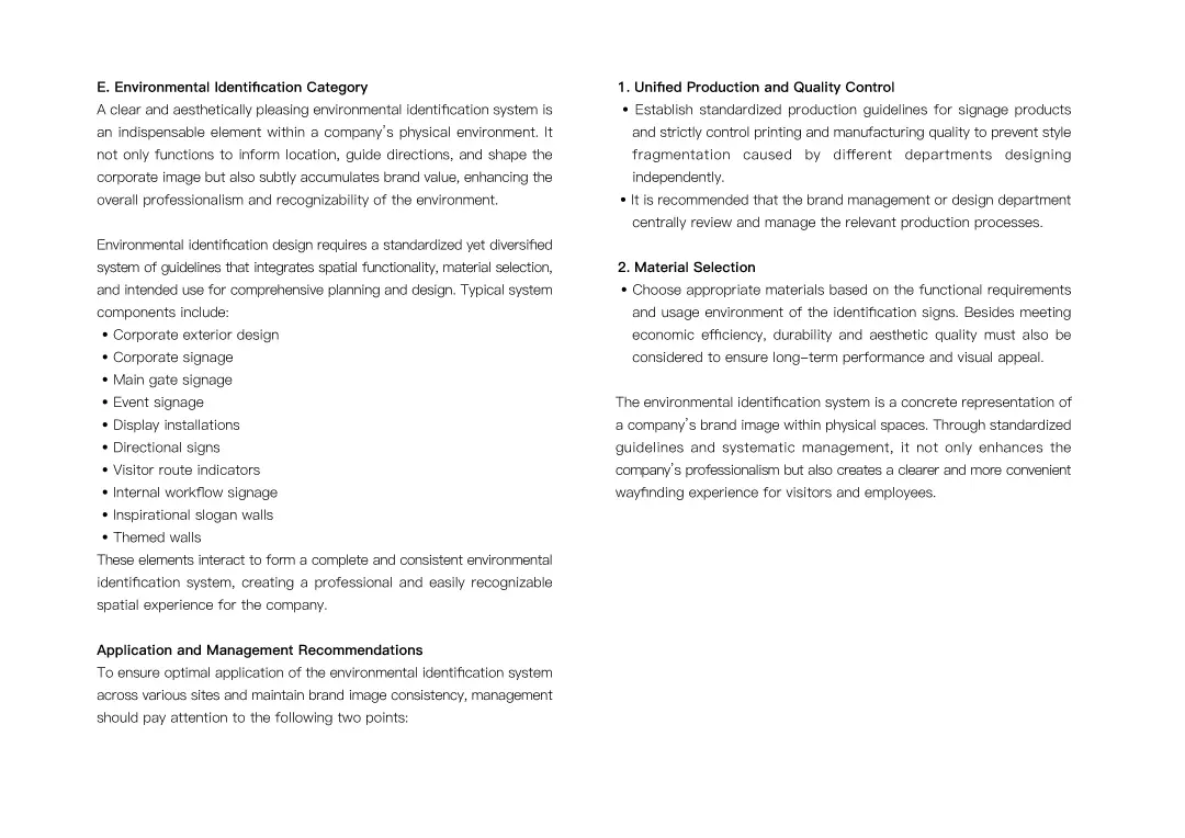
PECKER
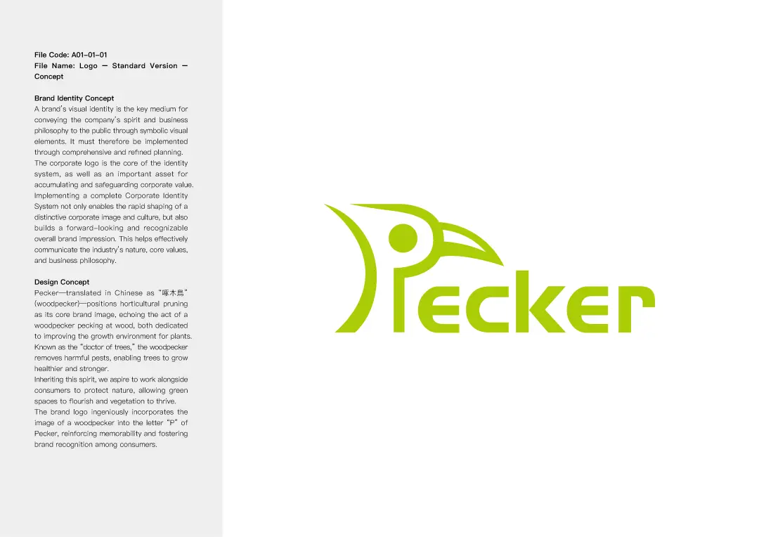
PECKER is a horticultural hand tool company. The brand's Chinese name, 「琢木鳥」 (Zhuó Mù Niǎo), is inspired by the woodpecker, with the character 「啄」 (peck) replaced by 「琢」, meaning to carve or craft meticulously. The English brand name is “PECKER,” symbolizing the passion and spirit of gardening enthusiasts who use these tools to beautify plants and nature. We designed a variety of plant-like visuals based on the shapes of gardening tools, aiming to capture attention and leave a lasting impression of the brand through this creative concept.
LOGO DESIGN
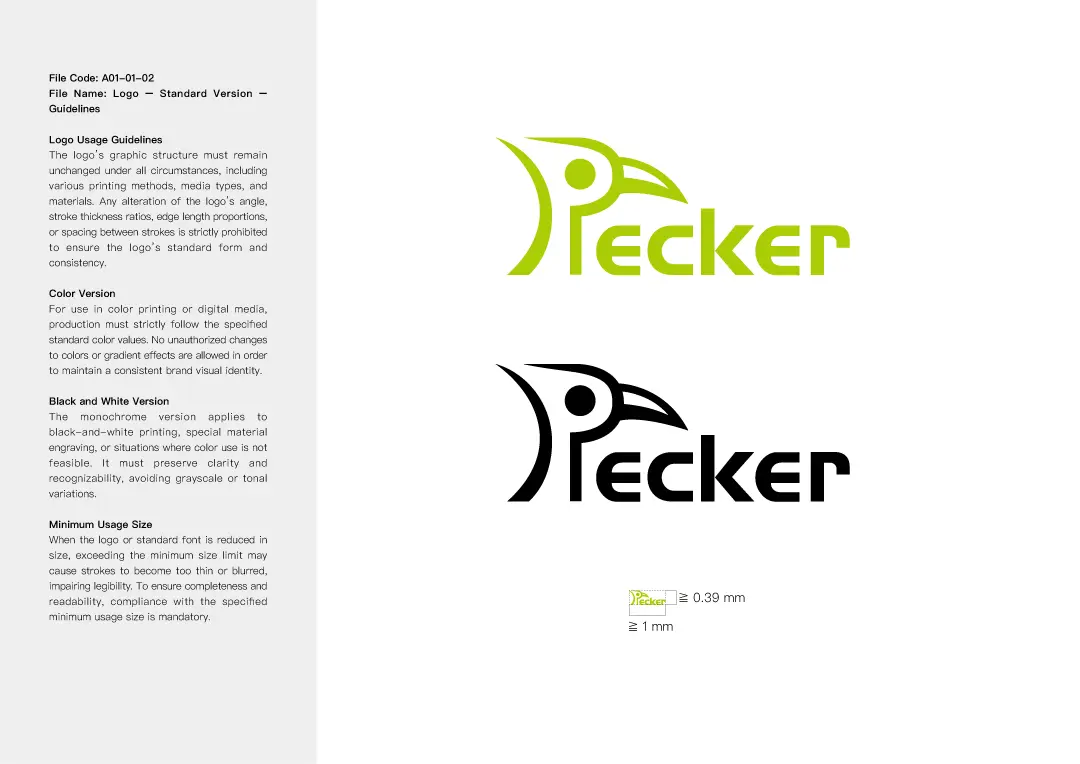
For the logo design, we drew inspiration from the form of a woodpecker, creating 16 different logo styles ranging from classic and intricate to modern and minimalist for the client to choose from. Each logo was accompanied by a unique concept and idea, along with in-depth analysis for the client's reference. In the end, we made subtle refinements to the selected version to achieve the most visually harmonious result, meeting the client's needs and expectations.
STANDARD COLOR DESIGN
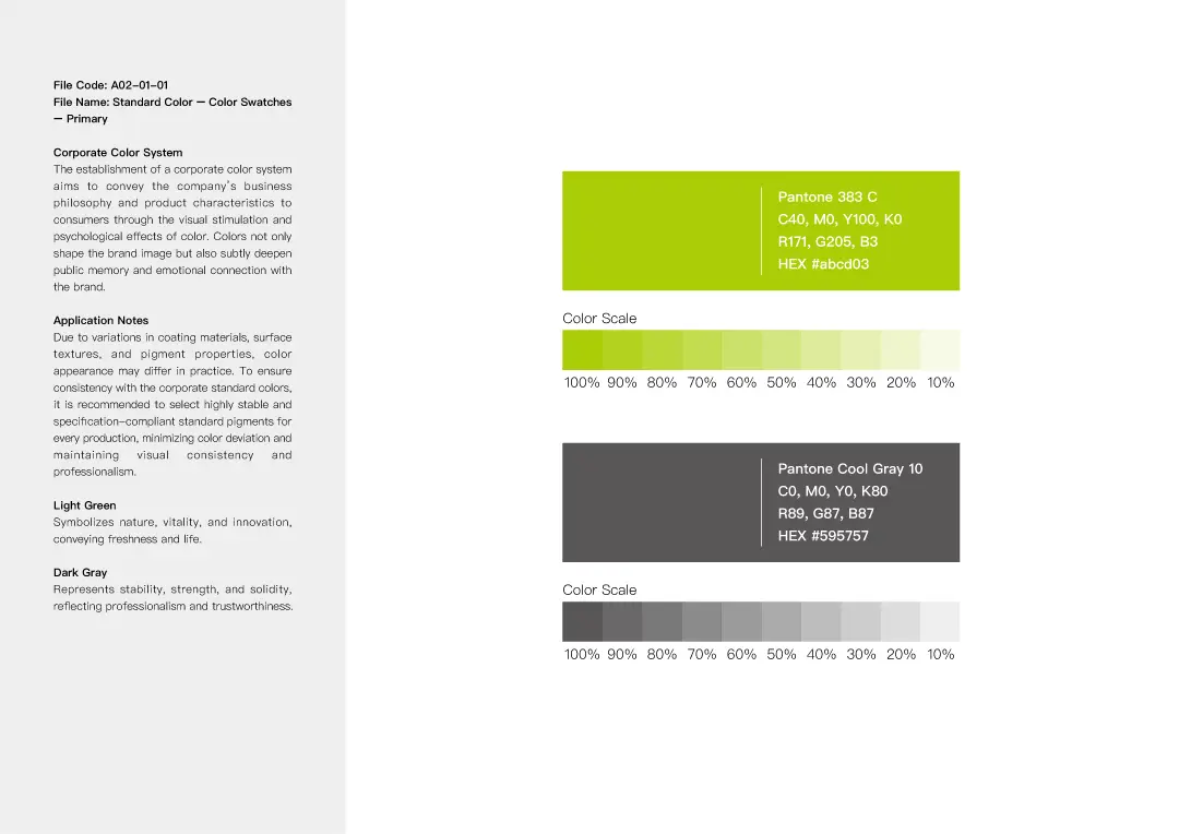
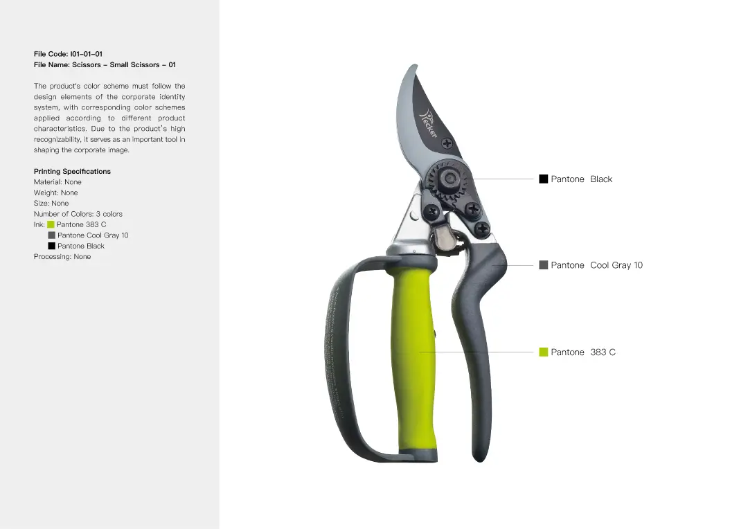
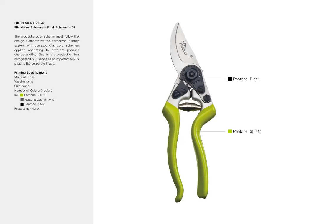
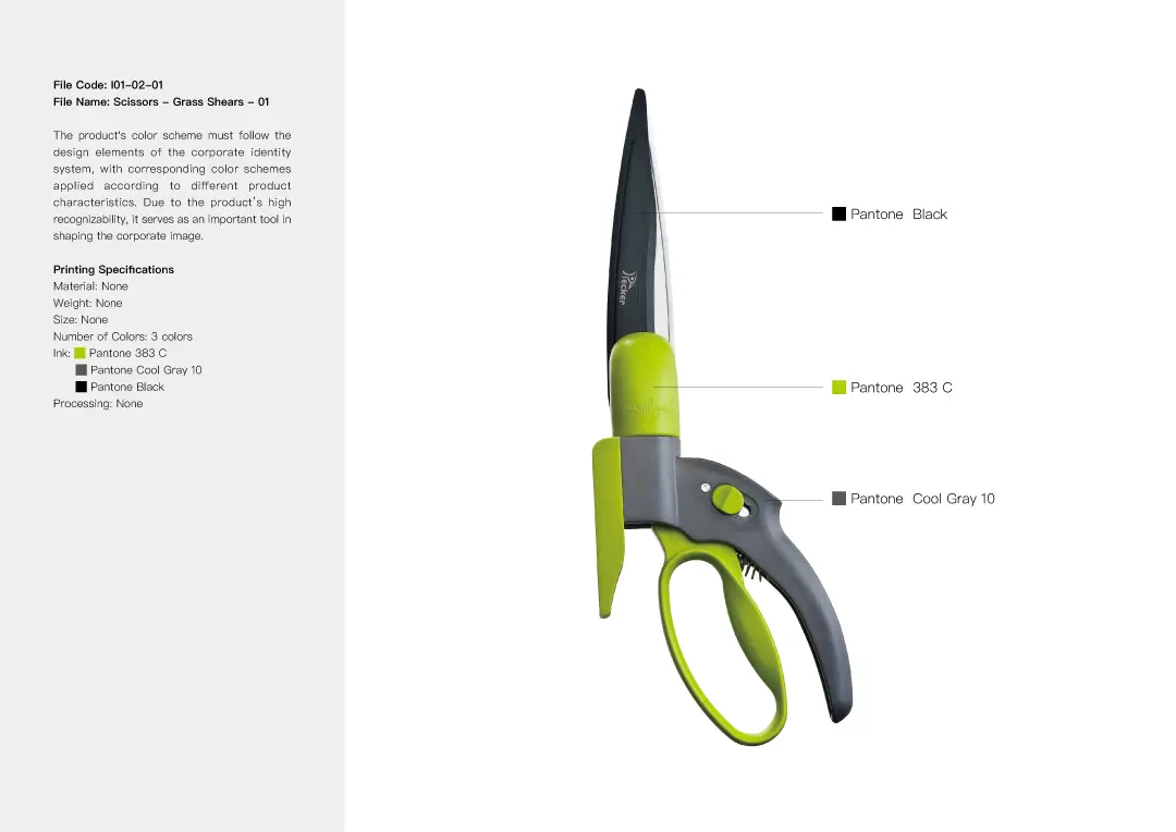
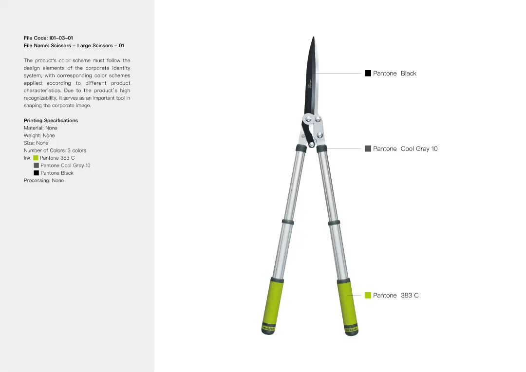
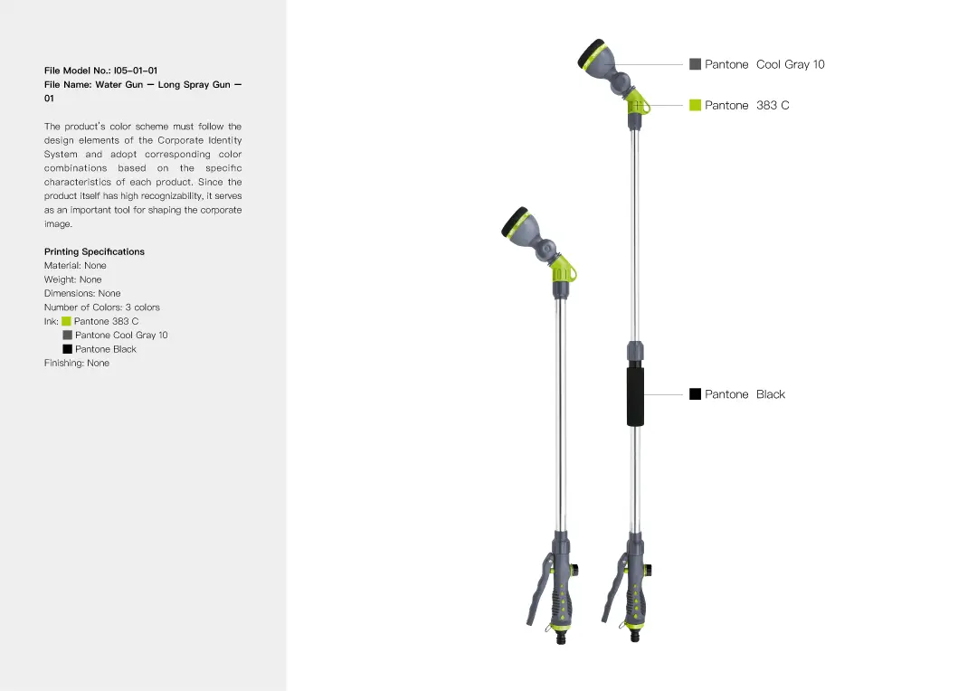
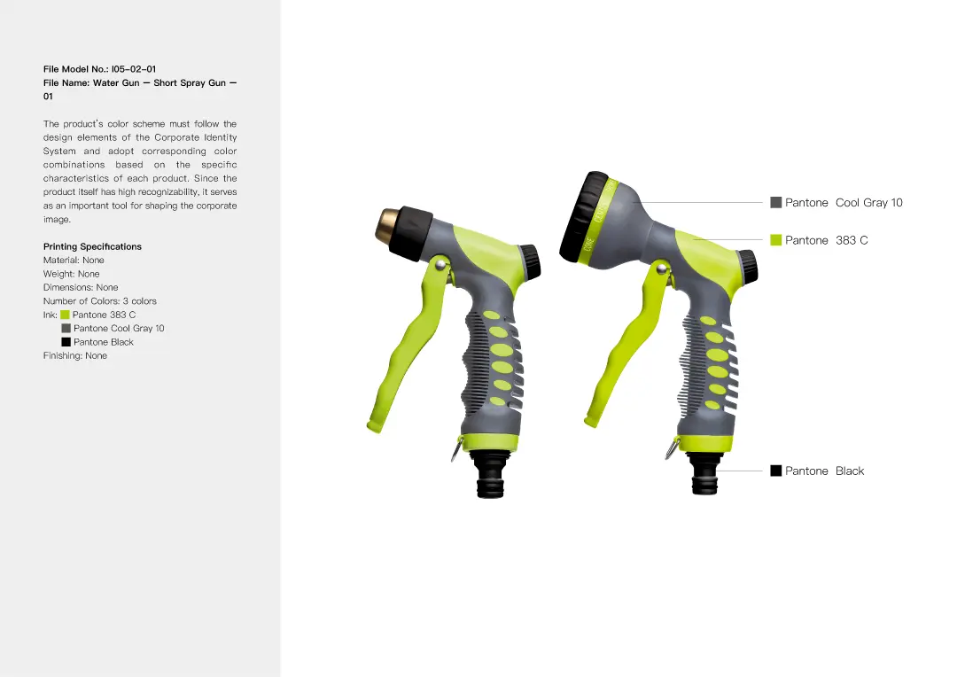
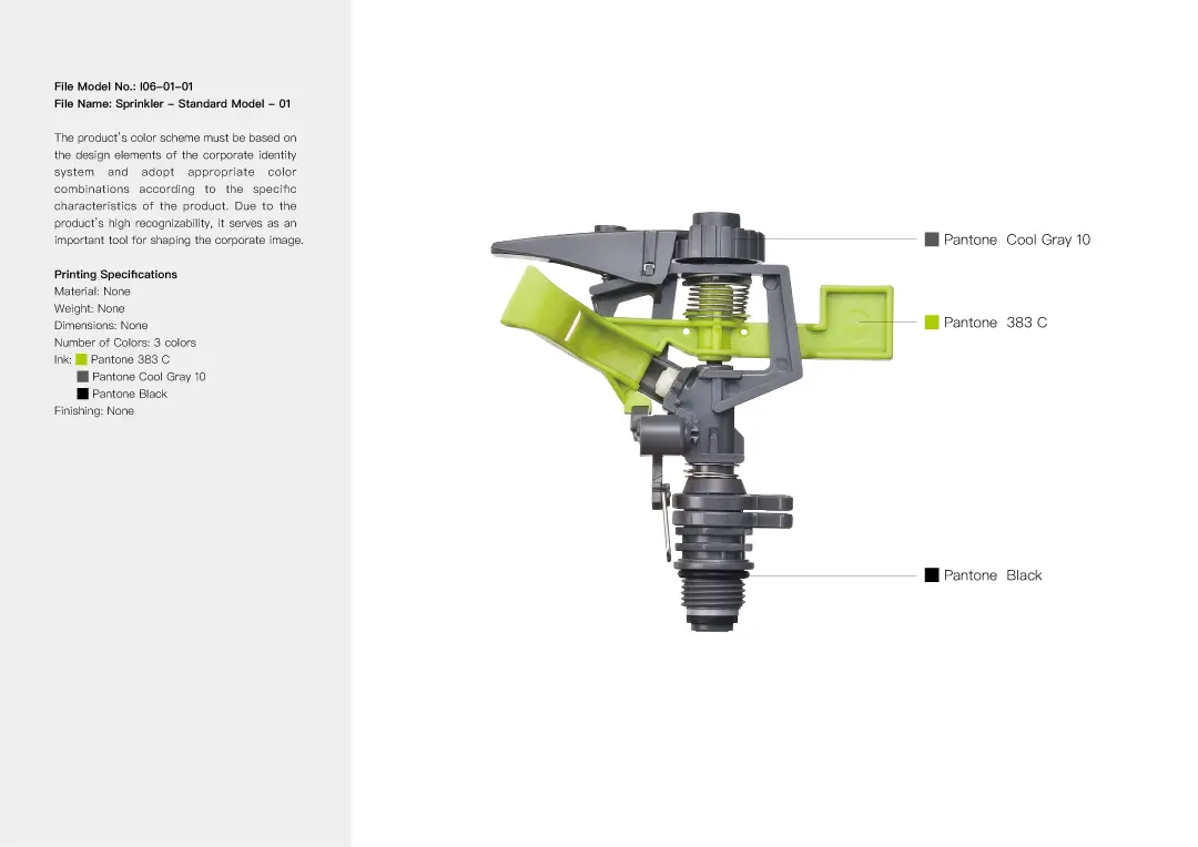
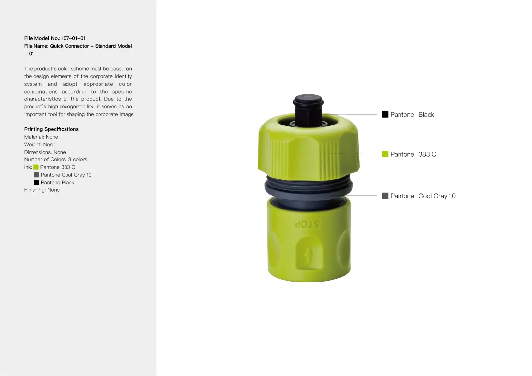
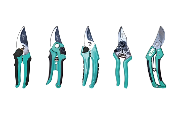
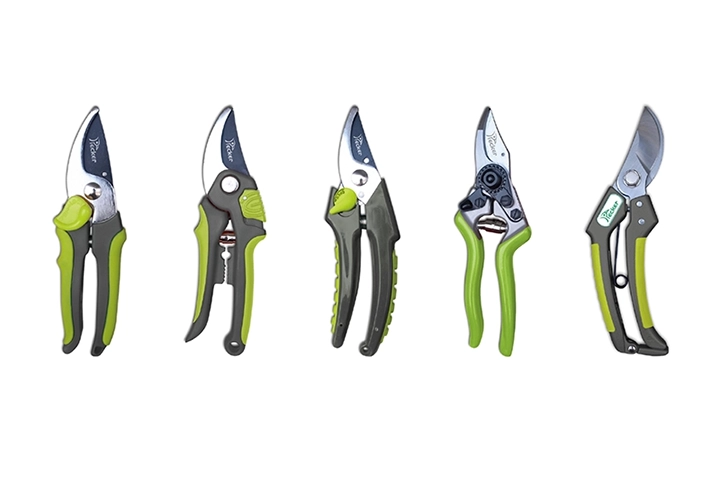
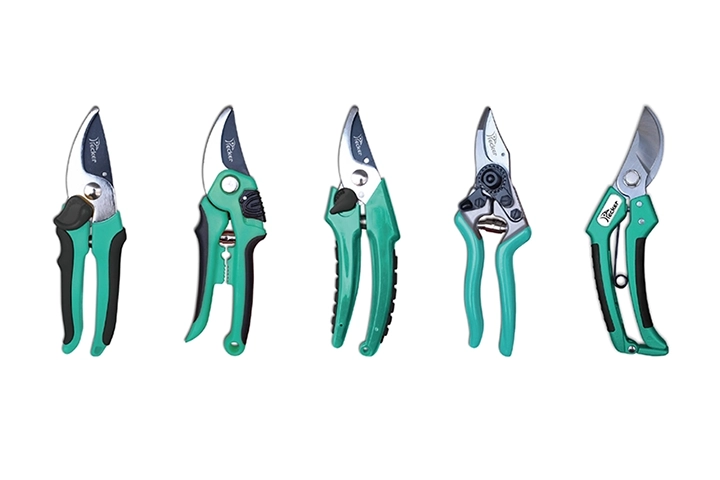
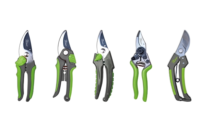
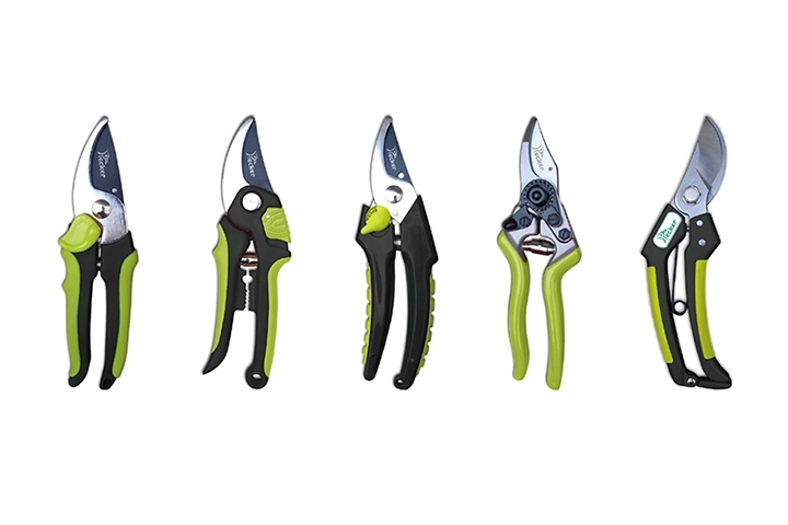
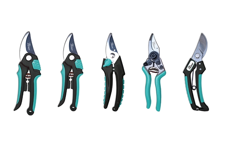
In selecting the brand’s standard colors, we conducted in-depth research on PECKER’s actual products and developed nine different color scheme proposals. Our focus was on the uniqueness of each palette and its harmony with the product components. Ultimately, we chose a Scandinavian-inspired color scheme: Olive Green (Pantone 390C) and Cool Gray (Pantone Cool Gray 10). This combination evokes a natural atmosphere while maintaining a modern aesthetic. The olive green conveys a fresh and distinctive feel, setting it apart from the more commonly seen bright greens in the market. This final color scheme was then applied across the brand’s logo, logotype, stationery, and other materials to build a cohesive and complete visual identity system.


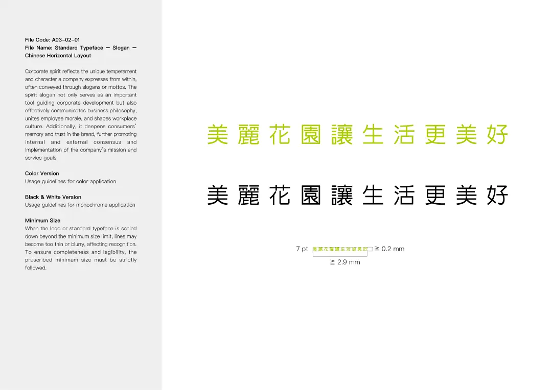
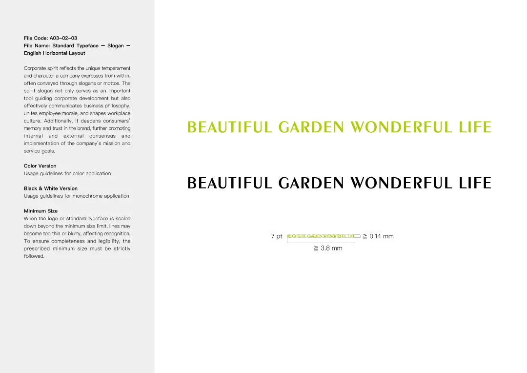
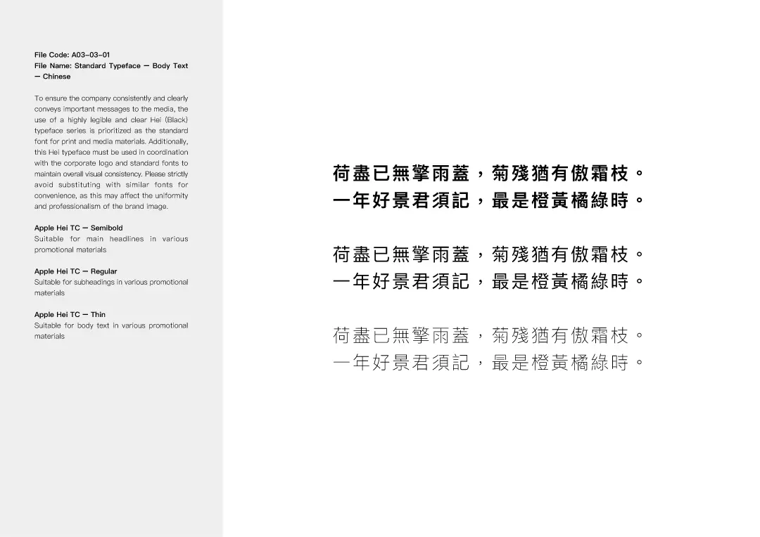
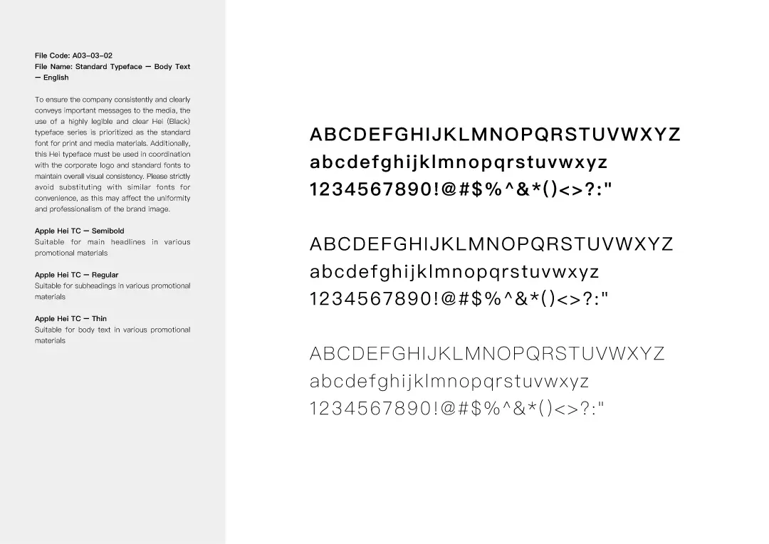
STANDARD FONT DESIGN
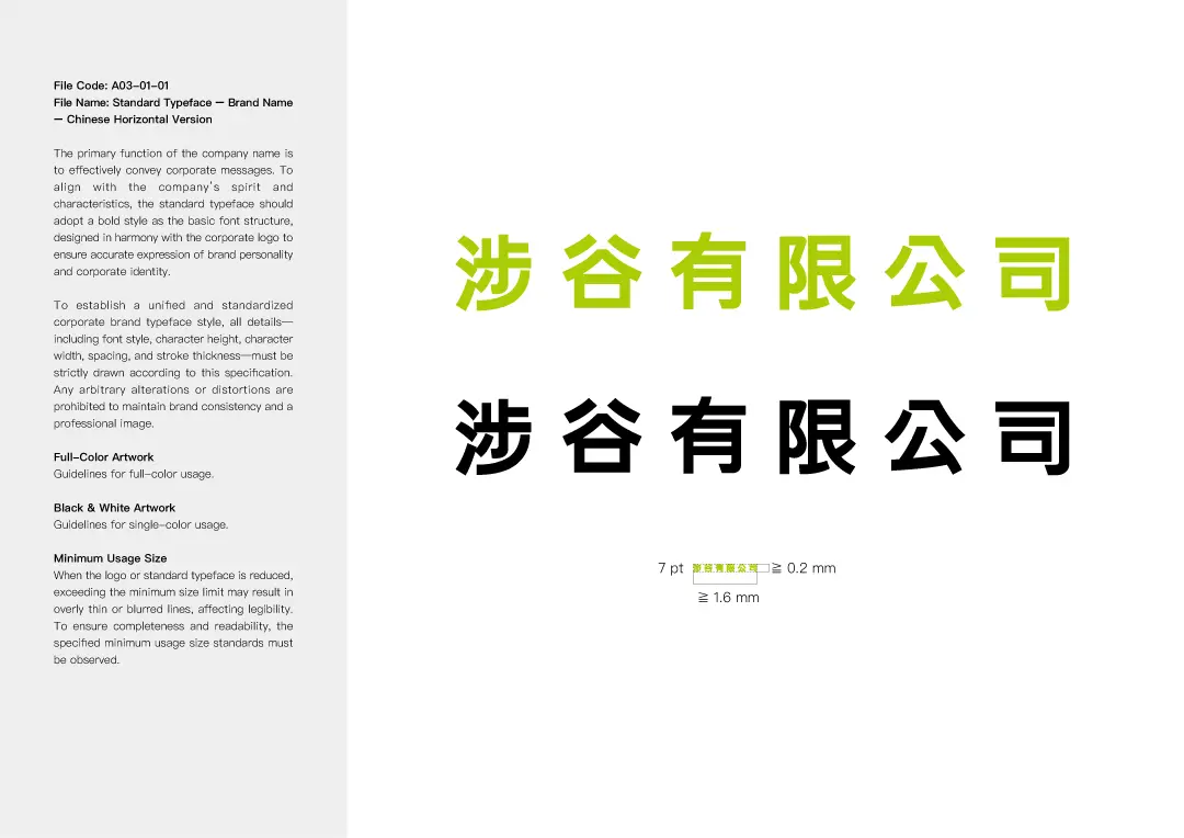
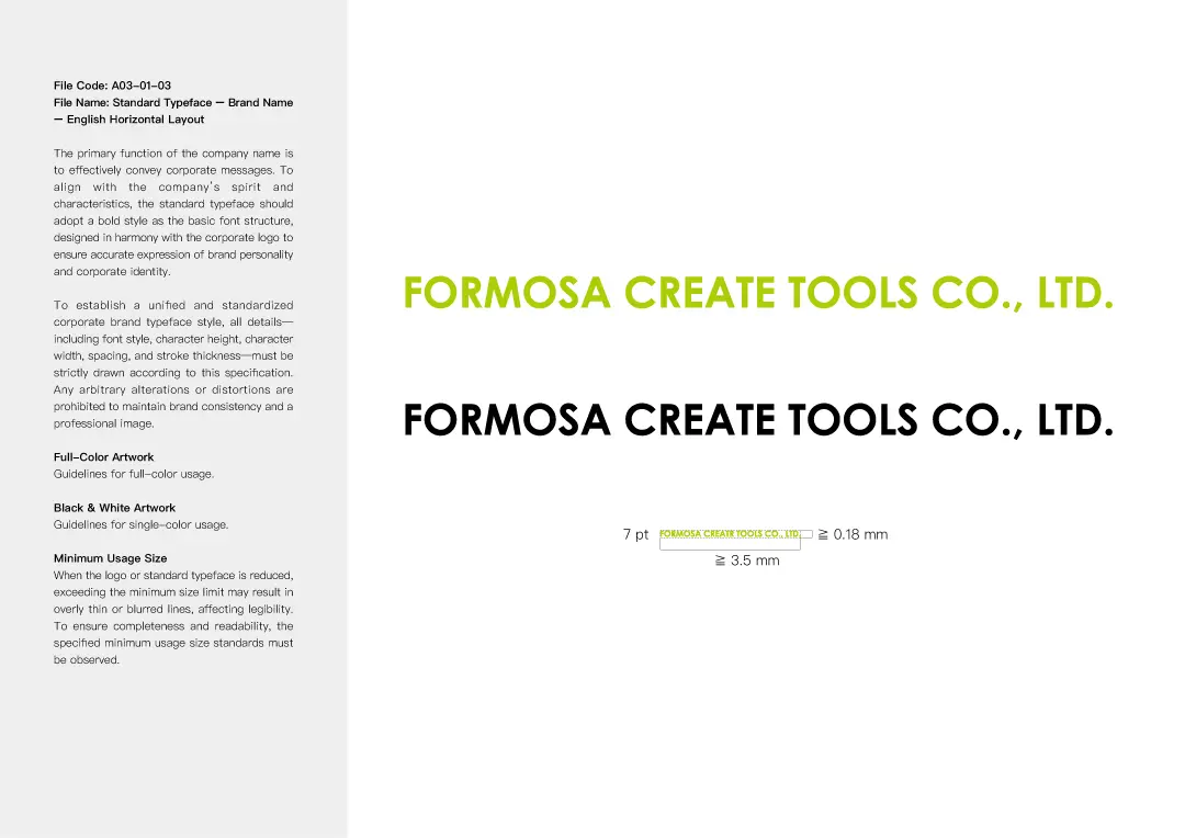
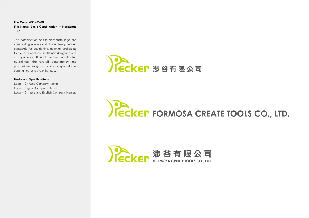
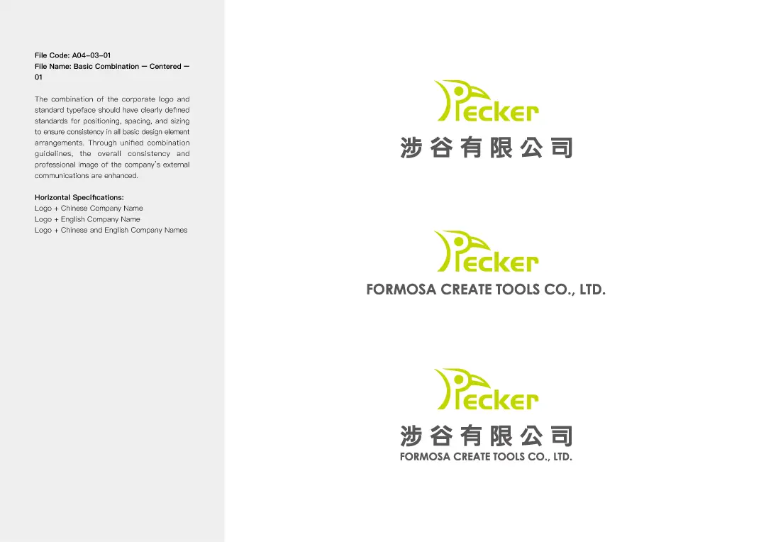
After careful consideration, we finalized a logo and specially designed a custom hand-drawn typeface to achieve optimal visual harmony. This unique typeface not only complements the logo but also evolved into a unified identity system, setting clear guidelines for its future use across business cards, envelopes, catalogs, websites, and other design applications.


VISUAL DESIGN
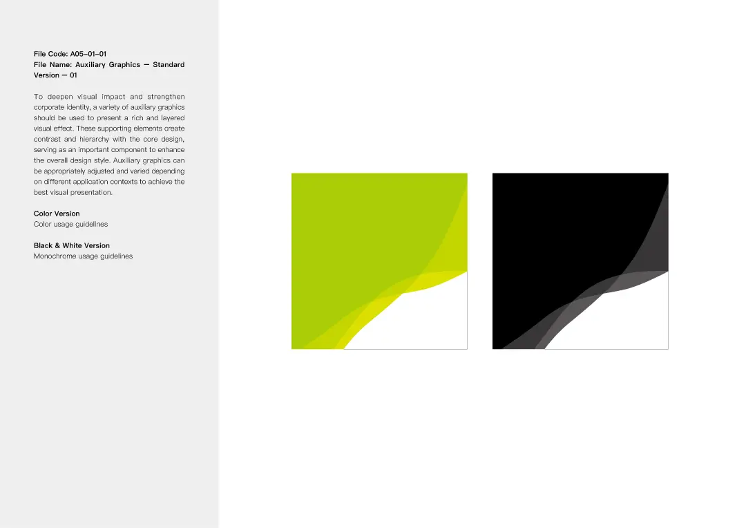
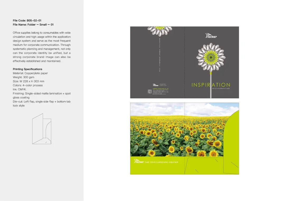
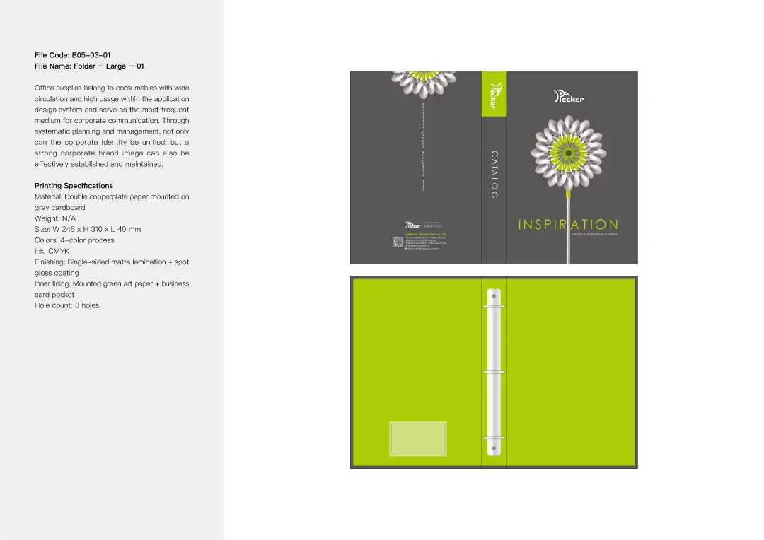
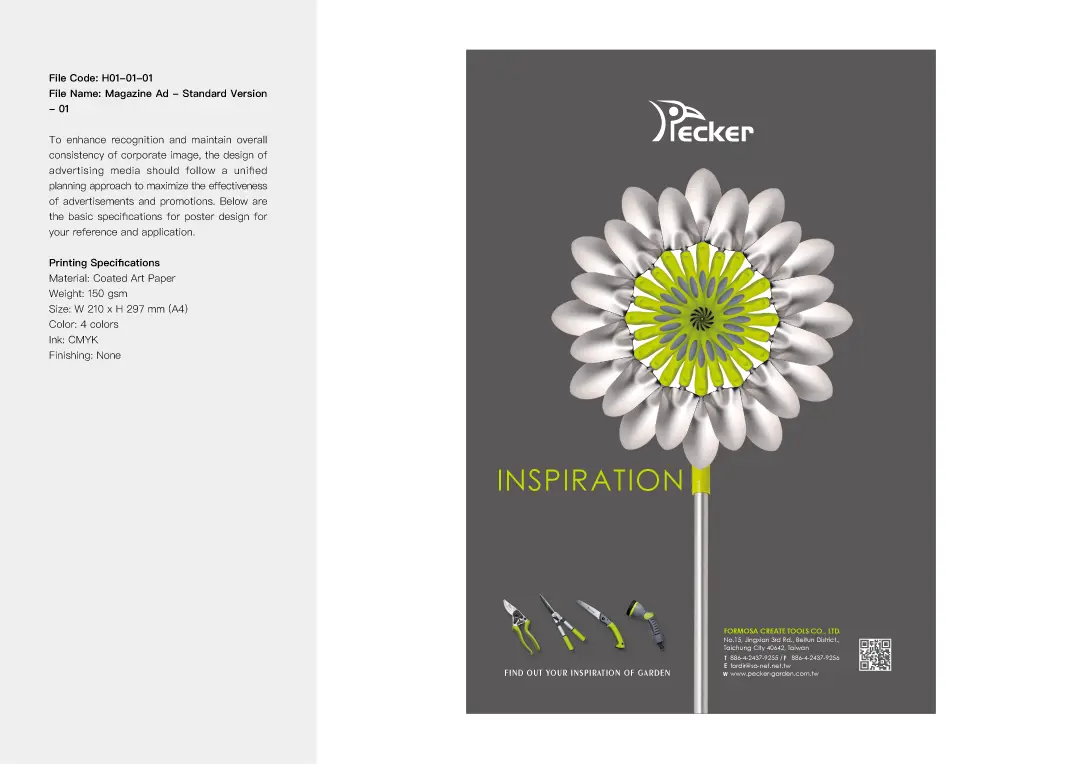
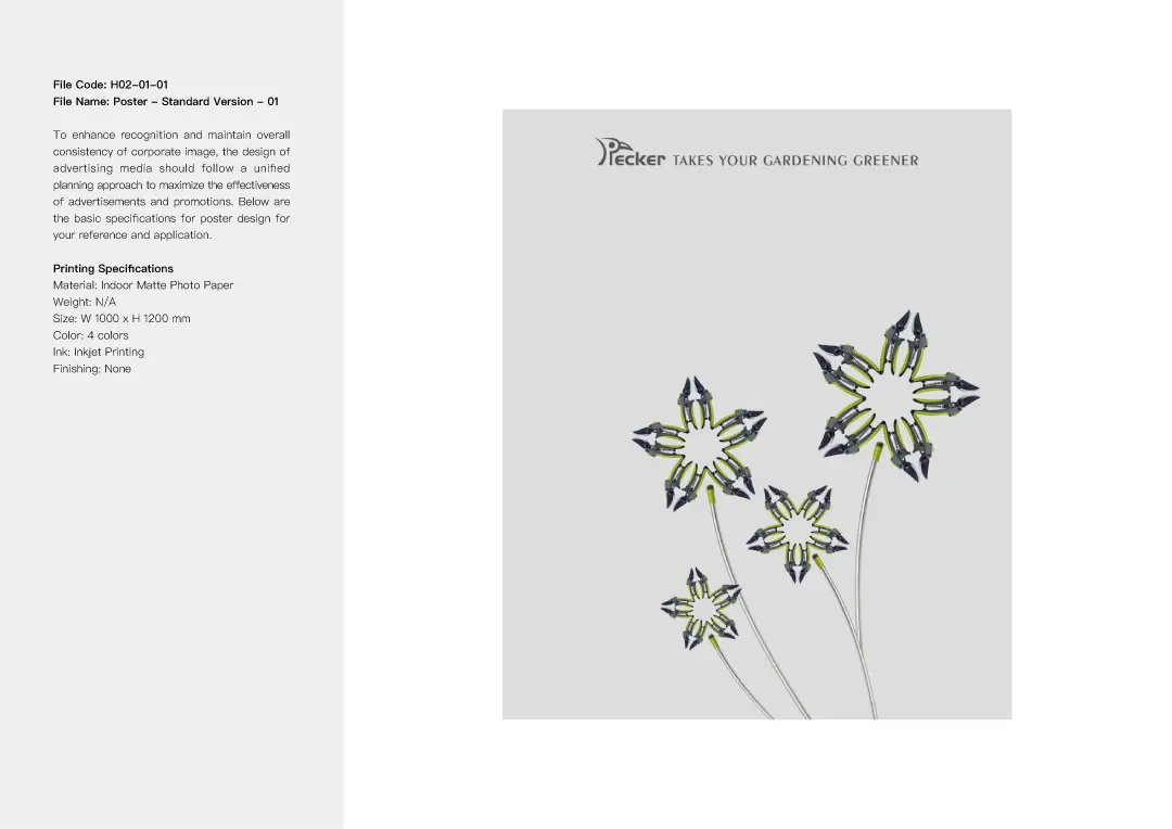
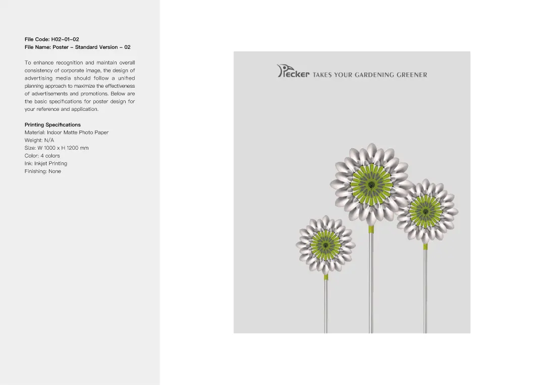
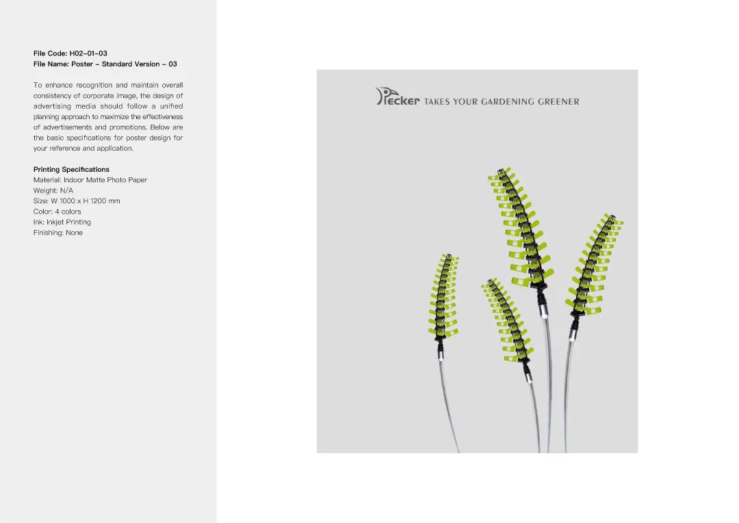
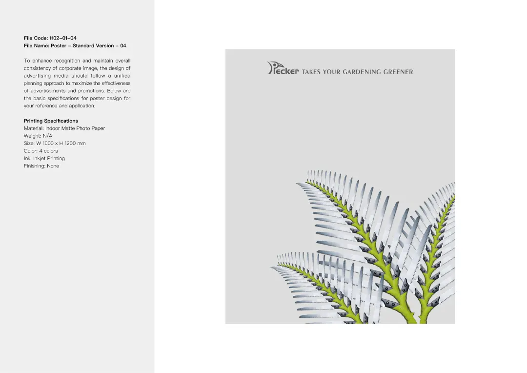
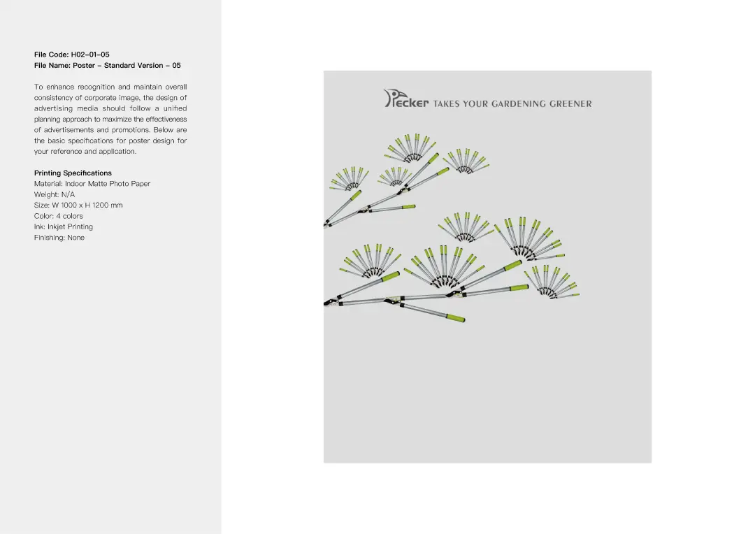
For the visual design, we cleverly arranged and combined gardening tools such as shovels, sprinklers, pruning shears, flower scissors, saws, and rakes to design plant-inspired shapes including sunflowers, sage, pine trees, flowers, palm leaves, and dandelions. These imaginative designs are visually striking and memorable, perfectly showcasing the essence of the products the brand promotes.


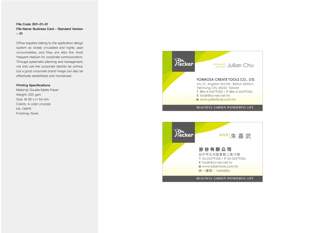
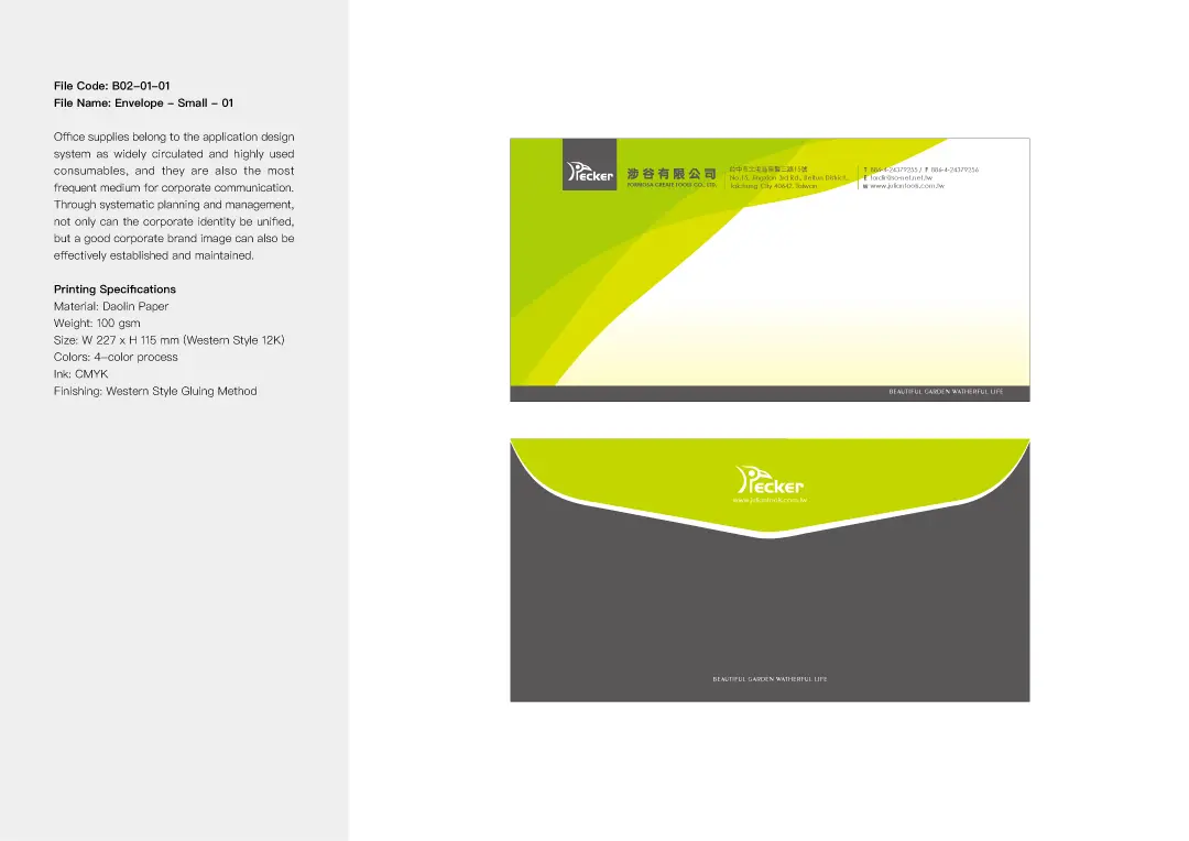
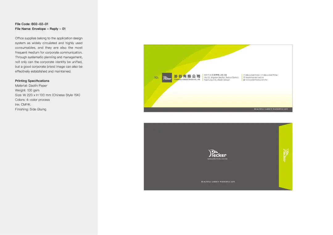
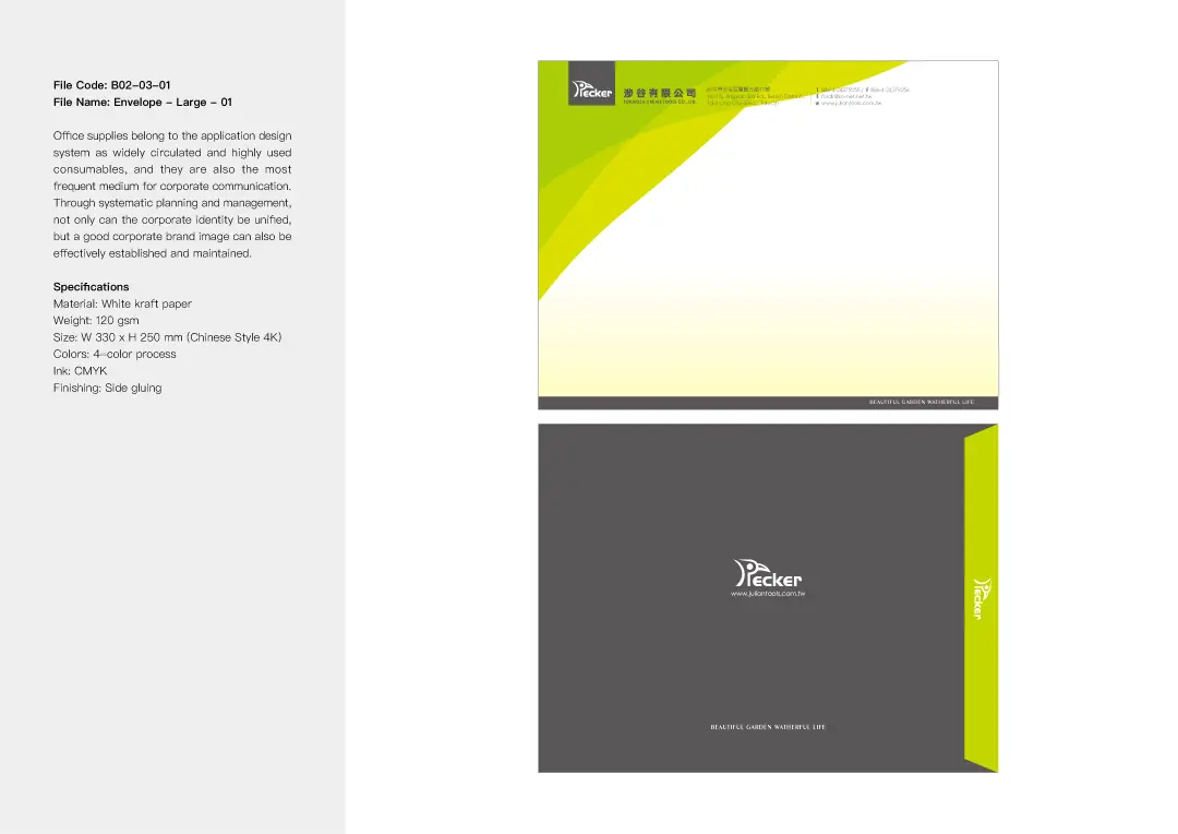
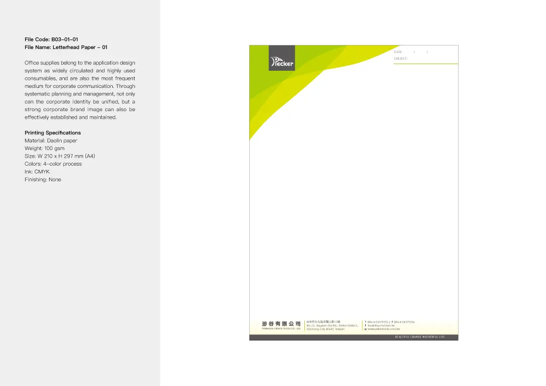
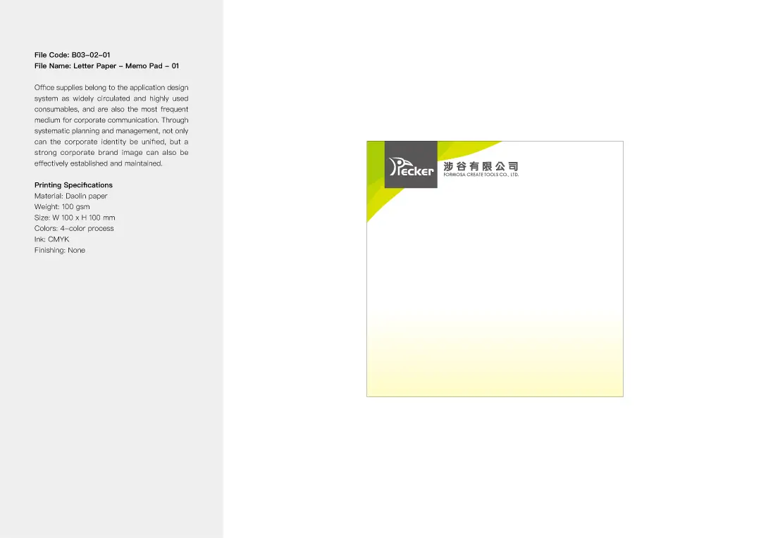
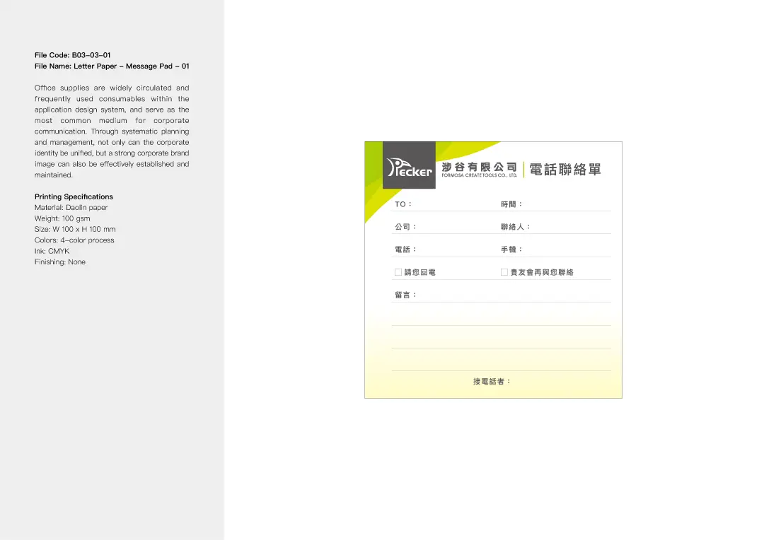
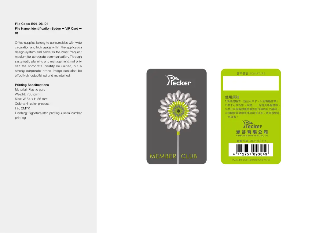
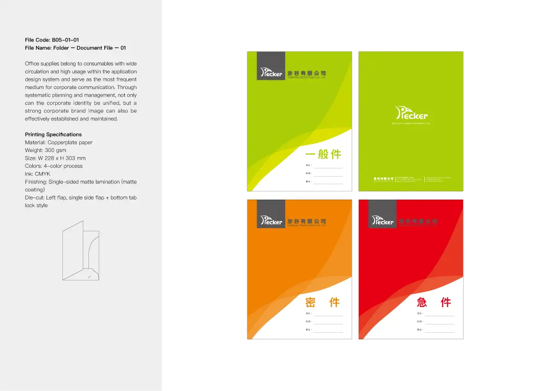
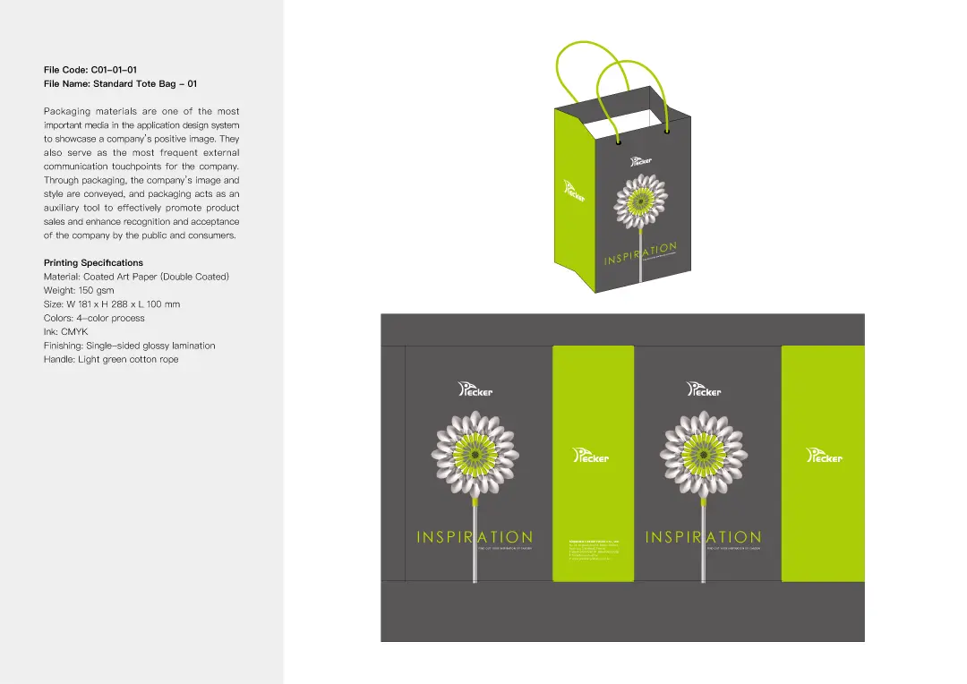
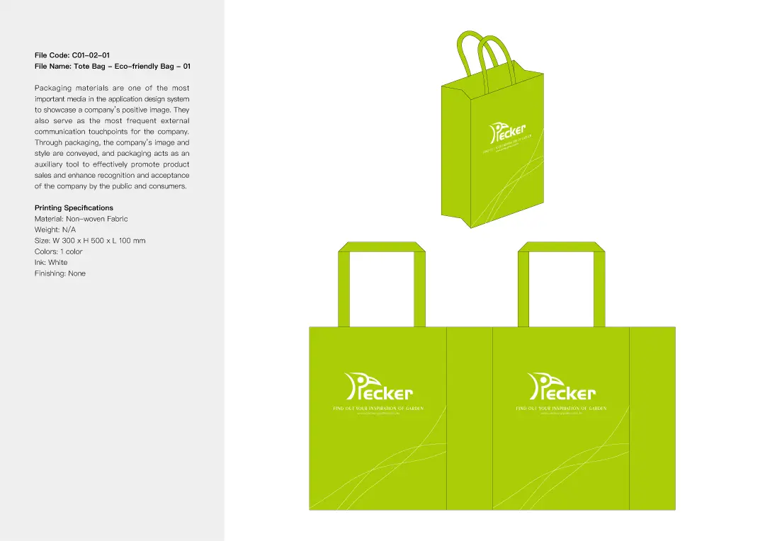
STATIONERY DESIGN
We combined the logo, standard colors, typography, and creative graphics into a unified visual identity system. This system is applied across various brand materials, including business cards, envelopes, backing cards, and posters. The design aims to highlight PECKER’s creative brand image and enhance overall brand consistency.

EXHIBITION POSTER DESIGN


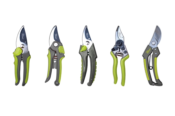
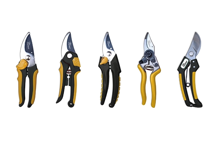
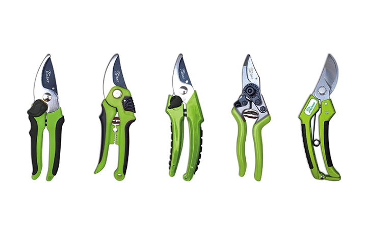
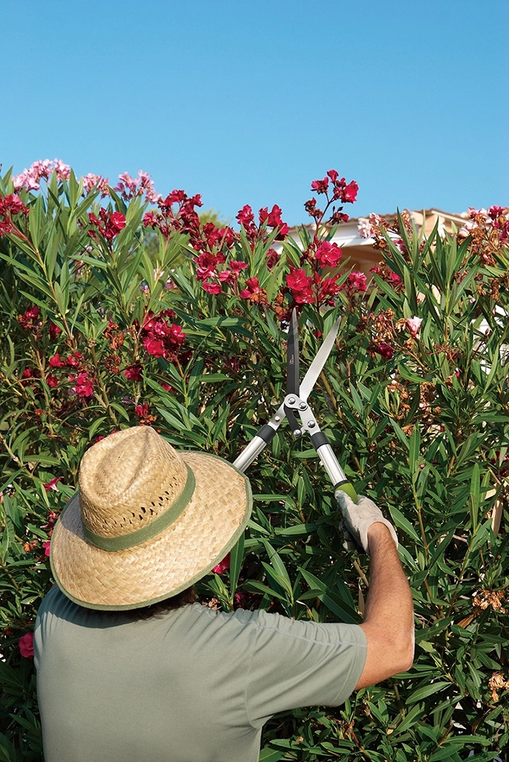
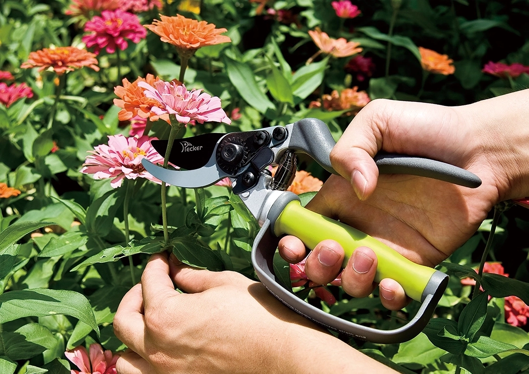
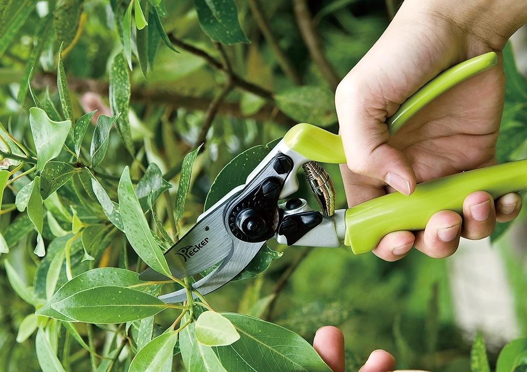
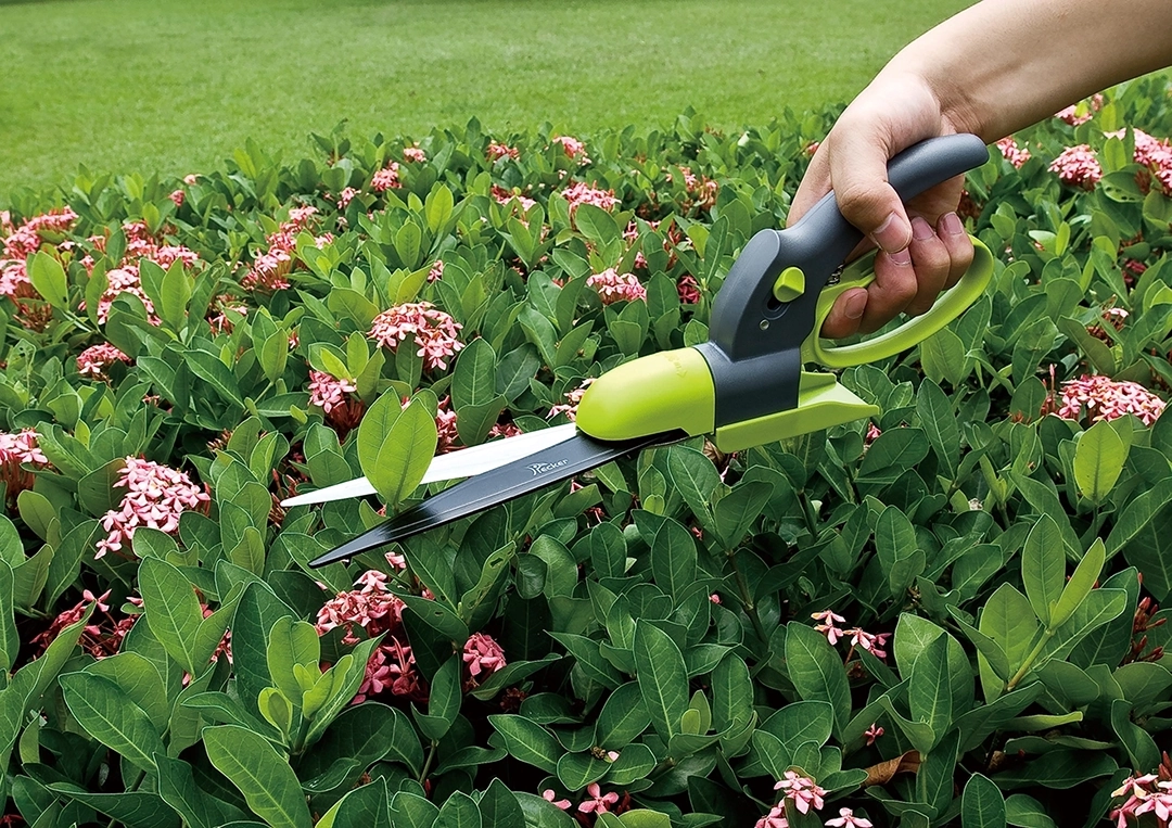
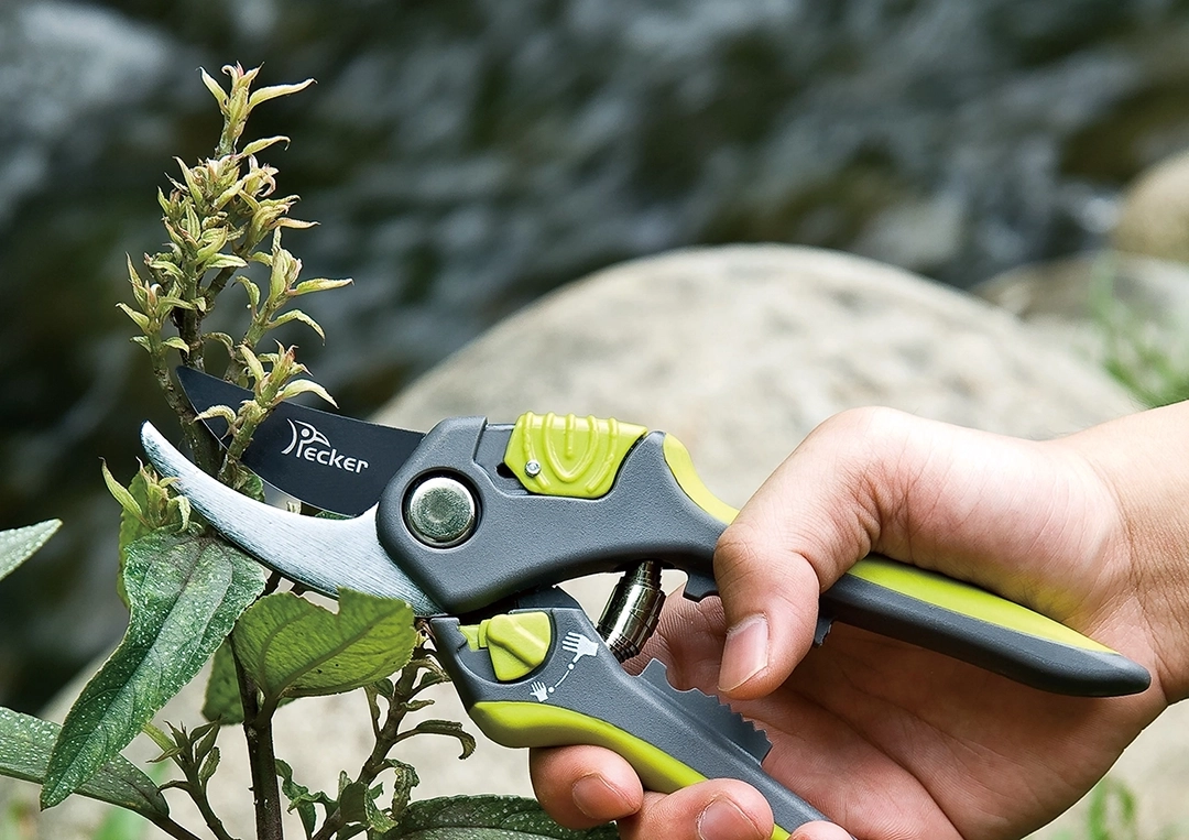
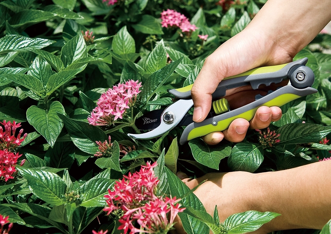
PHOTOGRAPHY
Finally, the client revamped the brand and products based on the CIS identity system we designed. We then conducted commercial photography for the new products, focusing on different contexts and uses. These photos, along with the creative graphics, will support the presentation of future designs for catalogs, websites, posters, exhibitions, and other related materials.


CATALOG DESIGN
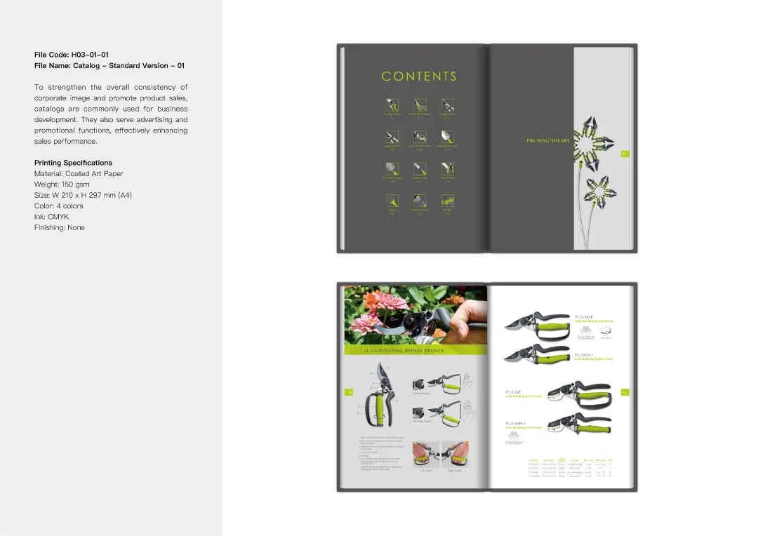
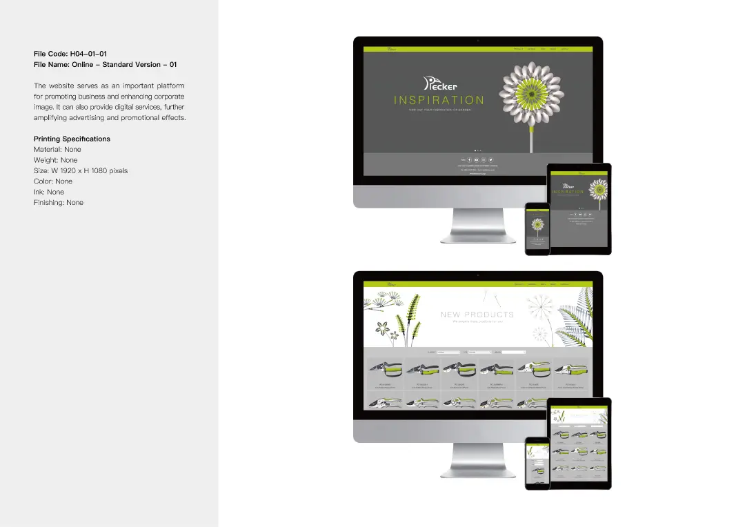
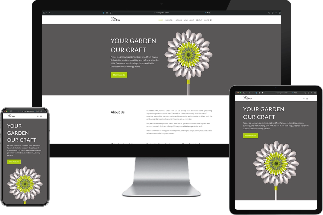
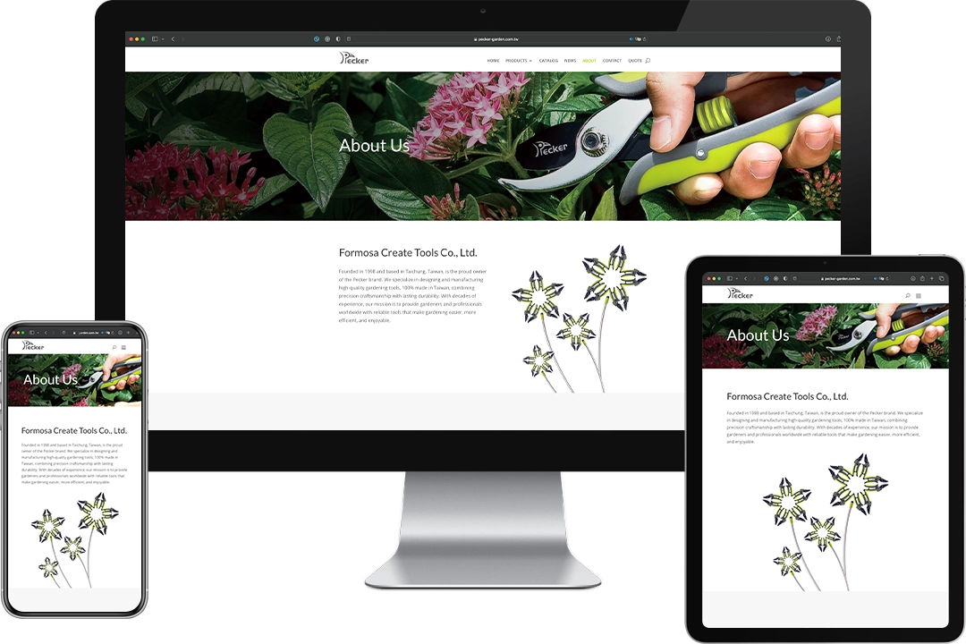
We skillfully incorporated photography, logo, standard colors, typography, and creative graphics into the catalog and website design. These elements work together to establish a distinctive brand style and identity for PECKER, showcasing its creative spirit and professional value.


CORPORATE IDENTITY SYSTEM