ROYALHERB
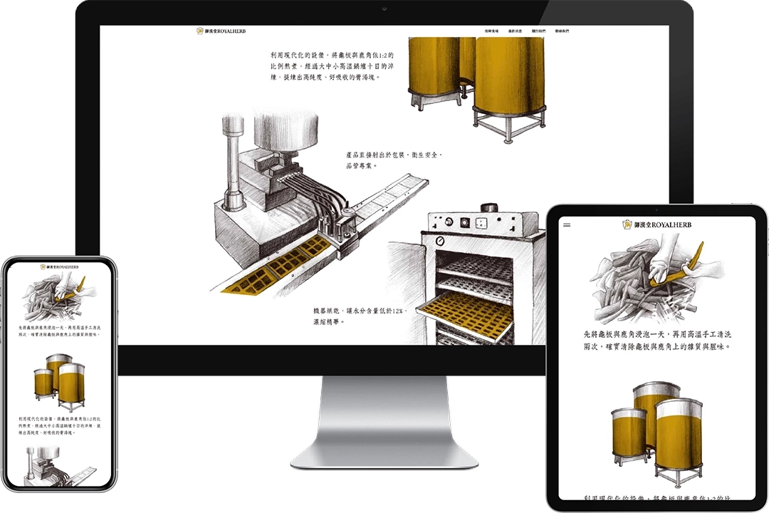
ROYALHERB Health Corporation specializes in Guilu Erxian gelatin and traditional Chinese medicinal herbs. The conventional image of Guilu Erxian gelatin has long been perceived as outdated and overly traditional. In this design project, we used sketch-style illustrations to present the herbs and production process, aiming to create a more refined and artistic brand identity. Our goal is to reshape public perception of Guilu Erxian gelatin and broaden its appeal across different age groups. We believe that this refreshed brand image will attract a wider audience and open up greater market opportunities for ROYALHERB Health Corporation.
LOGO DESIGN
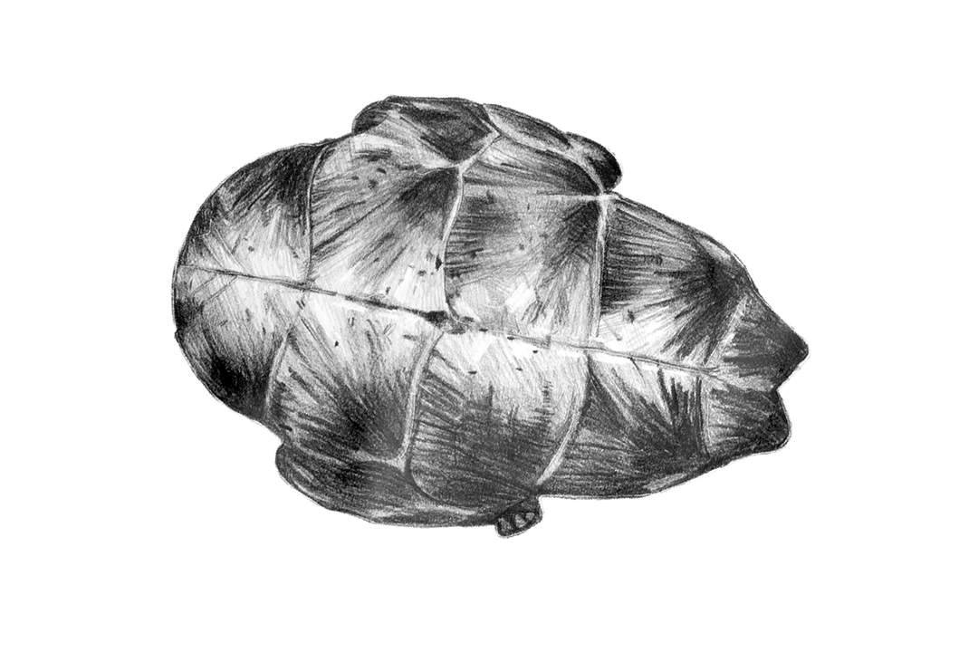
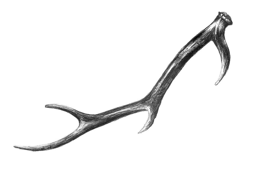
ROYALHERB Health Corporation is a long-established traditional Chinese herbal brand specializing in the production of Guilu Erxian gelatin. For the logo design, we incorporated elements such as medicinal herbs, herbal jars, traditional Chinese medicine aesthetics, turtle shells, deer antlers, and calligraphy. In total, we created 16 distinct design styles, each carrying its own unique concept and meaning.
STANDARD FONT DESIGN
In the end, we selected a final logo and custom-designed a unique hand-drawn typeface to achieve optimal visual harmony. At the same time, we developed it into a comprehensive visual identity system, establishing consistent guidelines and standards for future designs such as business cards, envelopes, promotional materials, and packaging. This system aims to highlight the distinctive charm of ROYALHERB Health Corporation and enhance the consistency and professionalism of its brand image.


VISUAL DESIGN
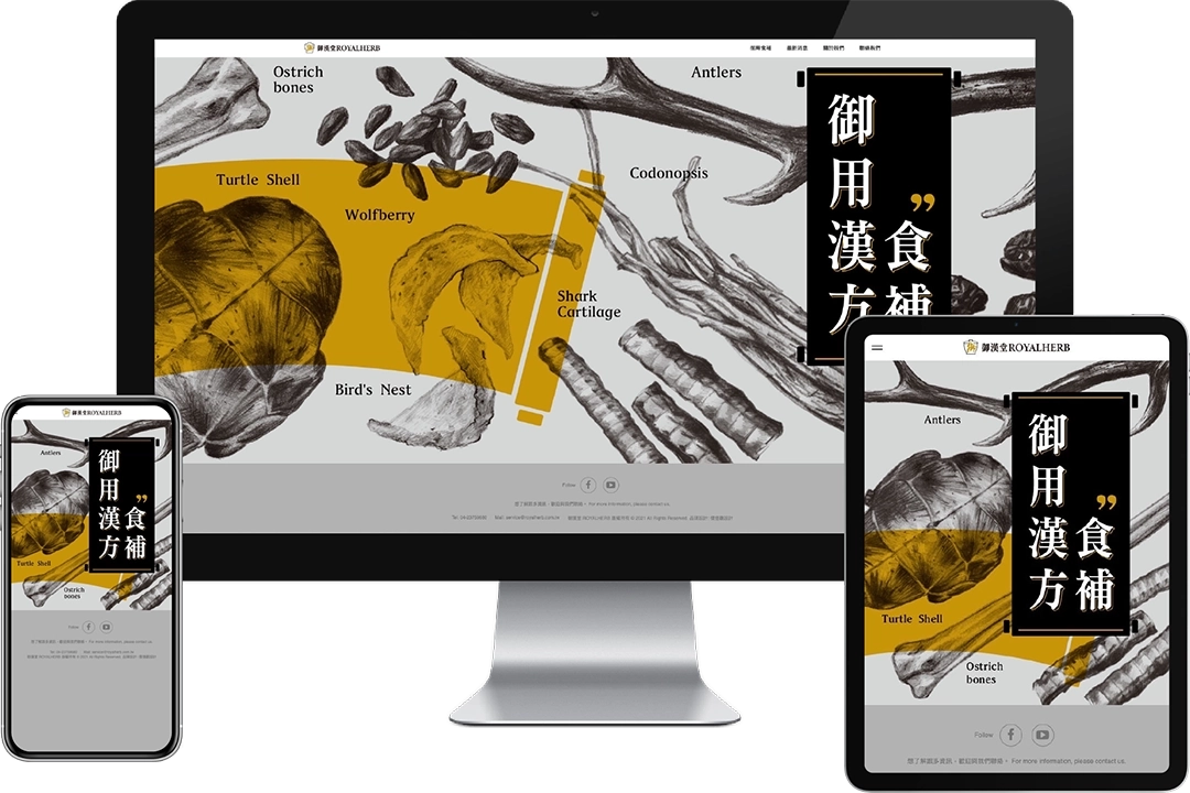
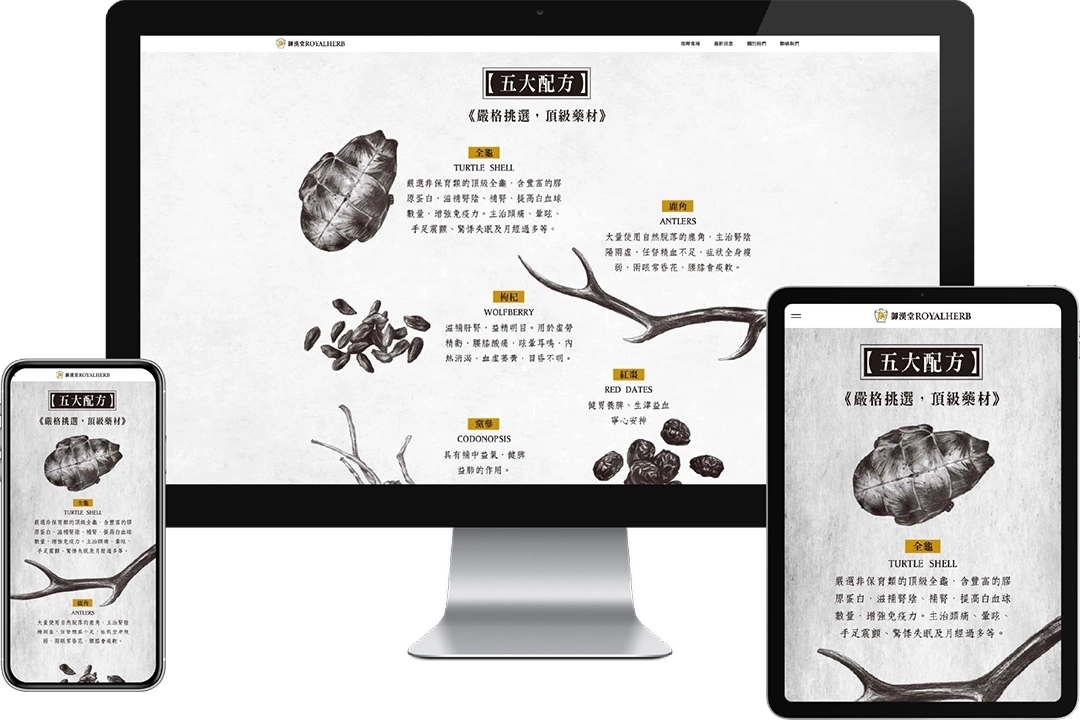
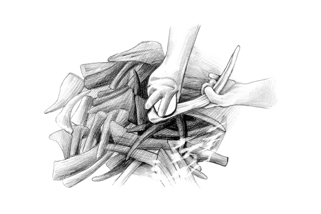
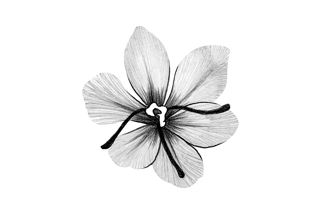
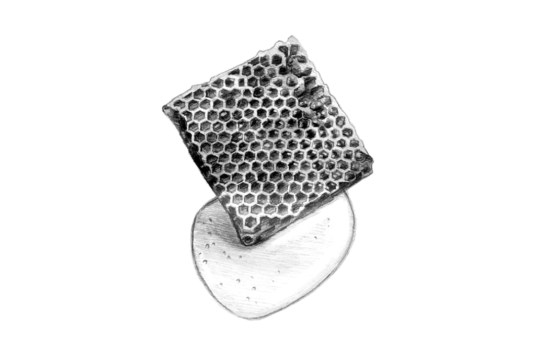
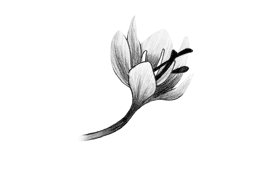
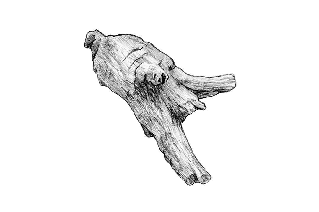
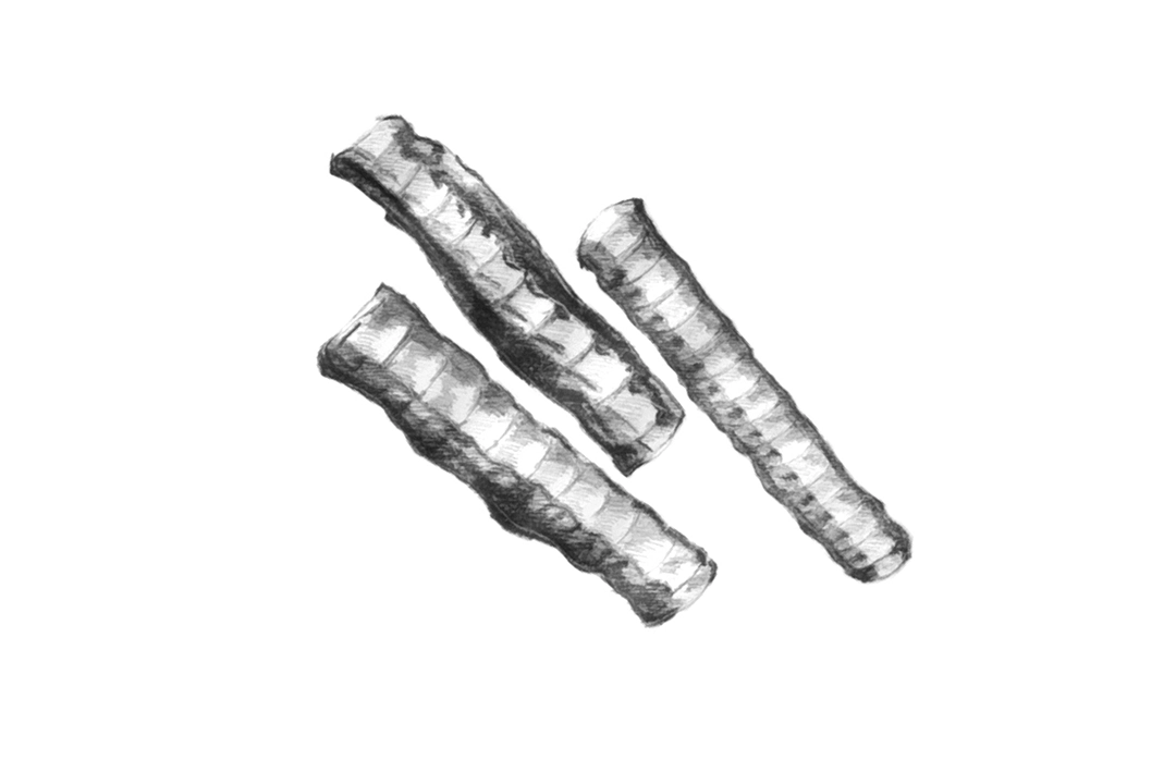
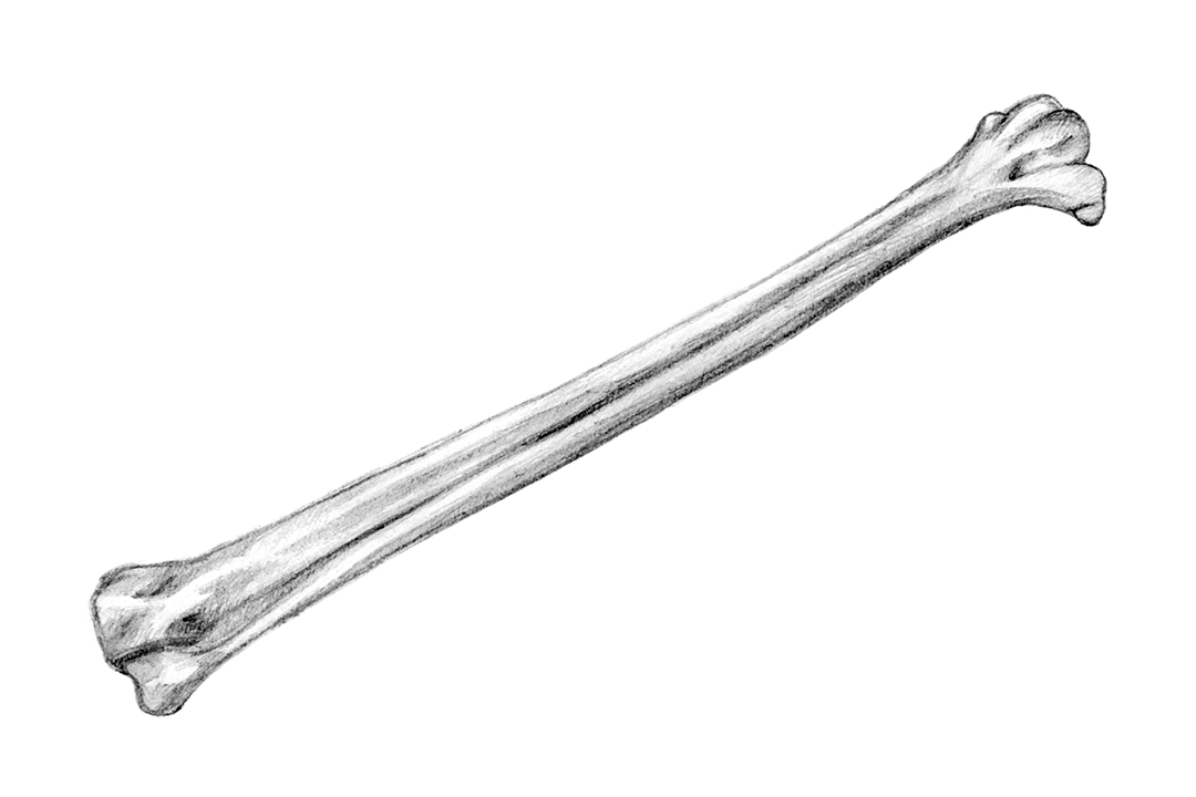
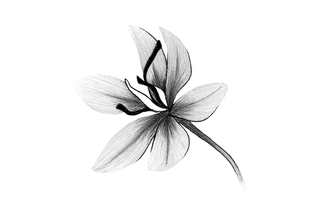
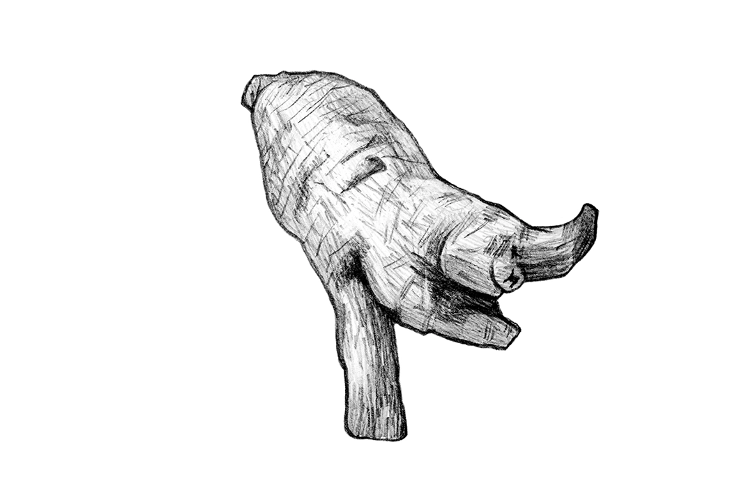
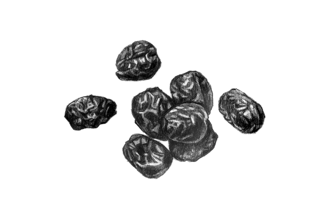
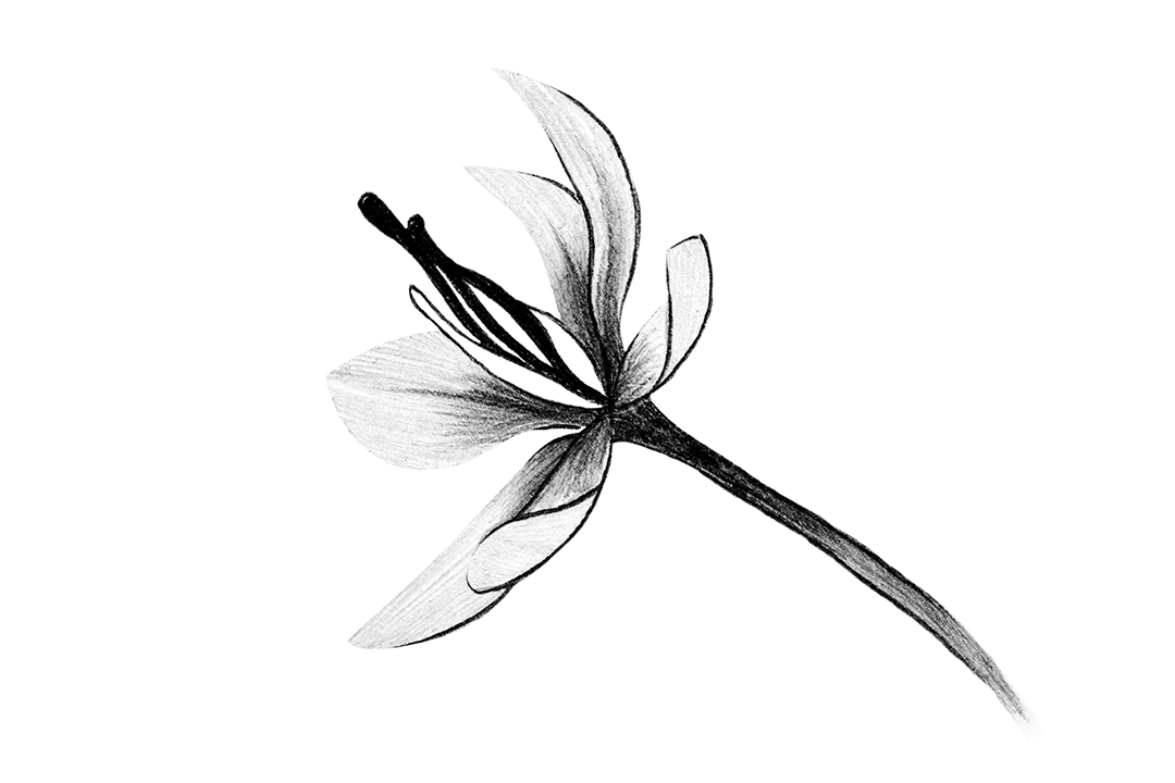
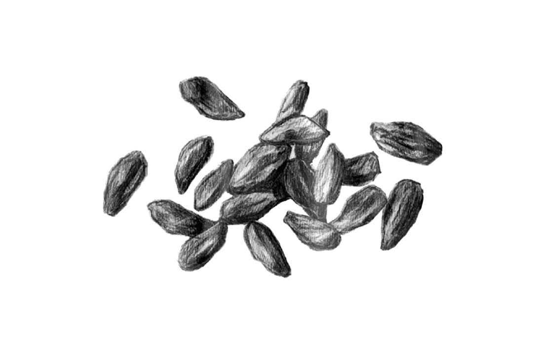
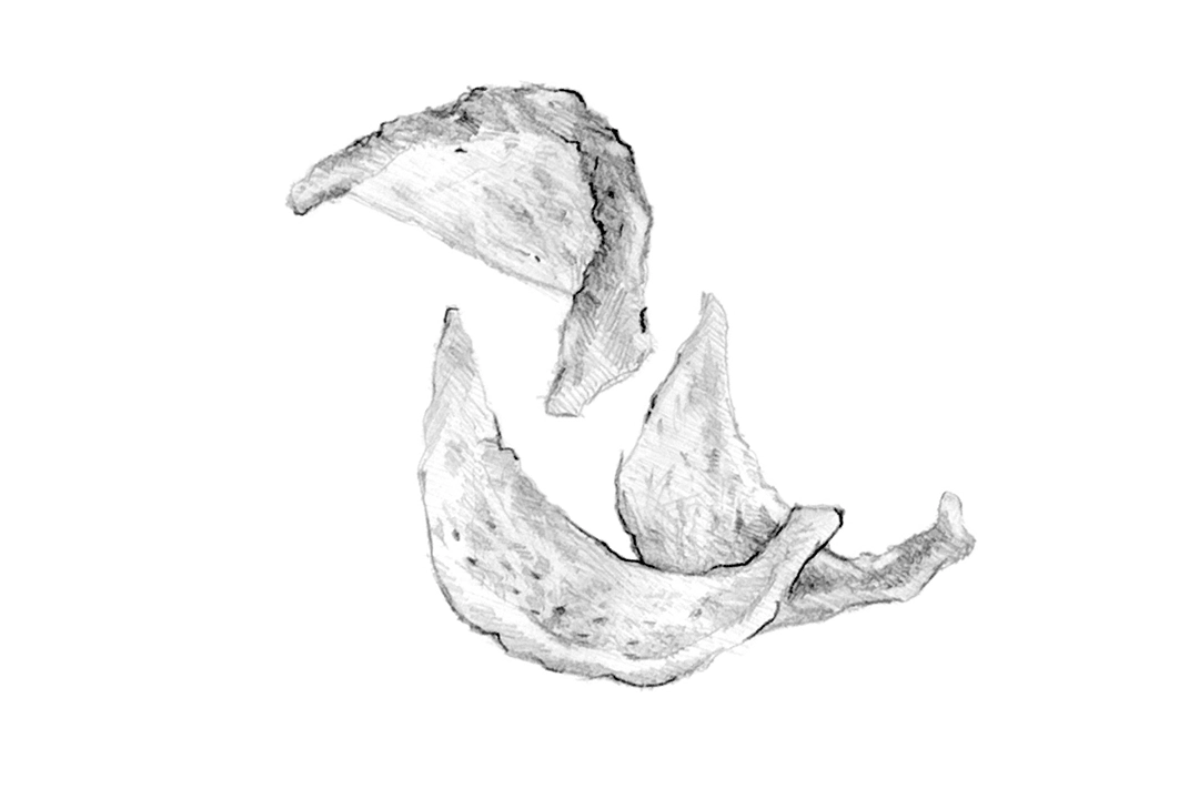
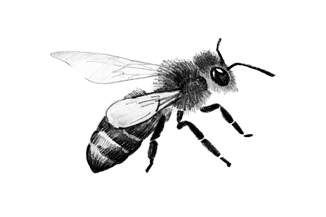
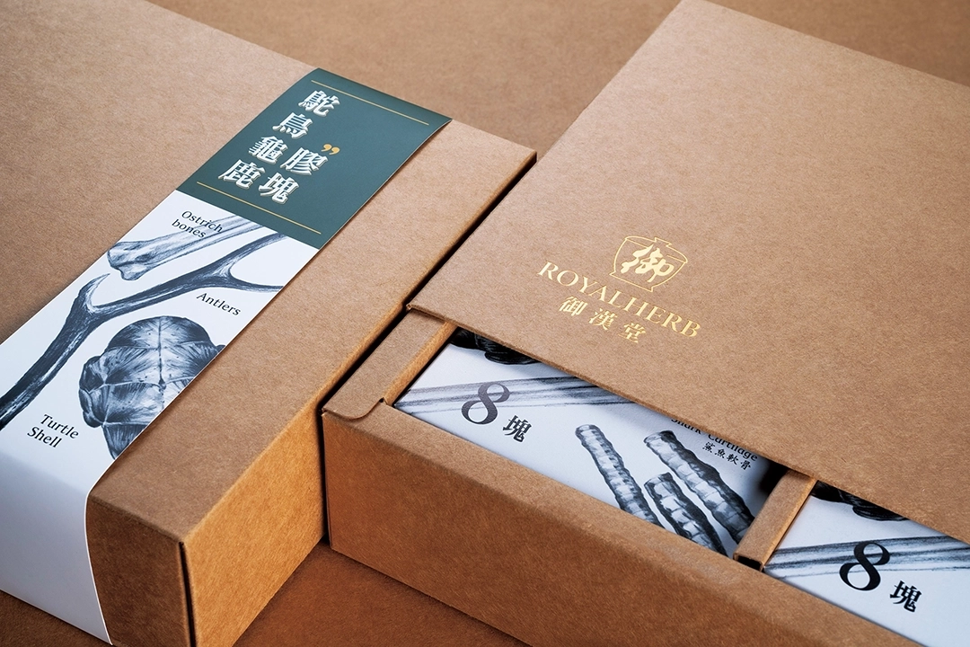
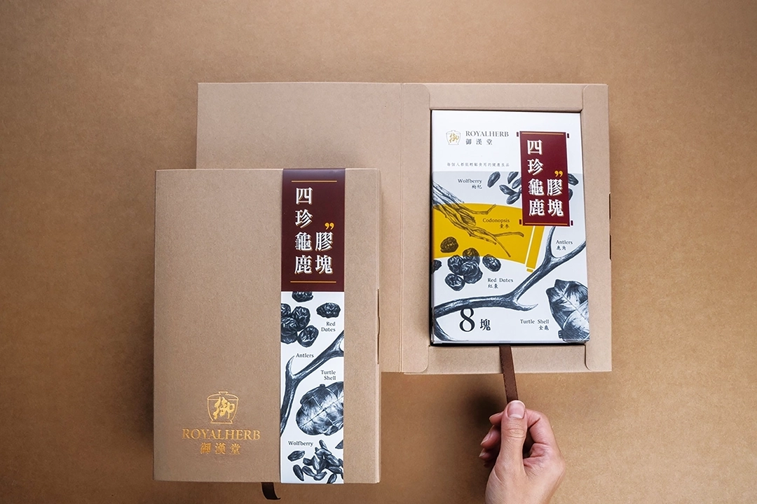
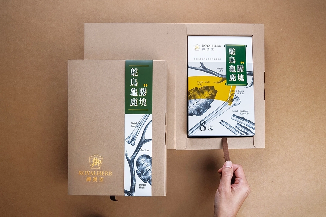
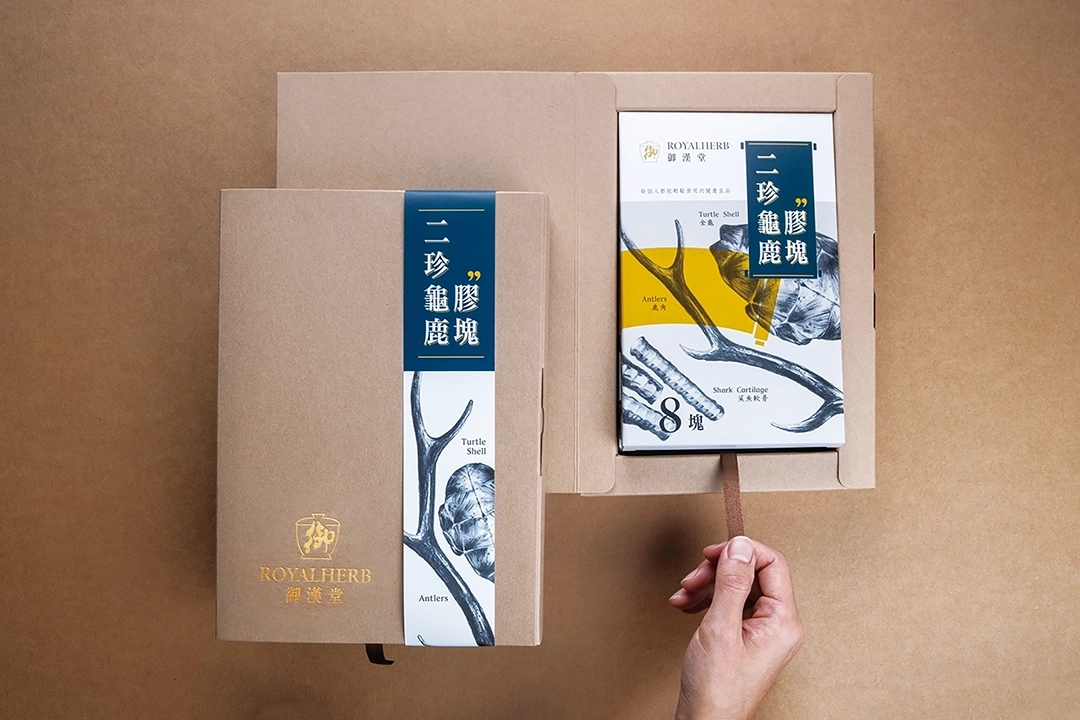
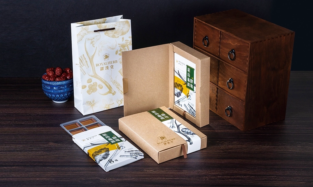
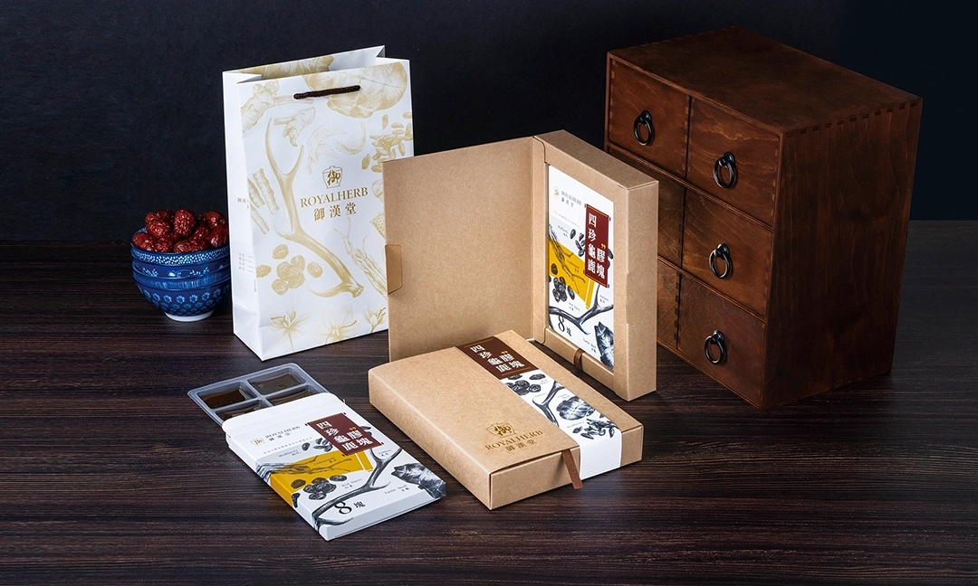
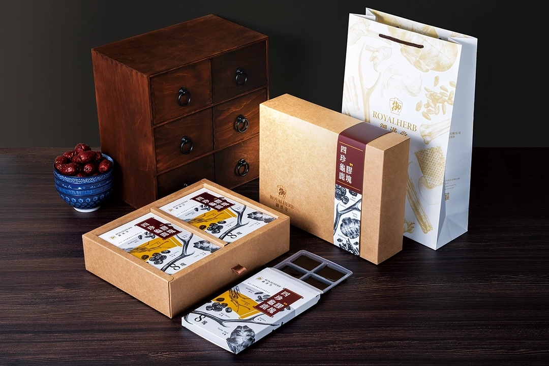
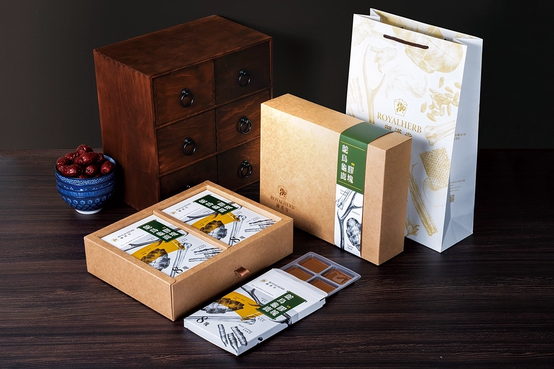
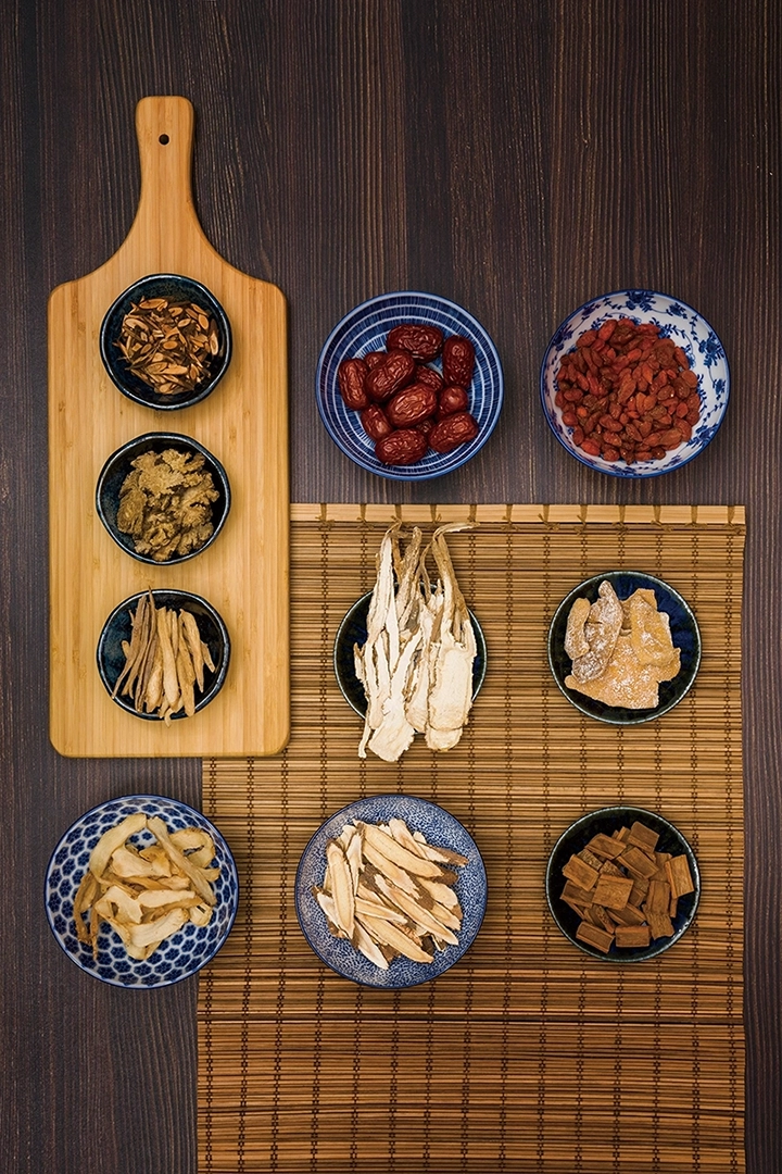
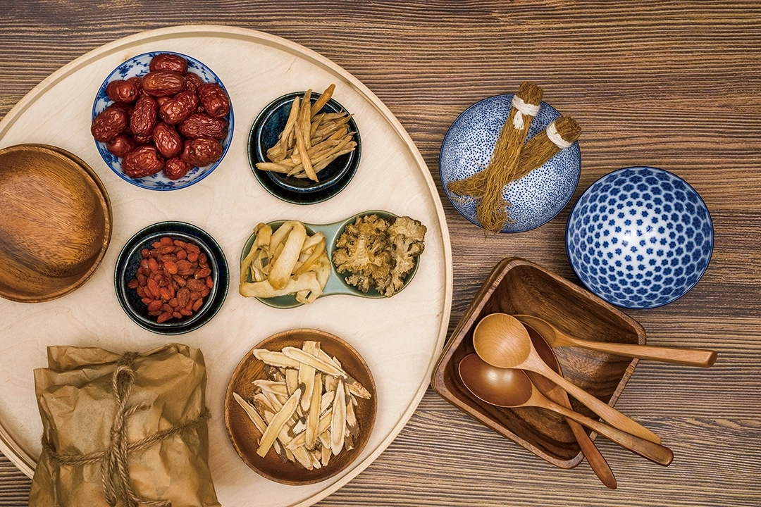
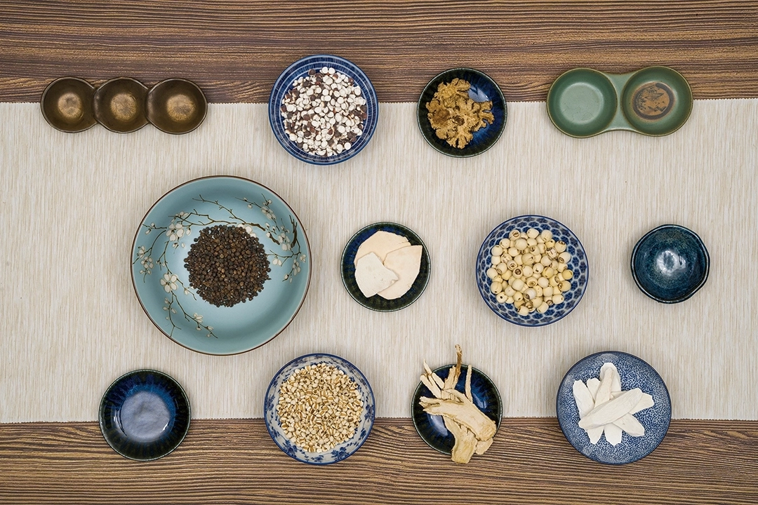
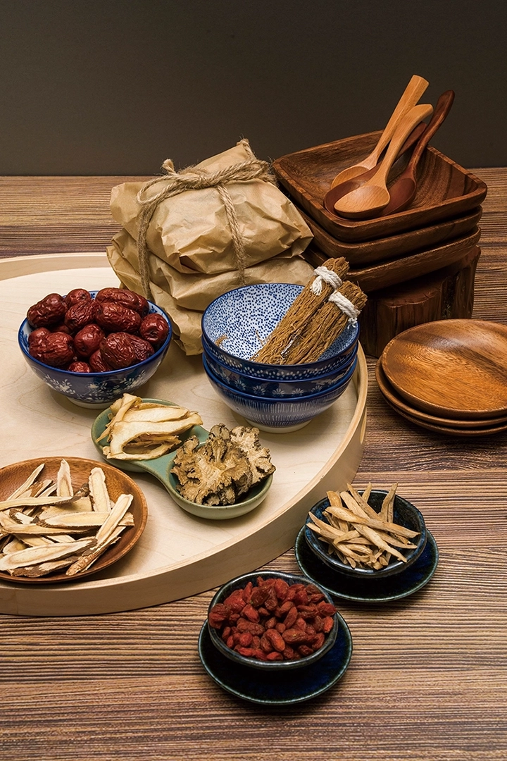
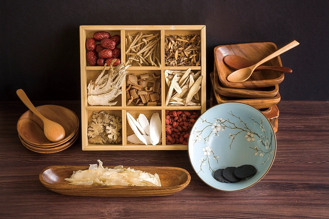
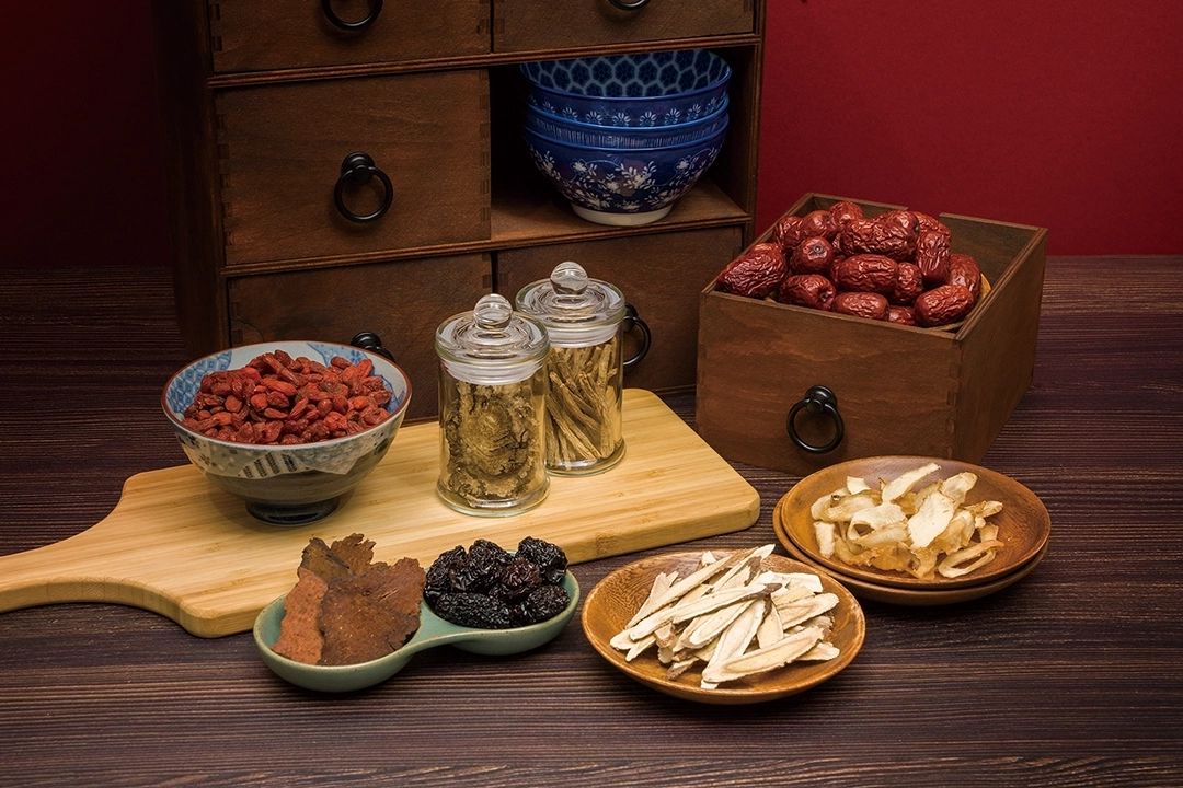
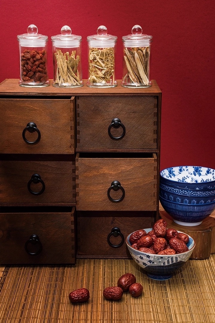
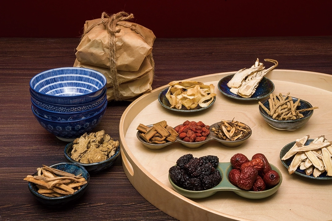
The packaging and promotional materials for Guilu Erxian Jiao traditionally use actual photos of medicinal herbs to showcase the products, presenting a conventional and old-fashioned image of Chinese herbal medicine. However, this approach may limit the brand's ability to attract a broader consumer base, especially younger customers. Therefore, this time we chose to depict the medicinal herbs using sketches. This not only adds an artistic and literary feel to the packaging and promotional materials but also injects new vitality into the brand. This design style aims to create a more modern and appealing image that captures the attention of younger consumers. Through this approach, we hope to bring Guilu Erxian Jiao closer to the lifestyles and preferences of contemporary consumers while preserving its traditional Chinese medicine cultural heritage.

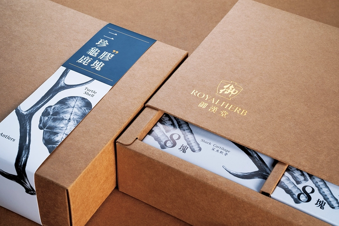
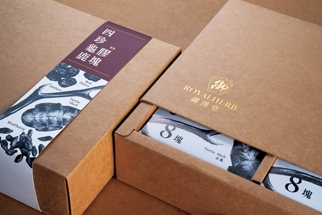
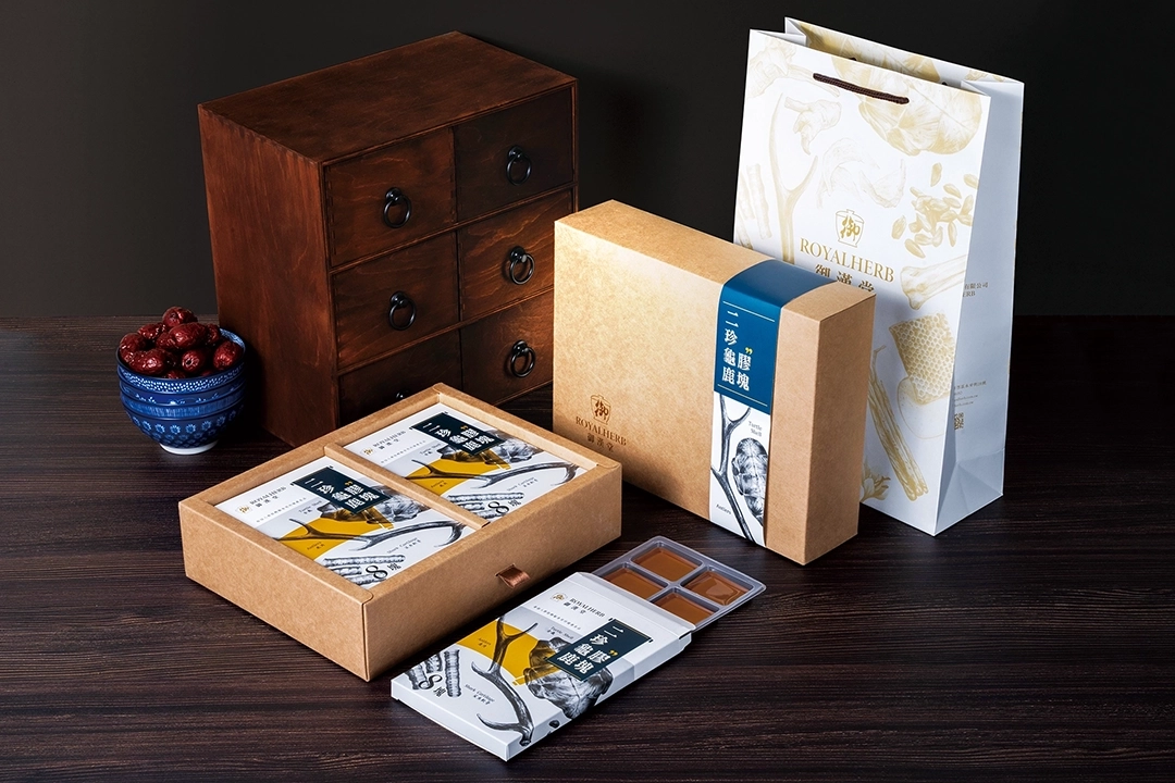
PACKAGING DESIGN
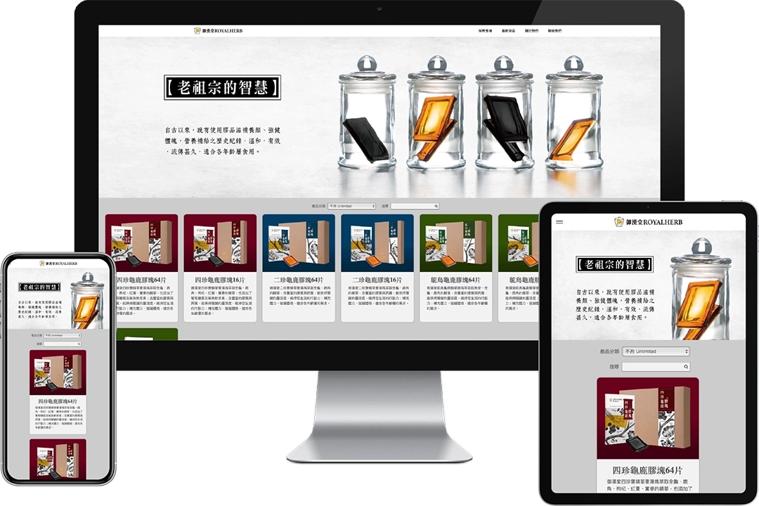
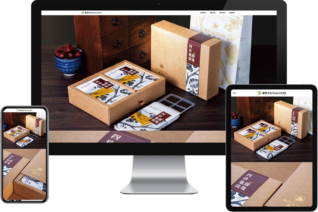
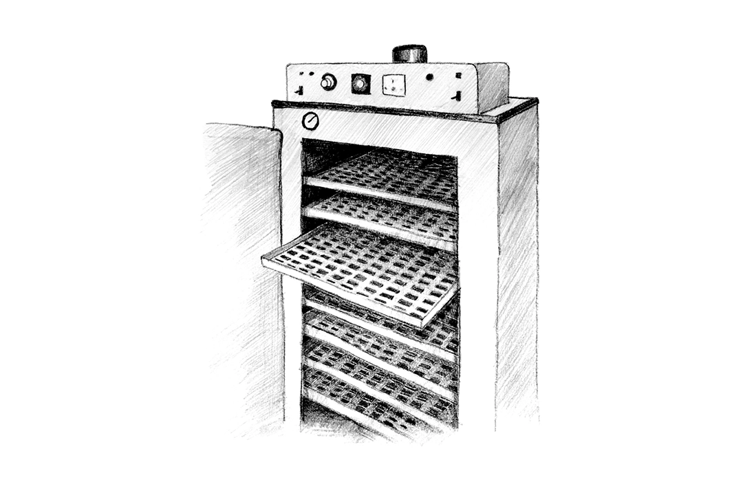
When designing packaging, multiple aspects need to be considered: visual appearance, packaging structure, packaging materials, mixed media, and printing methods. This packaging design involves three different product types, each with three identical quantities. Therefore, key considerations in the design include how to effectively share packaging materials, simplify the structure, facilitate packaging, and reduce storage space for packaging materials when not in use.


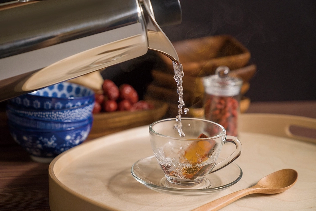
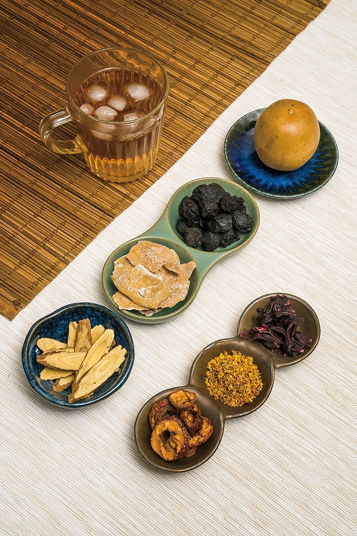
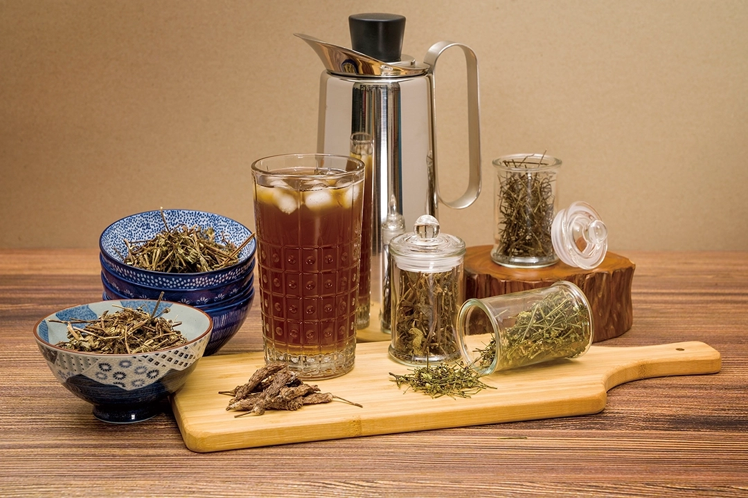
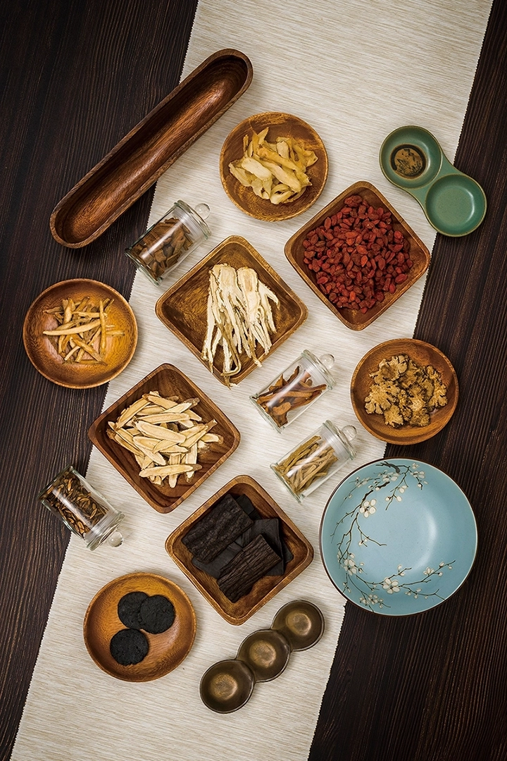
COMMERCIAL PHOTOGRAPHY

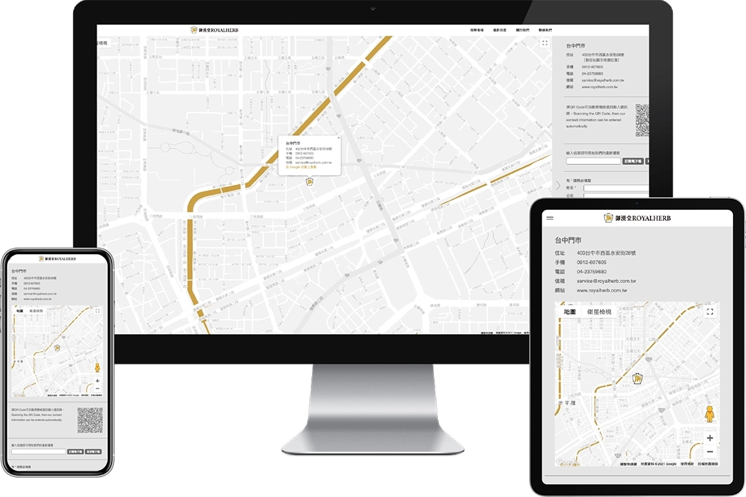
WEBSITE DESIGN
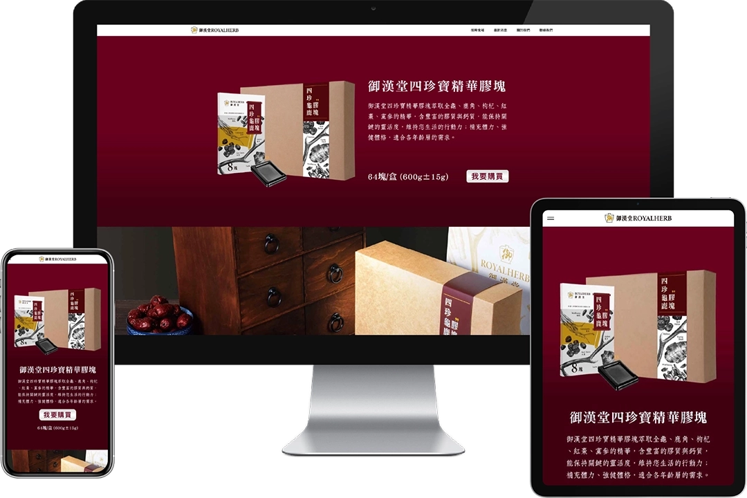
We incorporated photos, the logo, brand colors, typography, and creative graphics into the website design. These elements infuse ROYALHERB Health Corporation’s website with a unique brand identity and a strong sense of professionalism.