SMARTOP
SMARTOP is a brand name where “SMART” symbolizes intelligence, “TOP” represents excellence, and “ART” stands for creativity. SMARTOP is dedicated to creating an elegant, aesthetically pleasing, and innovative stationery brand. The company actively gathers numerous creative designers to showcase their works on the international stage. This time, the client specially entrusted us to establish SMARTOP’s brand identity system, including the logo, standard colors, typography, creative patterns, and general stationery design. Through this complete brand identity system, we aim to accurately convey SMARTOP’s brand spirit and values.


LOGO DESIGN
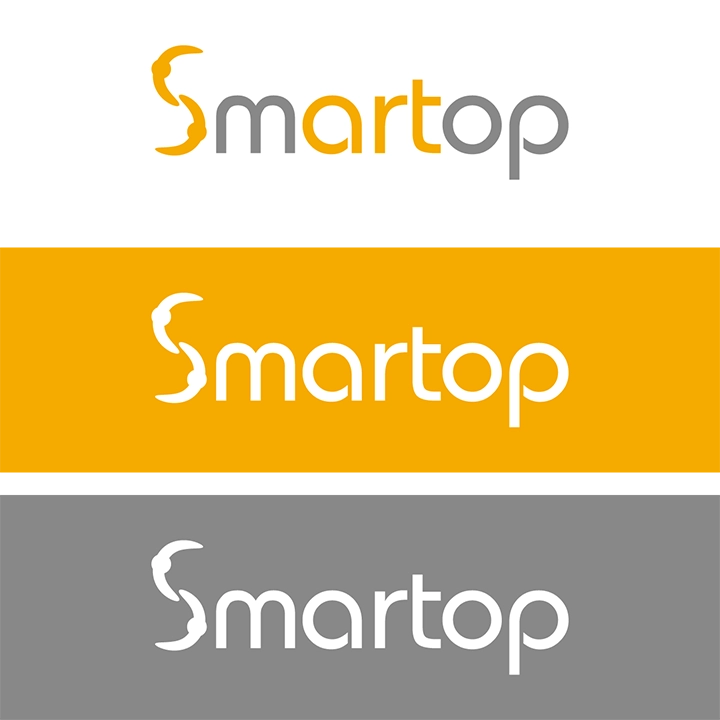
SMARTOP focuses on creating a platform that gathers creative ideas. Therefore, in the logo design process, we particularly emphasized elements such as “creativity,” “surprise,” “collaboration,” and “art” as our core design concepts. We meticulously crafted 16 different logo concepts for the client to choose from. Each logo was deeply analyzed and presented with unique ideas and concepts for the client’s consideration. Ultimately, the selected logo incorporates the idea of collaboration within the shape of the letter “S” and highlights the typography of “art,” symbolizing the brand’s strong emphasis on the spirit of art.
STANDARD COLOR
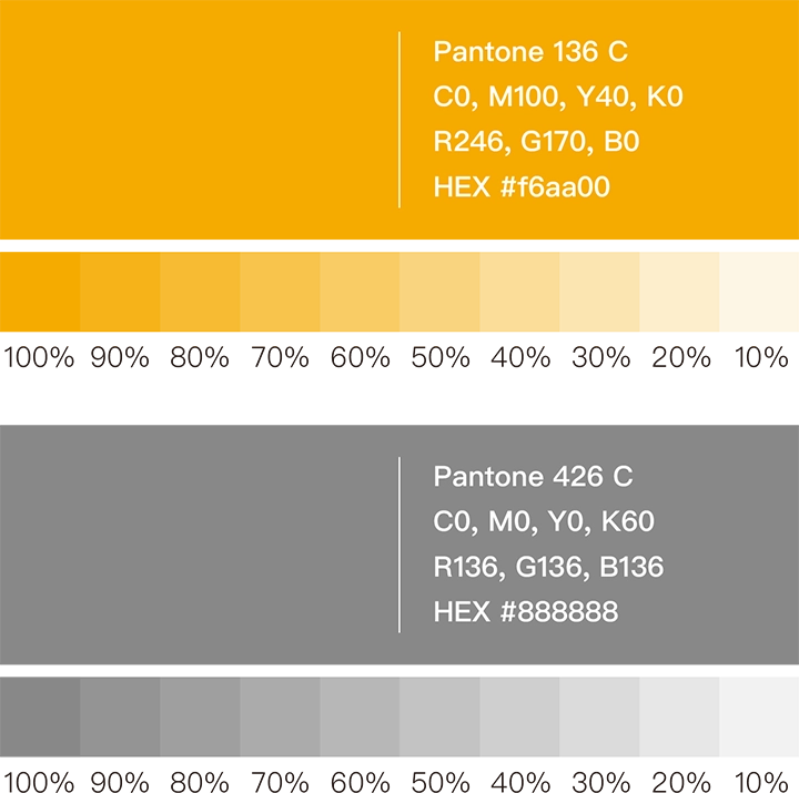
In the selection process of the standard colors, we carefully chose two shades to represent the brand’s vitality and stability. The deep yellow (Pantone 136 C) symbolizes energy and positivity, while the dark gray (Pantone 426 C) conveys a relaxed and steady tone. These two colors will serve as the primary hues of the brand identity system, embodying SMARTOP’s proactive mindset, courage to innovate, and steady progress forward.
STANDARD FONT DESIGN
We specially designed a unique hand-drawn Chinese typeface for SMARTOP. This delicate rounded style aims to reflect SMARTOP’s image as a thoughtful and harmonious brand. At the same time, it establishes a unified standard for typography layout, enhancing the overall brand image and providing clients with a more consistent and professional experience.


VISUAL DESIGN
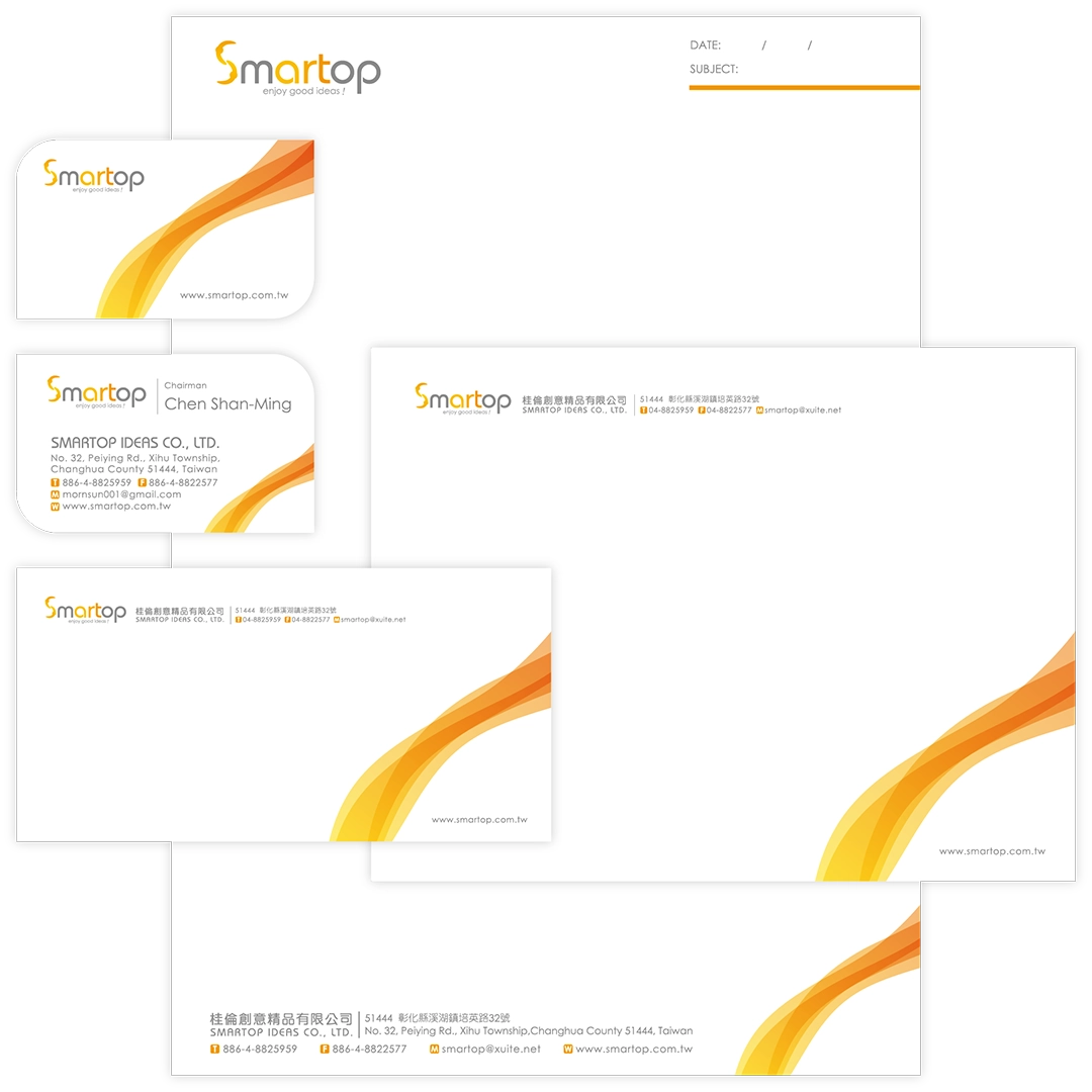
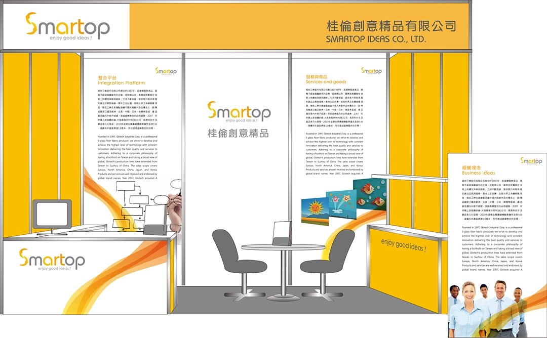
In the visual design, we specially created graphics symbolizing a warm current for SMARTOP, aiming to highlight its passionate character and vibrant energy. These graphics are crafted into patterns that can be applied in exhibition spaces, promotional materials, and other stationery items to emphasize the brand’s unique charm and professional image.
STATIONERY DESIGN
Finally, we integrated the logo, standard colors, typography, and creative graphics into office supplies and exhibition spaces, forming a unified identity system. This enhancement strengthens the consistency of the brand image, allowing SMARTOP to showcase its unique charm across various media platforms, making the brand more striking and influential.
