
SUCTION
SUCTION Industrial Co., Ltd. has been a key pioneer in the production of lubricating oil tools since its establishment in 1960. Over the years, the company has continuously strived to develop high-quality and durable products, earning wide acclaim within the industry. After more than sixty years of development, SUCTION decided to inject new vitality into the company by updating its logo, identity system, product colors, and catalog. We look forward to these new branding and design elements providing customers with a fresh experience and further solidifying SUCTION Industrial Co., Ltd.’s position as an industry leader.
LOGO DESIGN
In this logo design project, we aimed to embody the core values of “durability” and “strength.” We drew inspiration from powerful symbols such as the rhinoceros, elephant, tank, and lubricated gears, integrating these elements into the design. These strong images highlight the high quality and reliability of SUCTION Industrial Co., Ltd.’s products. Additionally, SUCTION plans to launch a new brand called “ZOE.” Centered around the concept of “lubrication,” we created a fresh logo for this brand. Ultimately, we provided 16 different design concepts, allowing them to choose the one that best fits their needs and style.
STANDARD COLOR DESIGN
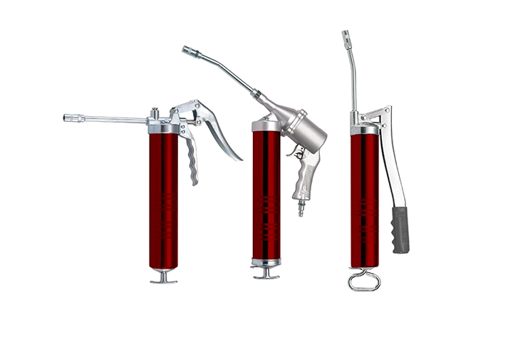
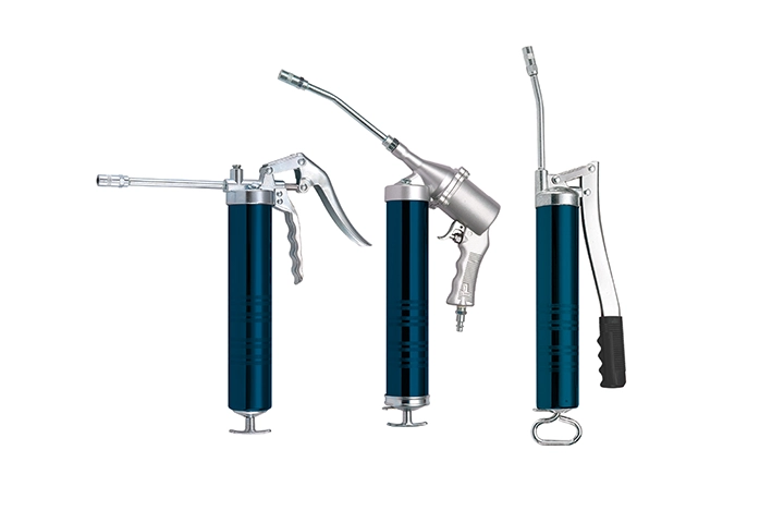
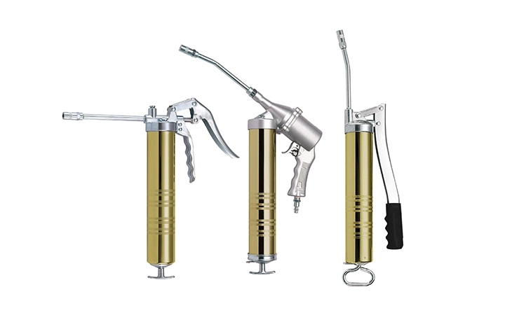
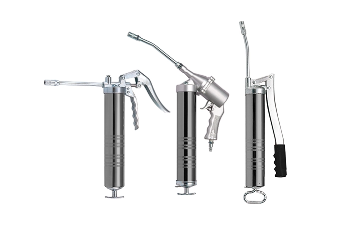
During the selection process for the standard colors, we focused on the main qualities of “stability” and “refinement.” After careful consideration, we chose six distinctive colors from a wide range of unique palettes and applied them to the products so that the client could truly experience the aesthetic enhancement brought by the new color scheme. Ultimately, we selected a stable yet eye-catching color combination: Liver Red (Pantone 200 C) and Dark Gray (Pantone Cool Gray 10) as the unified color standard for future products, and integrated this color pairing into the overall identification system.


STANDARD FONT
After careful consideration, we finalized a meticulously designed logo and created a unique hand-drawn bilingual (Chinese and English) typeface to accompany it. This distinctive font not only complements the logo, achieving optimal visual harmony, but we also established standardized layout guidelines to ensure a consistent visual identity across all future promotional materials and products. These comprehensive efforts aim to enhance SUCTION Industrial Co., Ltd.’s brand image, providing customers with a more cohesive and professional experience.


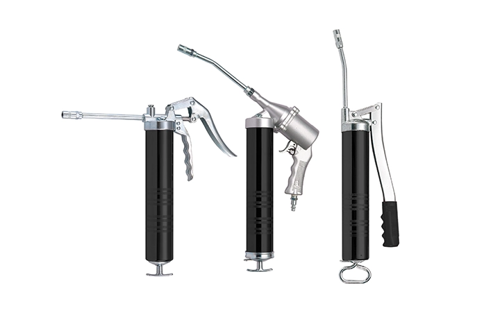
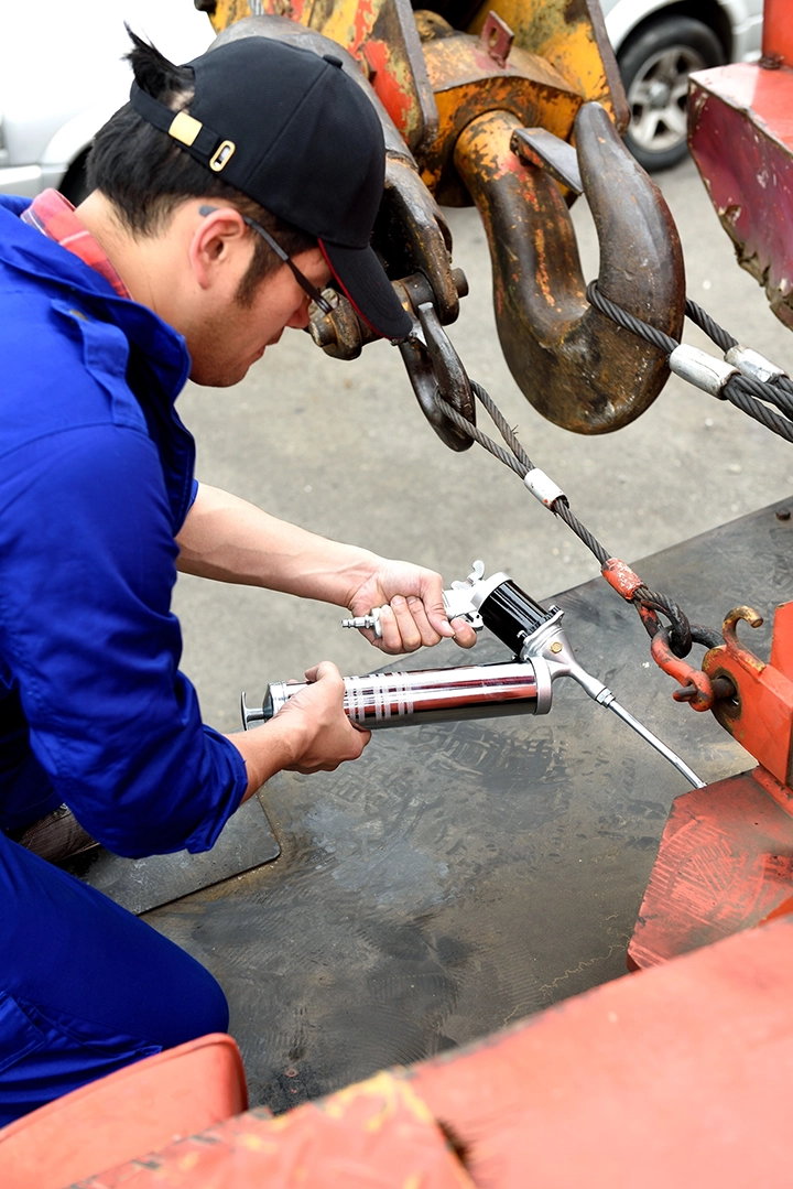
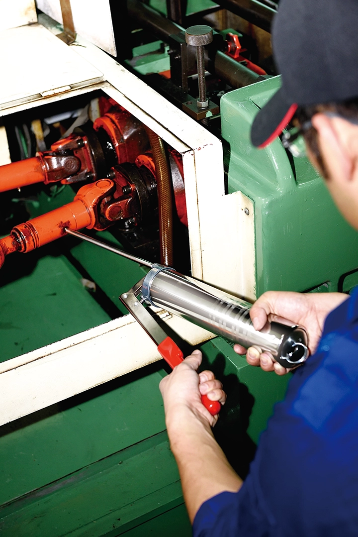
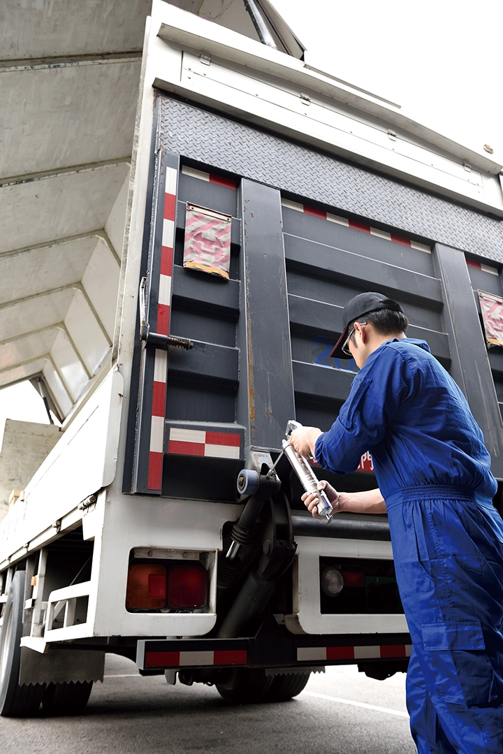
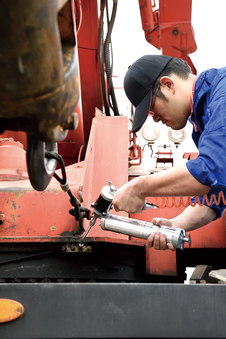
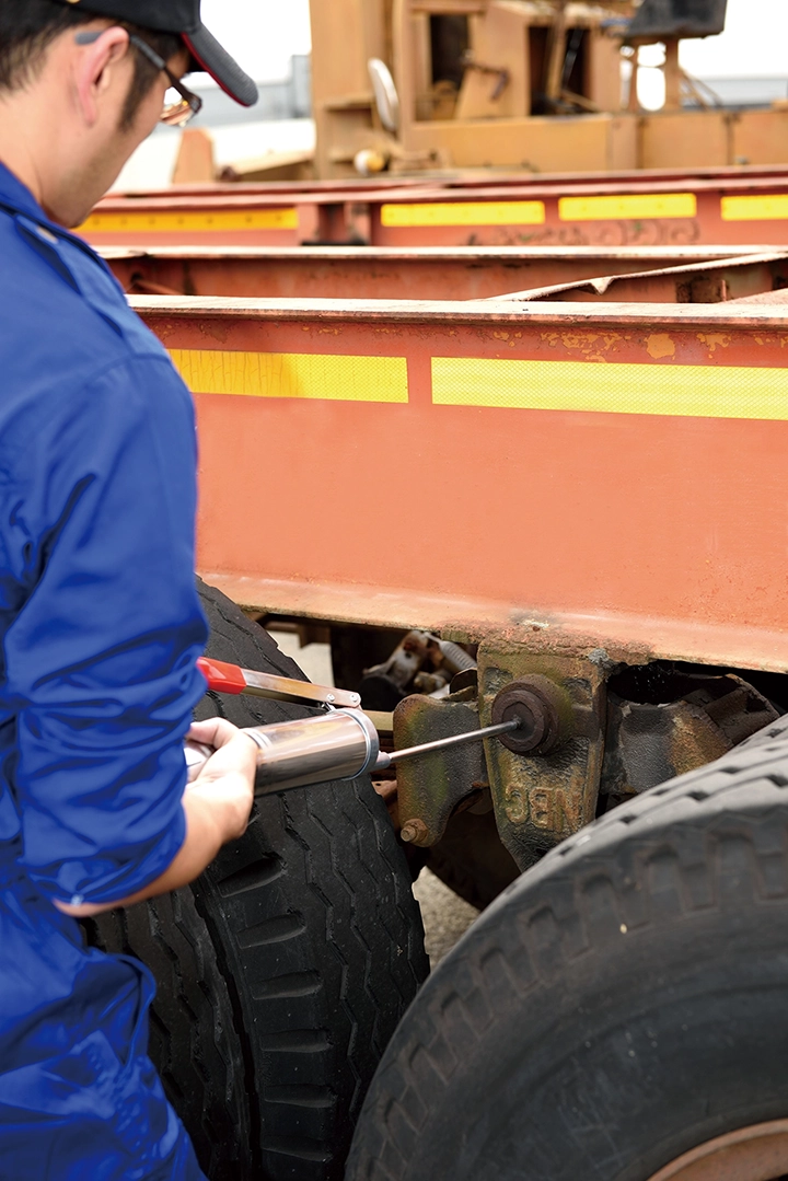
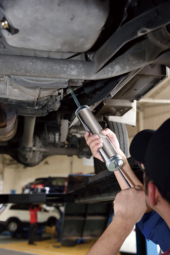
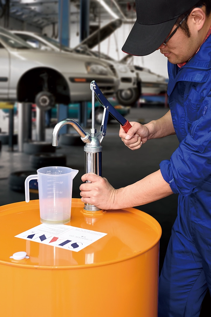
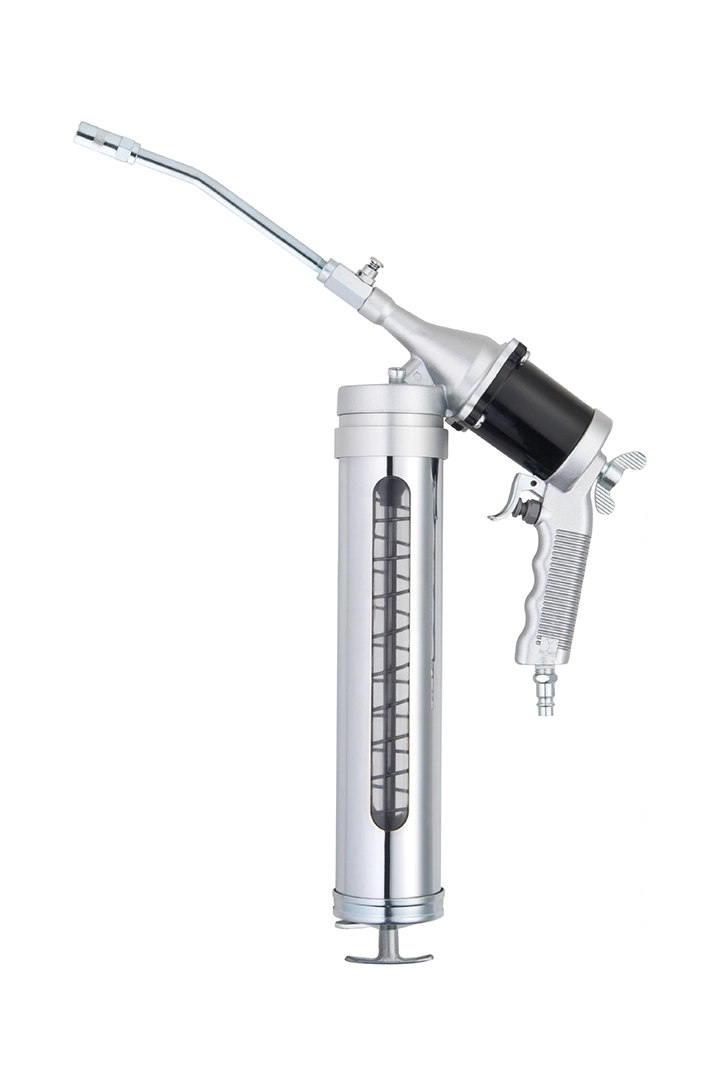
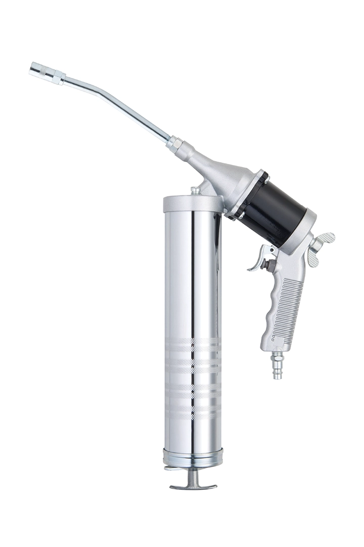
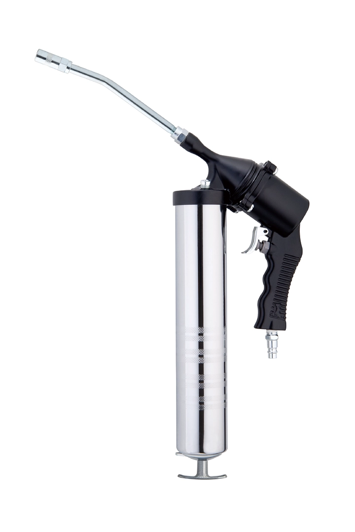
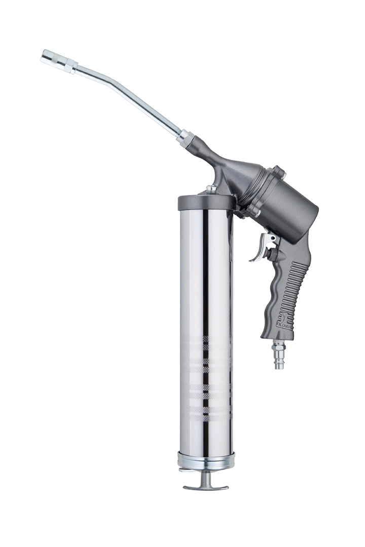
PHOTOGRAPHY
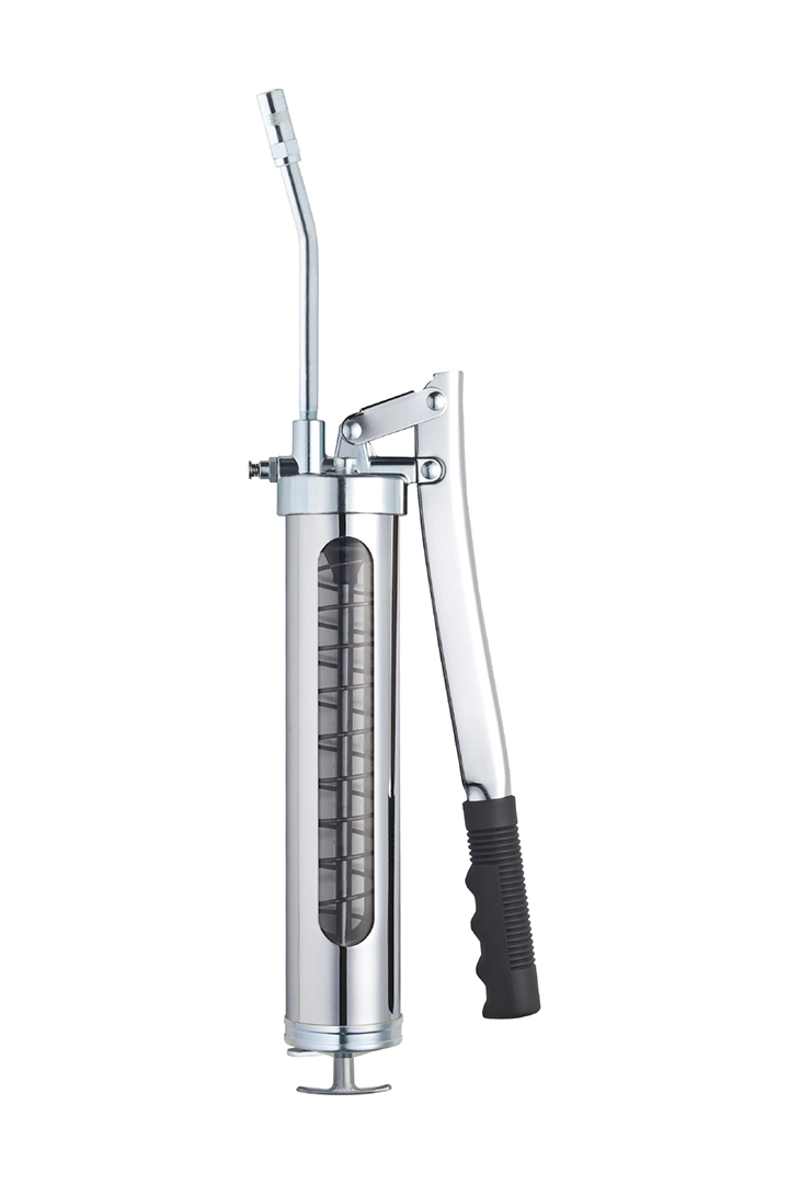
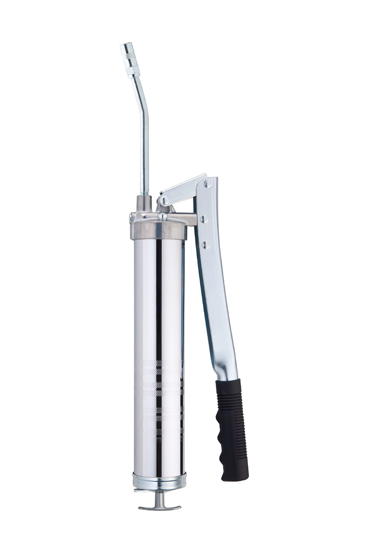
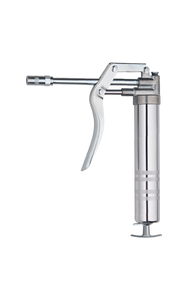
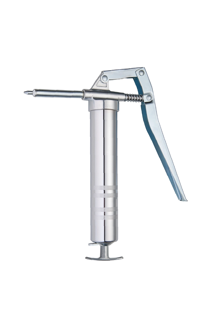
Finally, the client carried out a brand and product transformation based on the CIS system we designed. Subsequently, we conducted commercial photography of the new products, focusing on their features and uses. The photos from this shoot will be used in posters, catalogs, and the website, showcasing the company environment, production process, quality control, and product categories. To ensure the smooth execution of the photography, we will conduct thorough planning and preparation beforehand to capture the key content that the images need to convey.

POSTER DESIGN


CATALOG DESIGN
In the catalog design for SUCTION Industrial Co., Ltd., we placed great emphasis on the optimal presentation of product information. Before starting the design, we first gathered detailed data on all products and carefully considered how to use iconography to categorize and explain each product’s features. We also thoughtfully planned the product photography angles to highlight their unique qualities. Only after reaching consensus with the client did we proceed with copywriting, commercial photography, and digital design. Additionally, we skillfully integrated the CIS (Corporate Identity System) branding elements into the design to organically showcase SUCTION Industrial Co., Ltd.’s core values and professionalism throughout the catalog. Through meticulous design and expert execution, we aimed to create a catalog that clearly conveys the products’ characteristics and advantages while providing customers with an intuitive and rich informational experience.


