WARMCOFFEE
WARMCOFFEE is a coffee station established by the Taichung City Association for the Disabled, dedicated to cultivating professional coffee brewing skills among people with disabilities while providing them opportunities to enhance social interaction. We are honored to be commissioned by the organization to design their brand packaging. Through our design, we hope consumers will deeply feel that WARMCOFFEE represents not just a warm cup of coffee, but also a heartfelt warmth and gratitude for the opportunities given to these individuals for their growth.


LOGO DESIGN
For this logo design, we used charmingly naïve lines to depict an innocent and adorable child holding a warm cup of coffee. Through this logo, we aim to convey a sense of simplicity, sincerity, and genuine service and values.
STANDARD COLOR
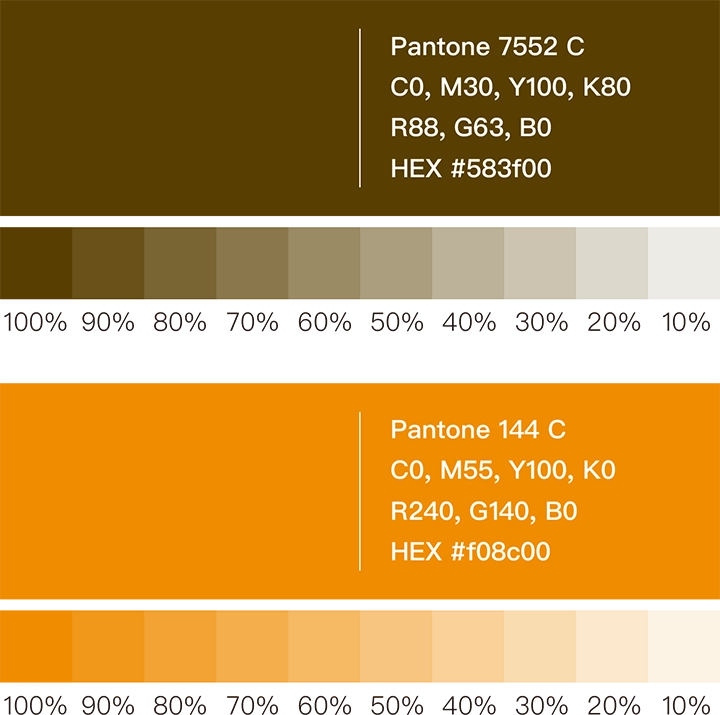
In selecting the standard colors, we carefully considered that the main product is coffee. We chose Coffee Brown (Pantone 7552 C) and a vibrant Orange-Red (Pantone 144 C) as the brand’s primary color palette. These two colors will serve as the main tones for the future unified packaging identity system. This combination not only highlights the product’s characteristics but also brings a warm and heartfelt energy to the overall brand packaging.

STANDARD FONT DESIGN
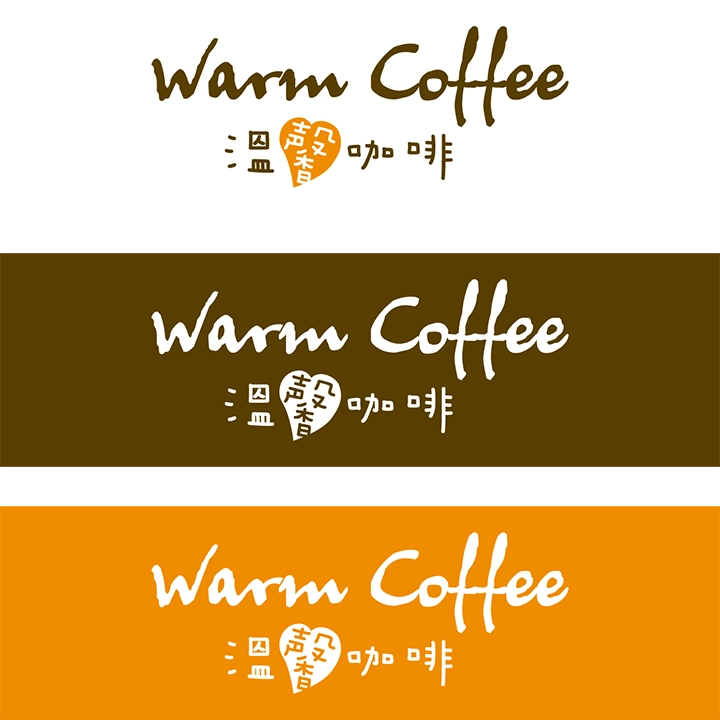
The brand image of WARMCOFFEE embodies a playful and sincere spirit. Therefore, for the typography design, we adopted a hand-drawn style to create a cute and approachable font. Specifically, in the character “馨,” we incorporated a heart symbol to highlight WARMCOFFEE’s emphasis on care and love.


VISUAL DESIGN
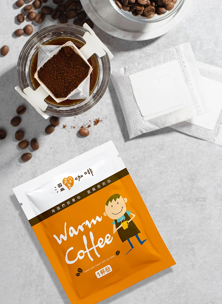
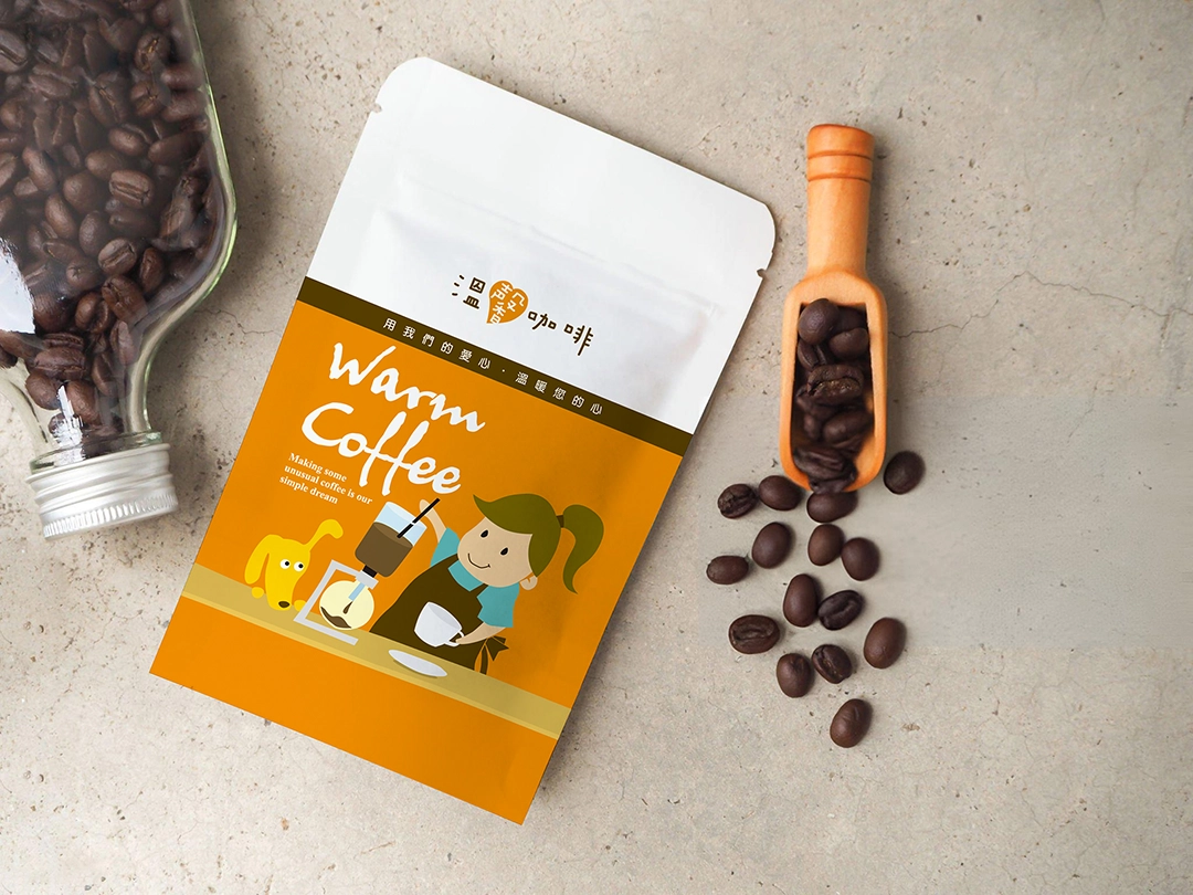
Since WARMCOFFEE is dedicated to cultivating children’s professional coffee brewing skills, we chose a playful line style and childlike illustrations for the creative graphics. We drew multiple scenes of children earnestly brewing coffee to showcase their sincere and hardworking spirit. At the same time, we want consumers to feel that when they purchase a drink, they are also giving these children an opportunity to grow.


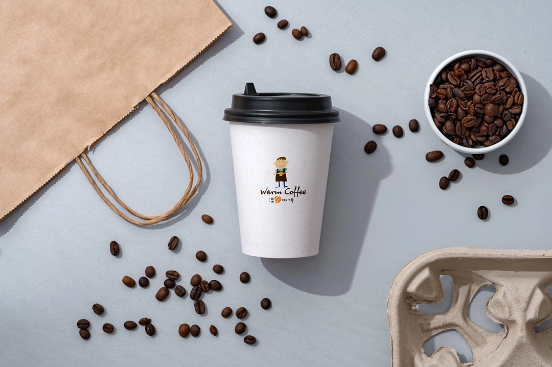
PACKAGING DESIGN
Finally, we integrated the logo, standard colors, typography, and creative graphics into the packaging design, allowing consumers to deeply experience the spirit and passion of the WARMCOFFEE brand. This has made the brand image more eye-catching and impactful.

