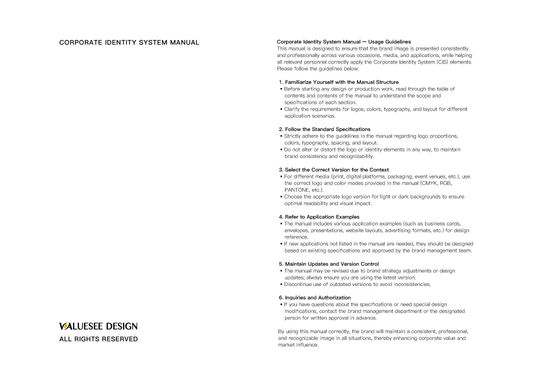
Introduction: Starting from the Brand Story to Find the Most Suitable Taichung Brand Design Direction
In a highly competitive market, a brand is more than just a name and a logo; it is the first step in building trust between a business and its consumers. For companies looking for a Taichung brand design company, a truly worthwhile design team doesn't just create a beautiful logo. They must be able to build a complete, consistent, and highly recognizable brand image—spanning brand positioning, visual strategy, packaging design, and website design.
VALUESEE DESIGN has long been deeply involved in Taichung brand design and brand image planning. By thoroughly understanding the client's industry characteristics, product advantages, and target audience, we develop visual systems that meet market demands. Through the following 5 representative brand design case studies, we will share how we use strategic thinking and creative design to help brands establish a clearer market impression and enhance their brand value and recognition.
Why Choosing a Taichung Brand Design Company Makes Your Brand More Competitive?
Combining Market Analysis and Brand Positioning
A professional Taichung brand design company does more than just execute visual design; they develop a more strategic brand identity starting from market positioning, consumer profiles, and brand personality.
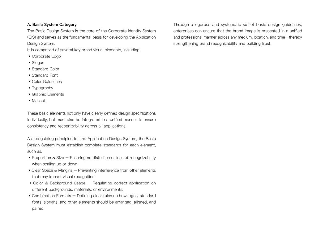
Integrating LOGO, Standard Typography, Standard Colors, and Extended Applications
Excellent Taichung brand design doesn't stop at the logo. It extends further into standard typography, standard colors, packaging, office supplies, catalogs, and websites to establish a complete and consistent brand system.
Enhancing Brand Recognition in the Taichung Market
For local businesses, planning with the assistance of an experienced Taichung design team allows the brand to stand out visually, establishing a professional, trustworthy, and story-driven image.


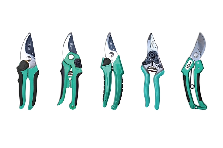
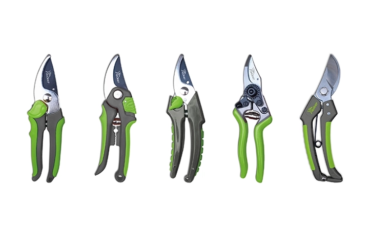
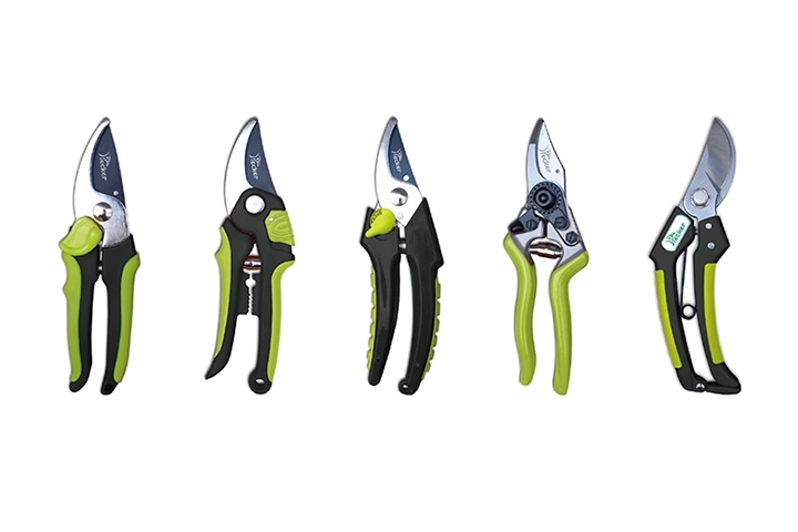
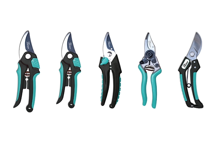
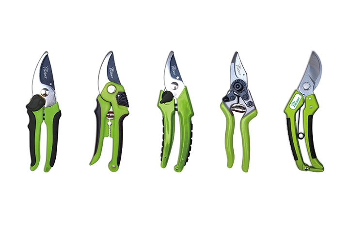
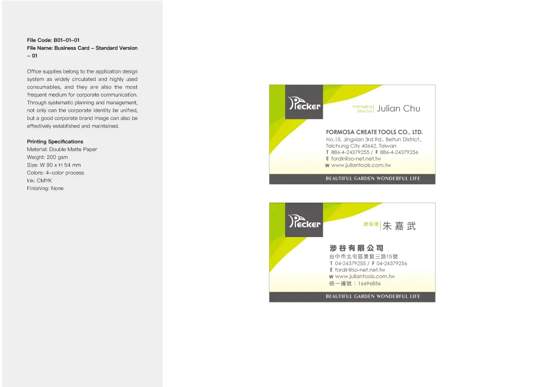
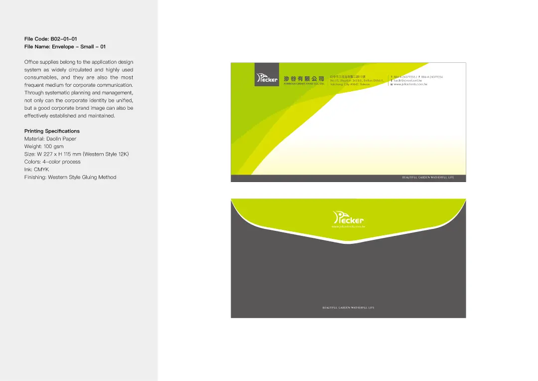
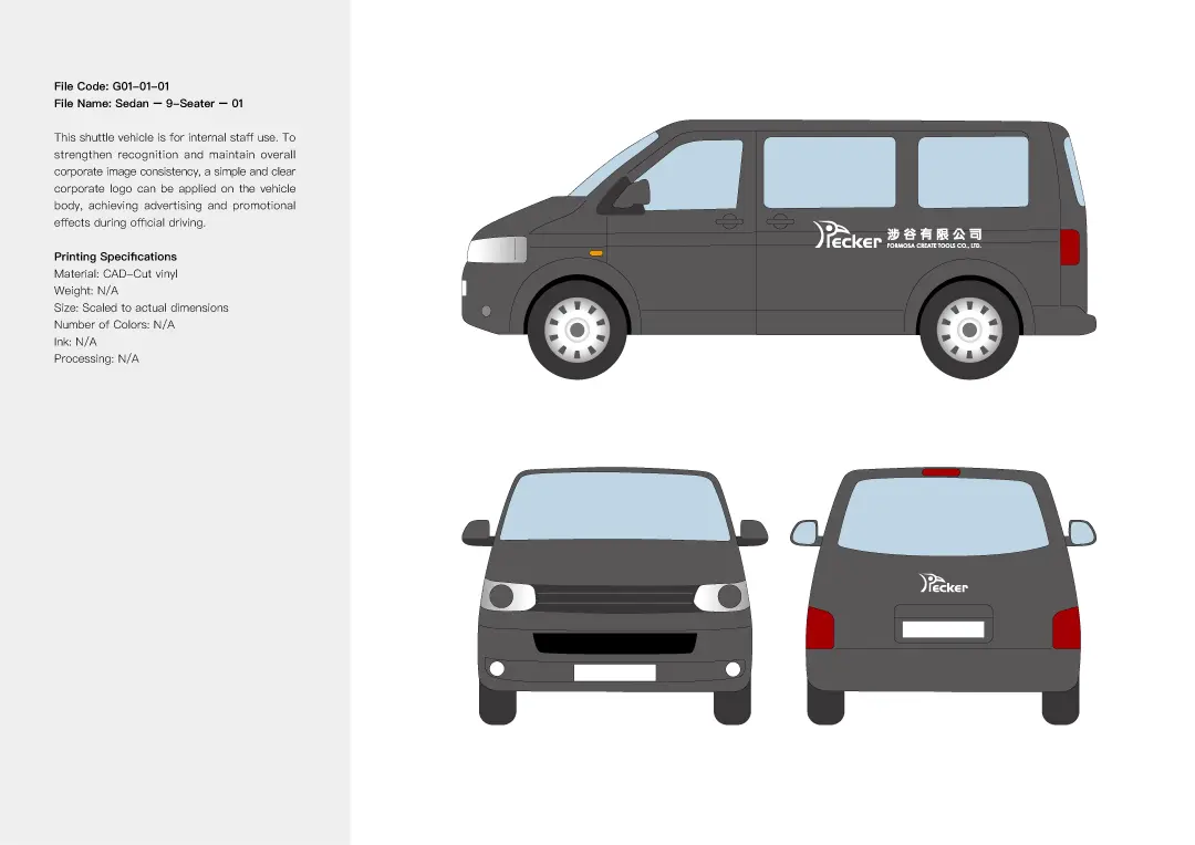
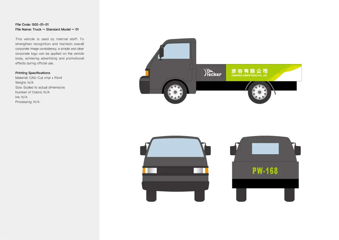
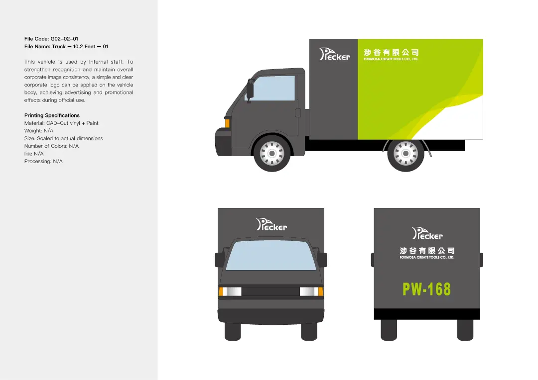
1. PECKER: Creating a Creative Brand Identity with Nature and Gardening Imagery
Brand Positioning and Design Strategy
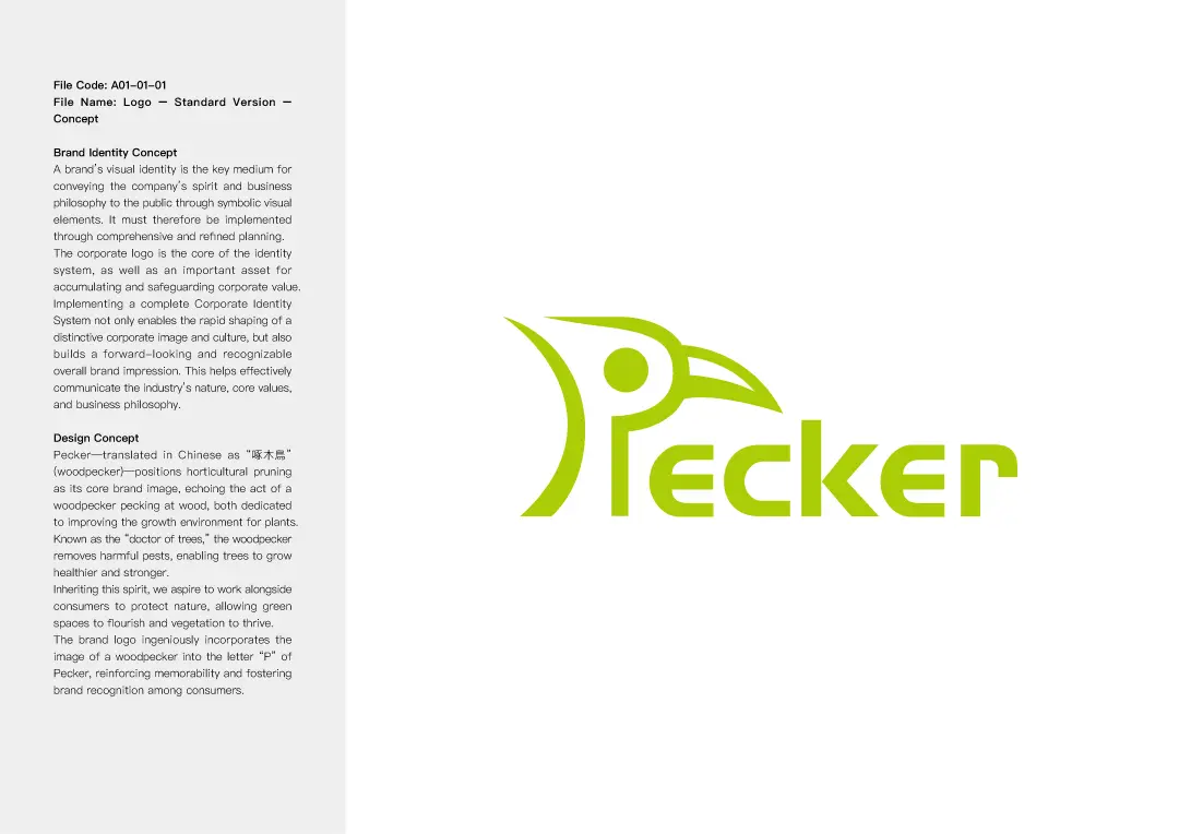
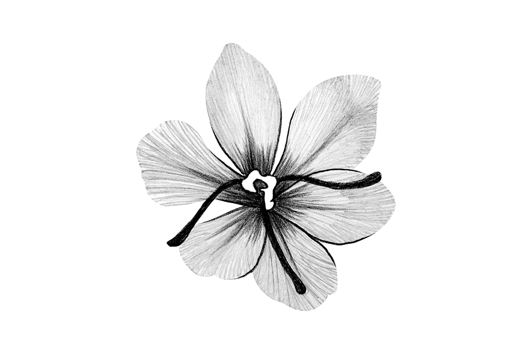
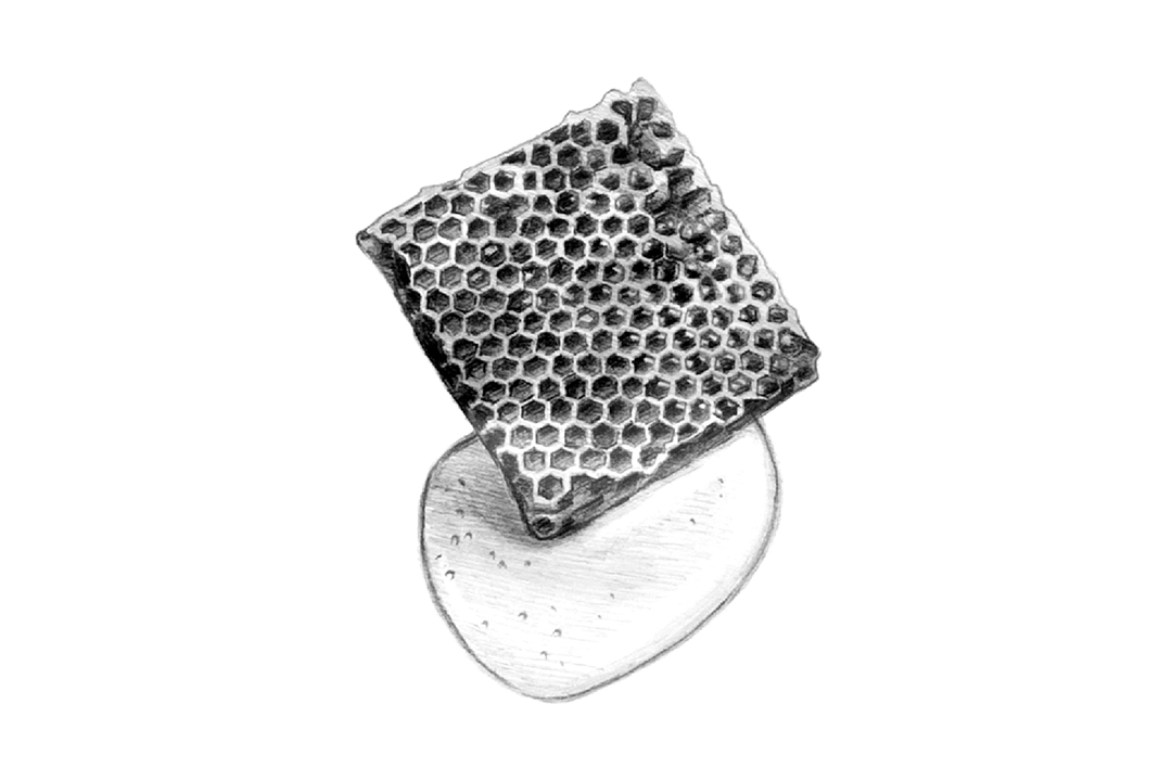
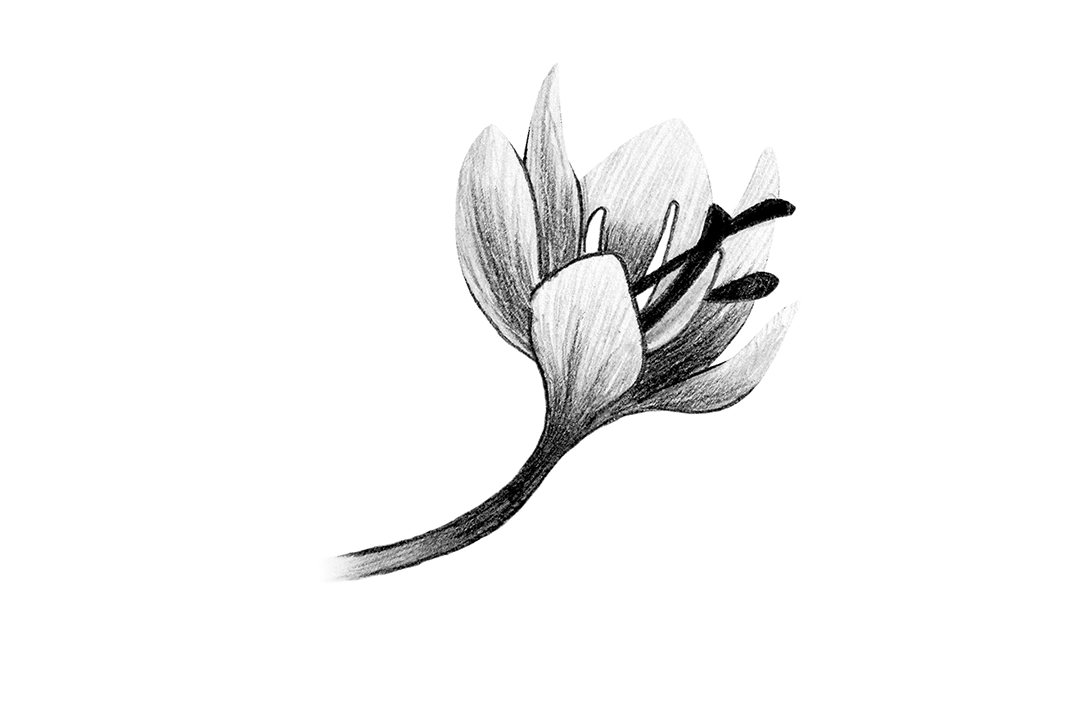
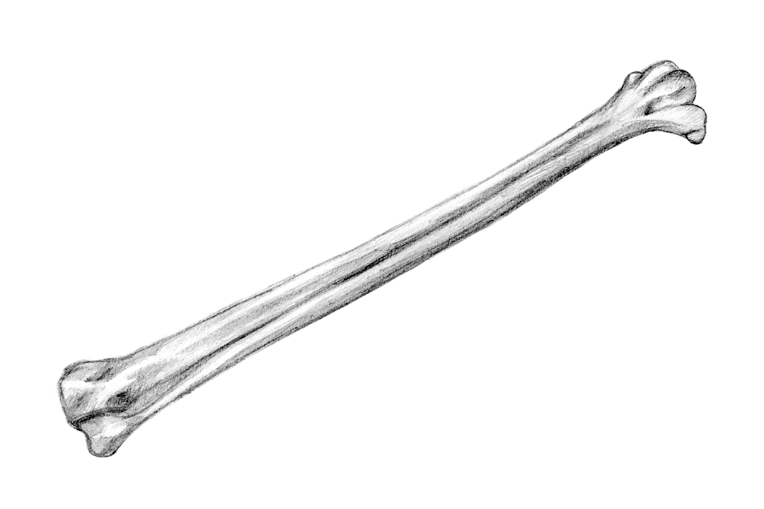
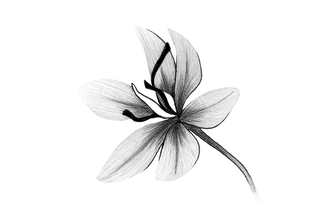
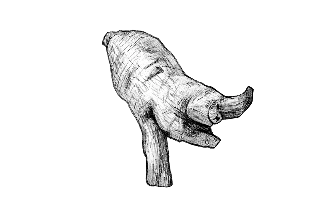
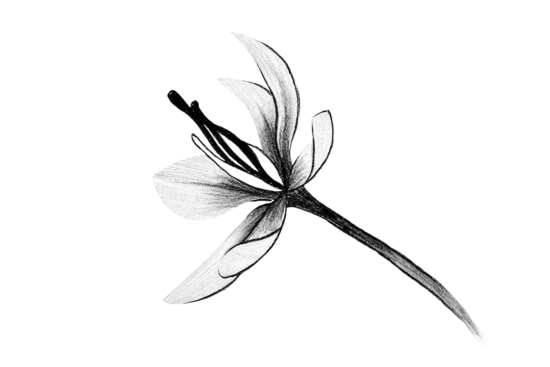
PECKER is a horticultural hand tool company. The brand's Chinese name, 「琢木鳥」 (Zhuó Mù Niǎo), is inspired by the woodpecker, with the character 「啄」 (peck) replaced by 「琢」, meaning to carve or craft meticulously. The English brand name is “PECKER,” symbolizing the passion and spirit of gardening enthusiasts who use these tools to beautify plants and nature. We designed a variety of plant-like visuals based on the shapes of gardening tools, aiming to capture attention and leave a lasting impression of the brand through this creative concept.
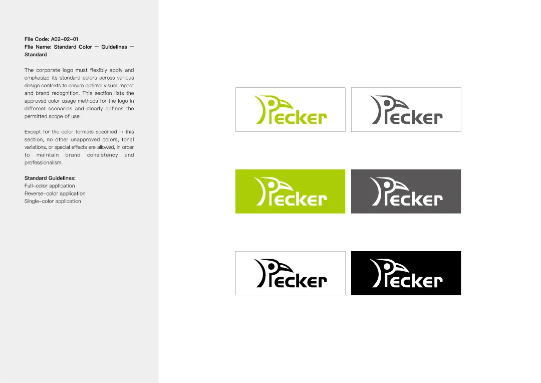
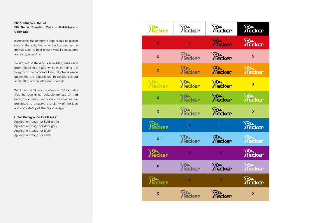
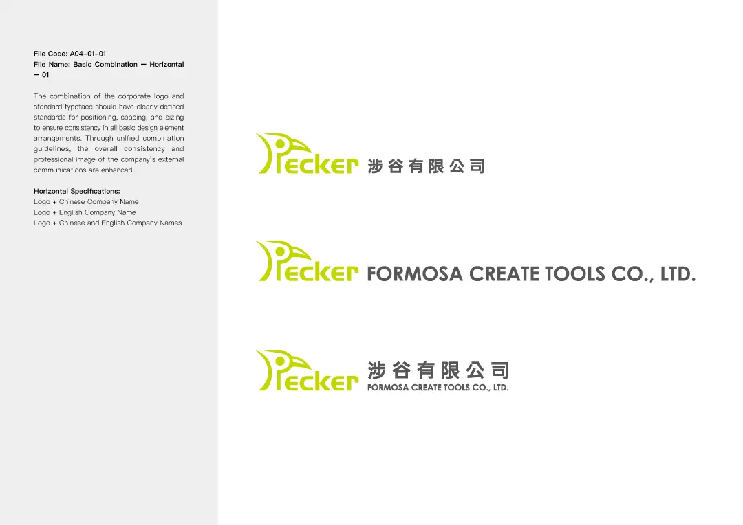
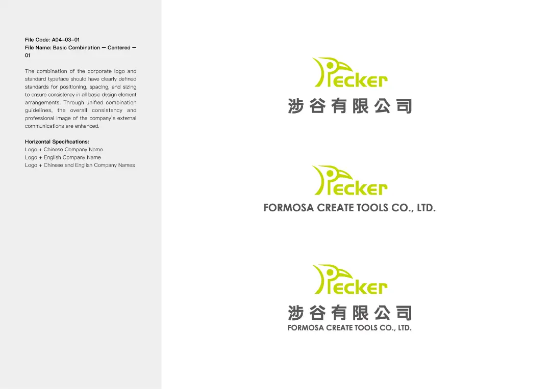
Logo Design Highlights
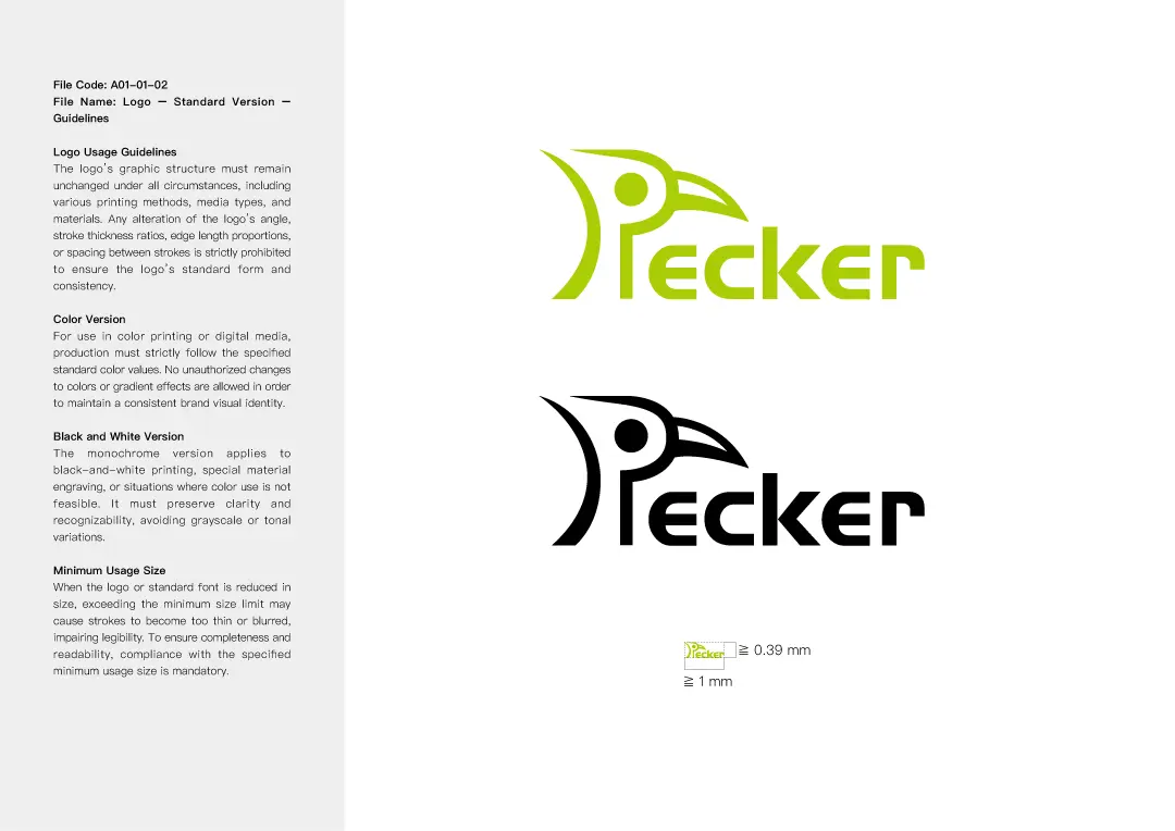
For the logo design, we drew inspiration from the form of a woodpecker, creating 16 different logo styles ranging from classic and intricate to modern and minimalist for the client to choose from. Each logo was accompanied by a unique concept and idea, along with in-depth analysis for the client's reference. In the end, we made subtle refinements to the selected version to achieve the most visually harmonious result, meeting the client's needs and expectations.
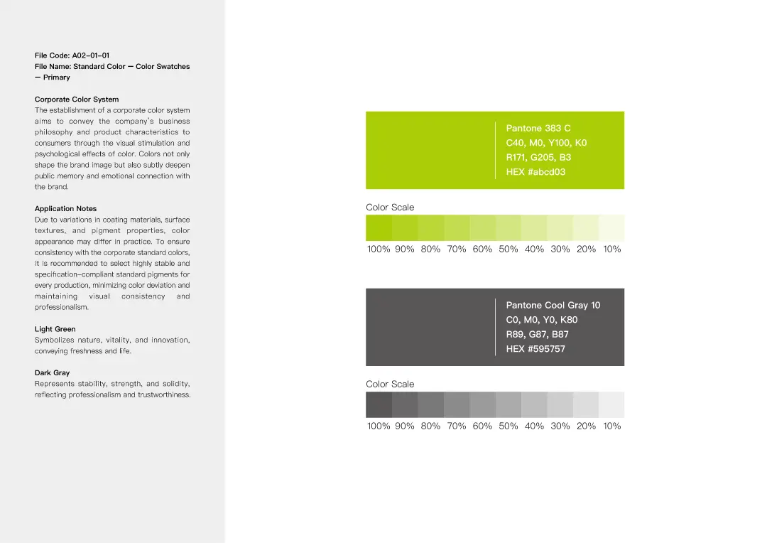
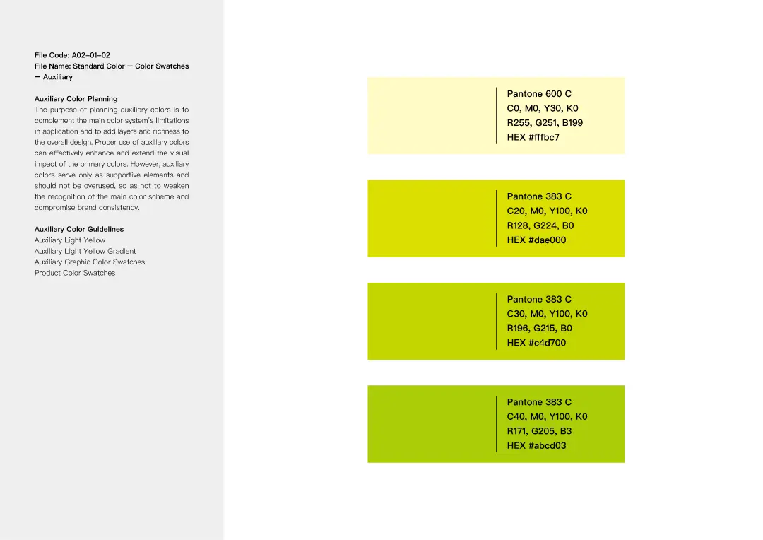
Standard Color Design Highlights
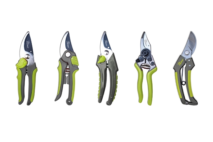
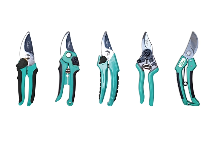
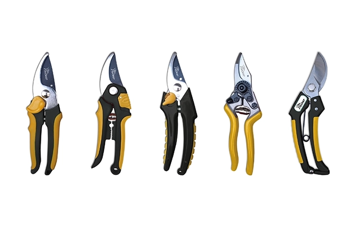
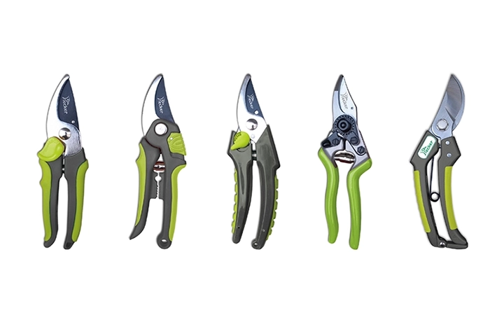
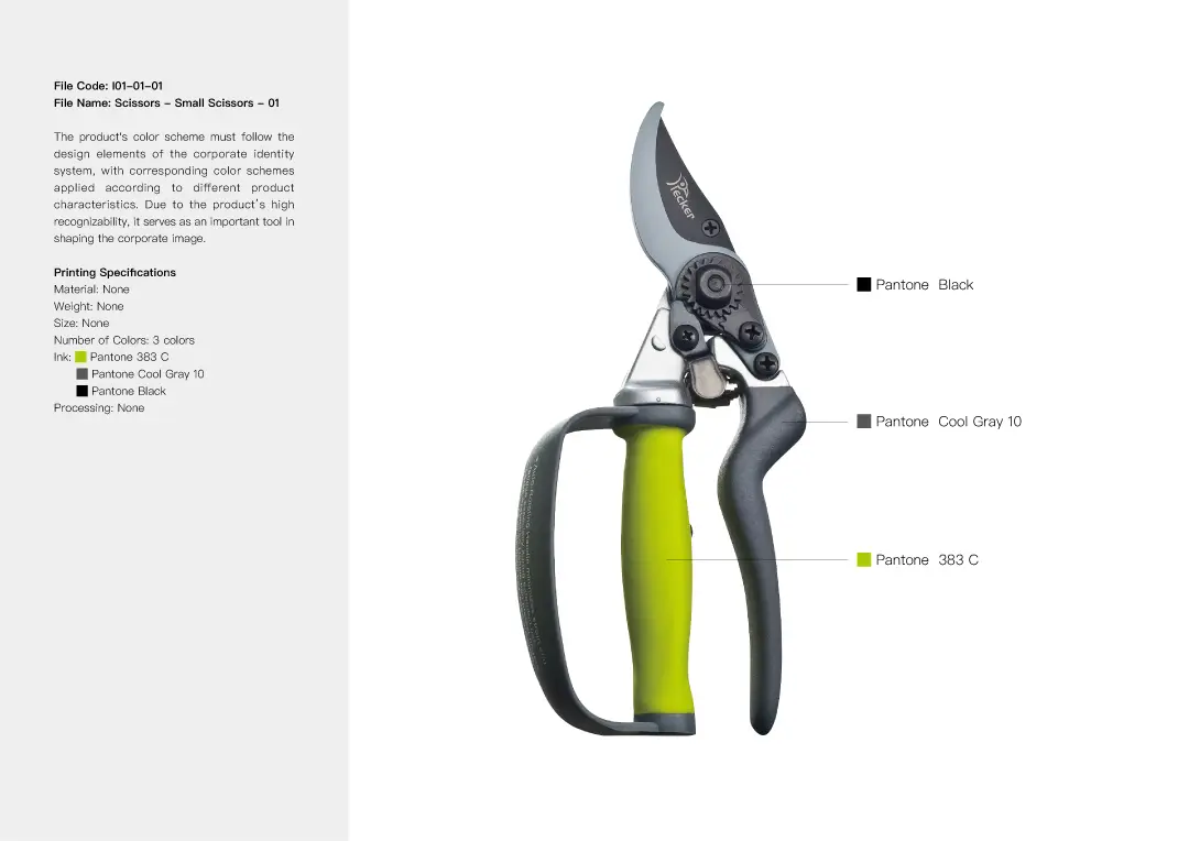
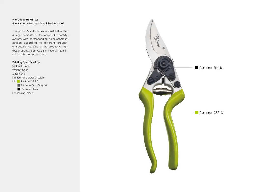
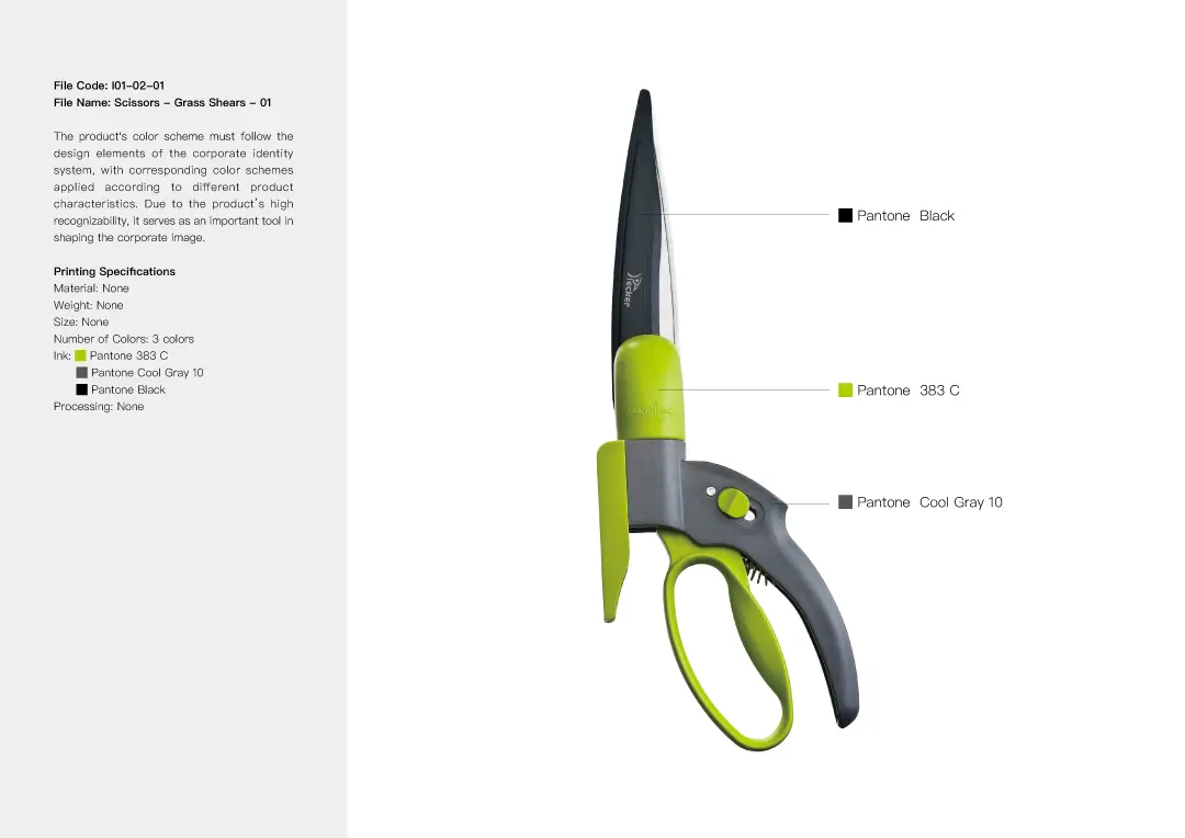
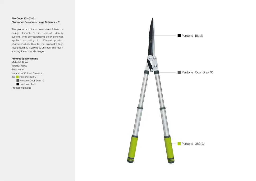
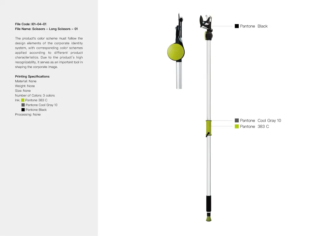
In selecting the brand’s standard colors, we conducted in-depth research on PECKER’s actual products and developed nine different color scheme proposals. Our focus was on the uniqueness of each palette and its harmony with the product components. Ultimately, we chose a Scandinavian-inspired color scheme: Olive Green (Pantone 390C) and Cool Gray (Pantone Cool Gray 10). This combination evokes a natural atmosphere while maintaining a modern aesthetic. The olive green conveys a fresh and distinctive feel, setting it apart from the more commonly seen bright greens in the market. This final color scheme was then applied across the brand’s logo, logotype, stationery, and other materials to build a cohesive and complete visual identity system.


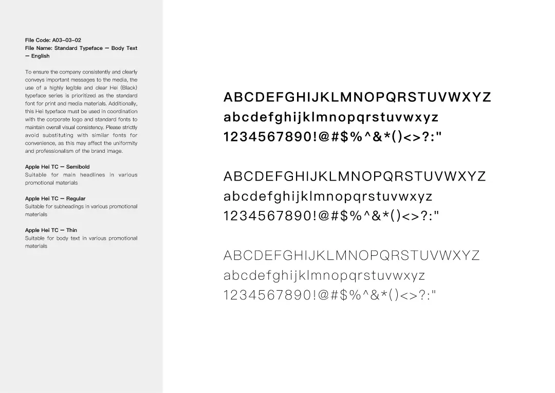
Standard Font Design Highlights
After careful consideration, we finalized a logo and specially designed a custom hand-drawn typeface to achieve optimal visual harmony. This unique typeface not only complements the logo but also evolved into a unified identity system, setting clear guidelines for its future use across business cards, envelopes, catalogs, websites, and other design applications.


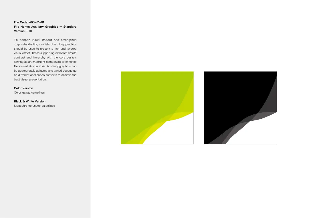
Visual Design Highlights
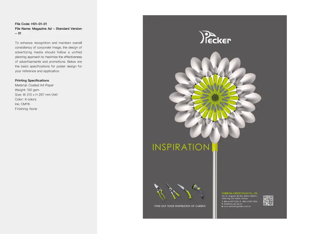
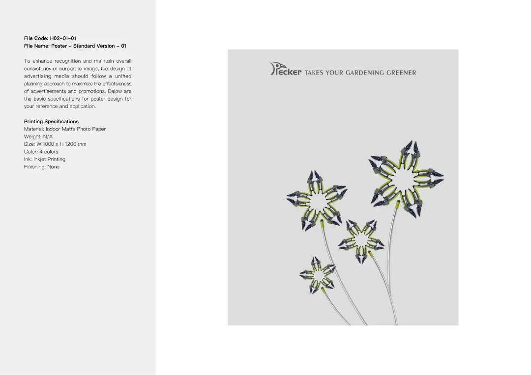
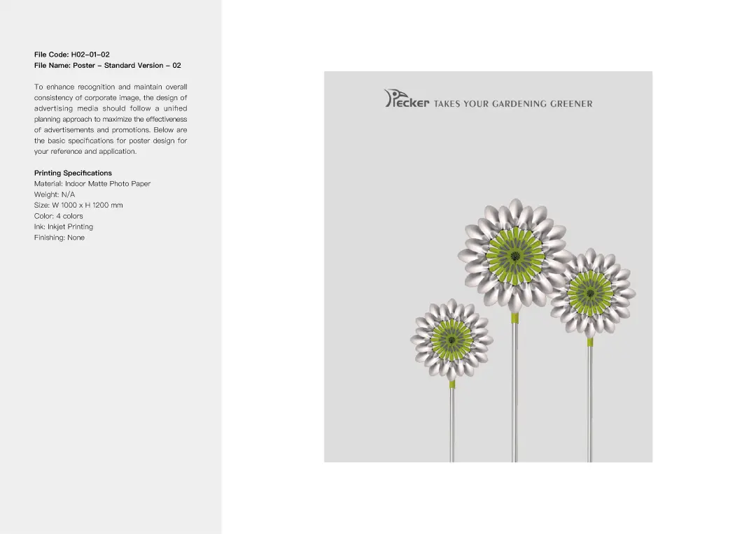
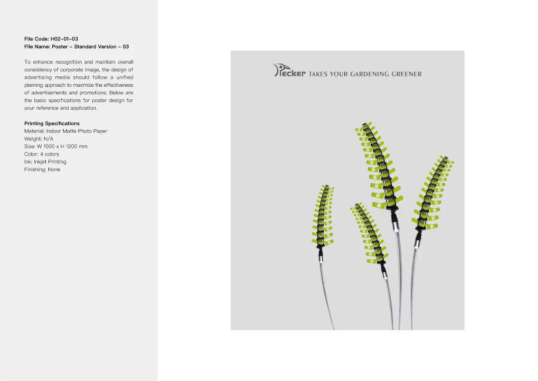
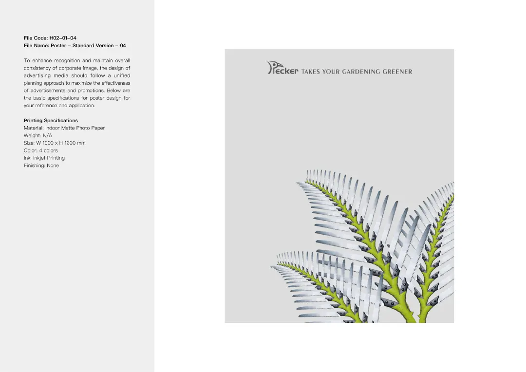
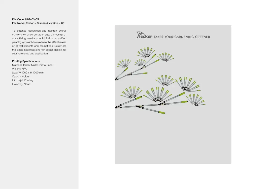
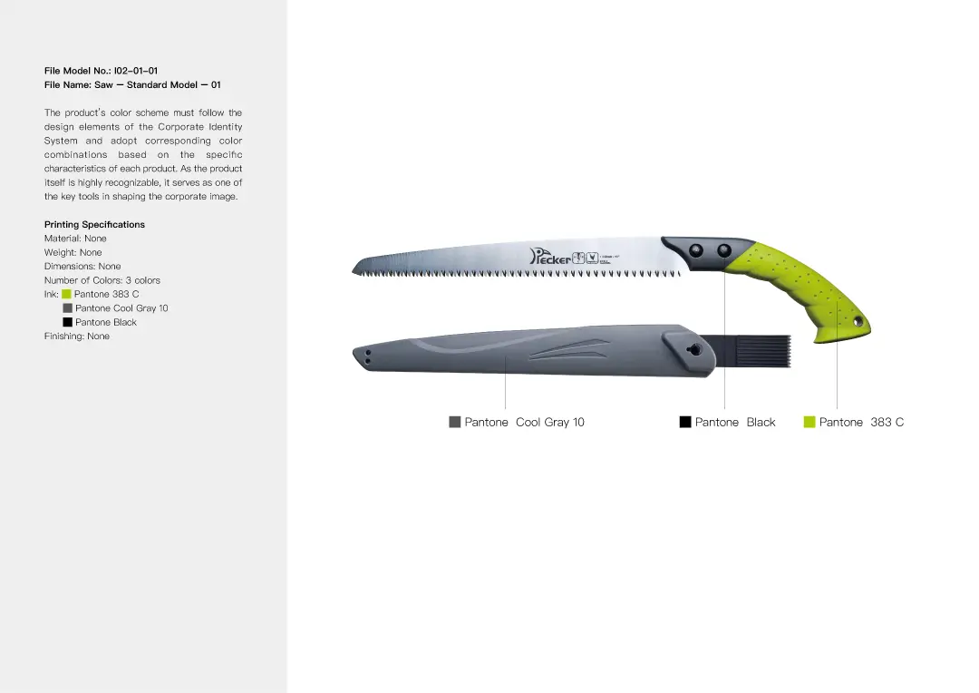
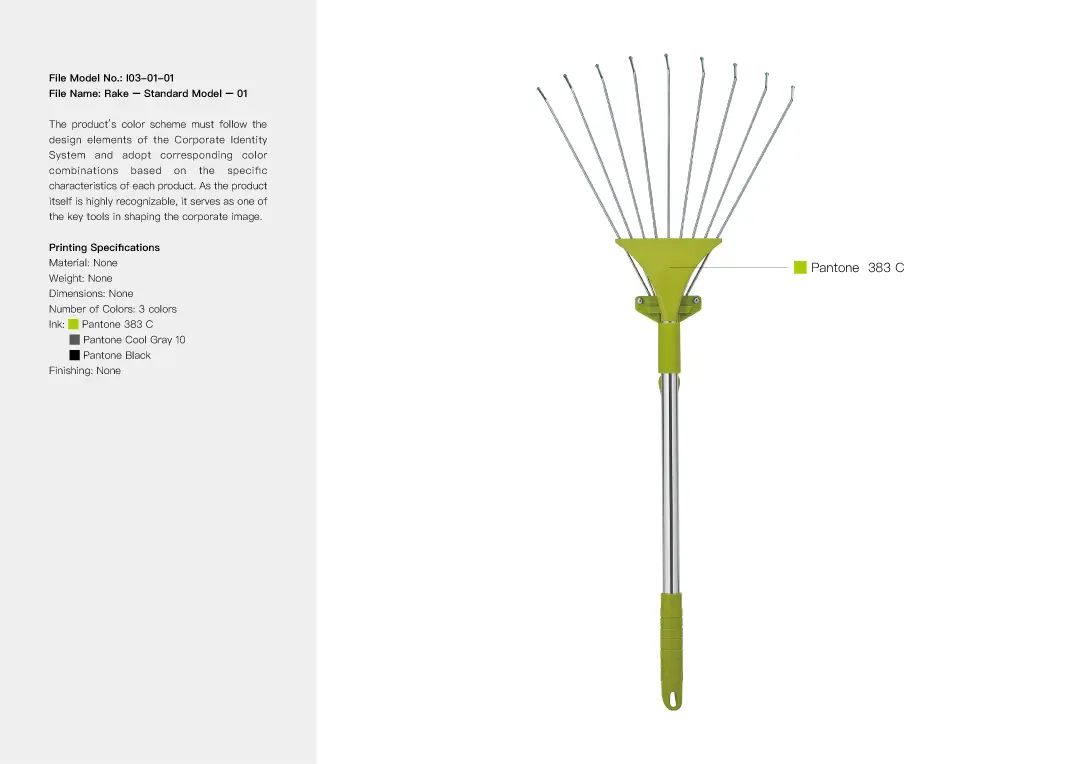
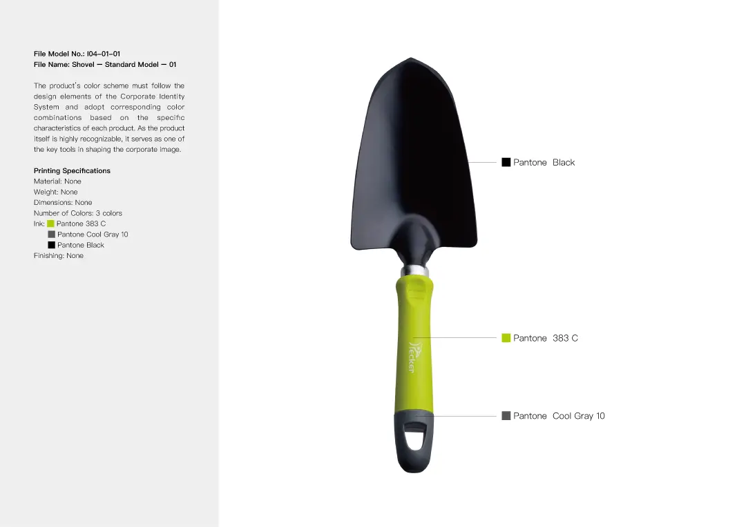
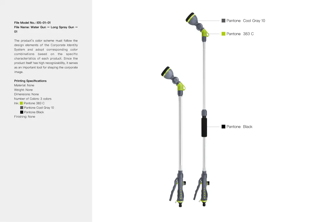
For the visual design, we cleverly arranged and combined gardening tools such as shovels, sprinklers, pruning shears, flower scissors, saws, and rakes to design plant-inspired shapes including sunflowers, sage, pine trees, flowers, palm leaves, and dandelions. These imaginative designs are visually striking and memorable, perfectly showcasing the essence of the products the brand promotes.


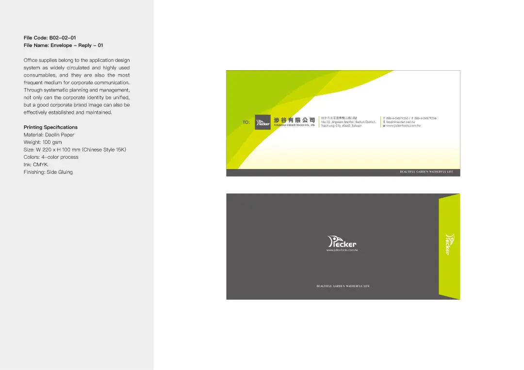
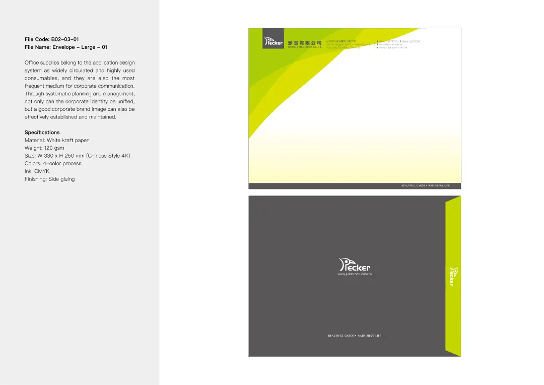
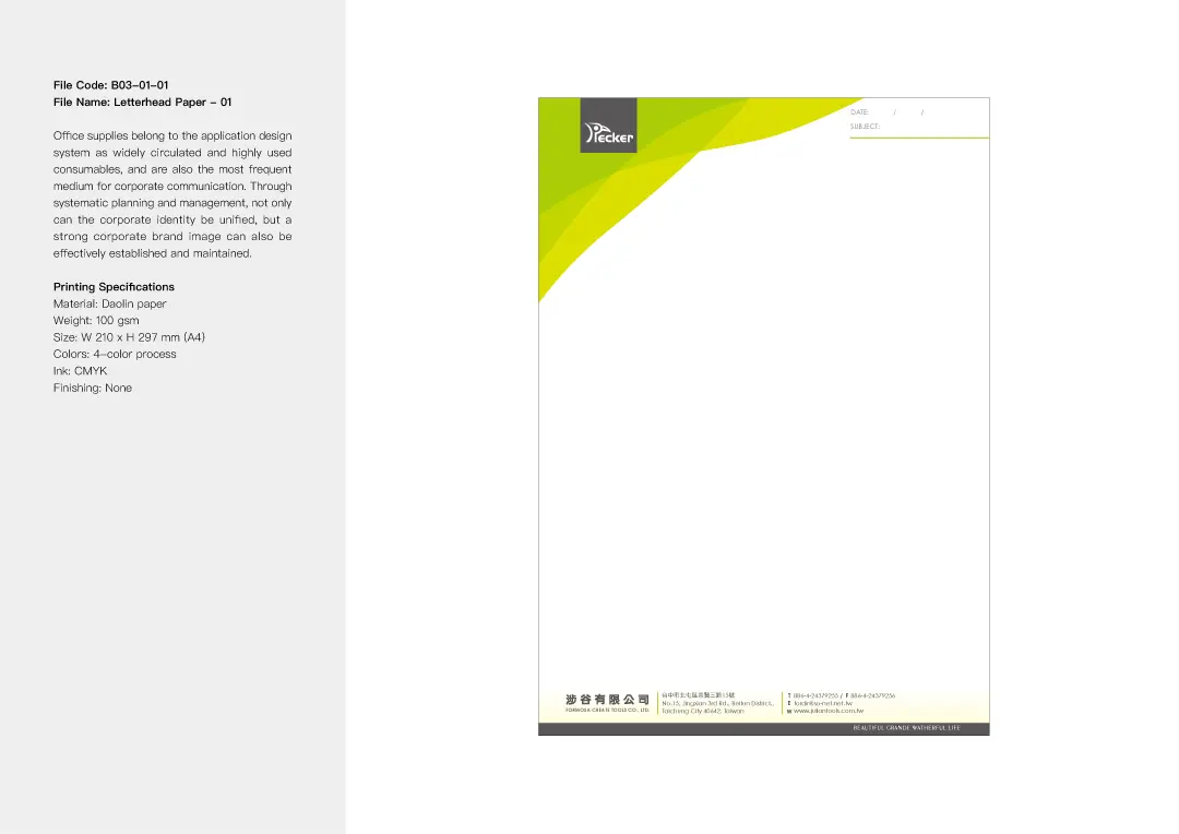
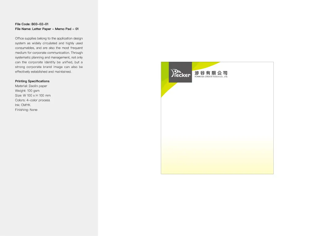
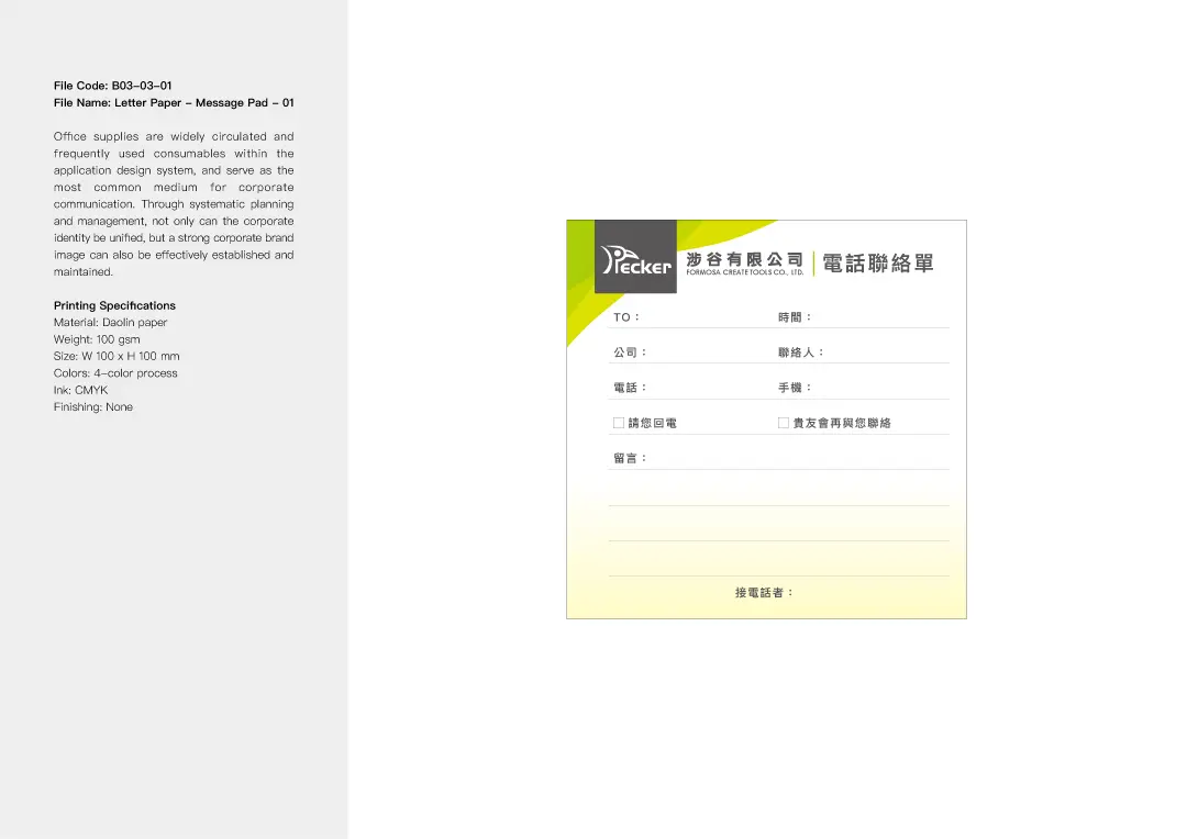
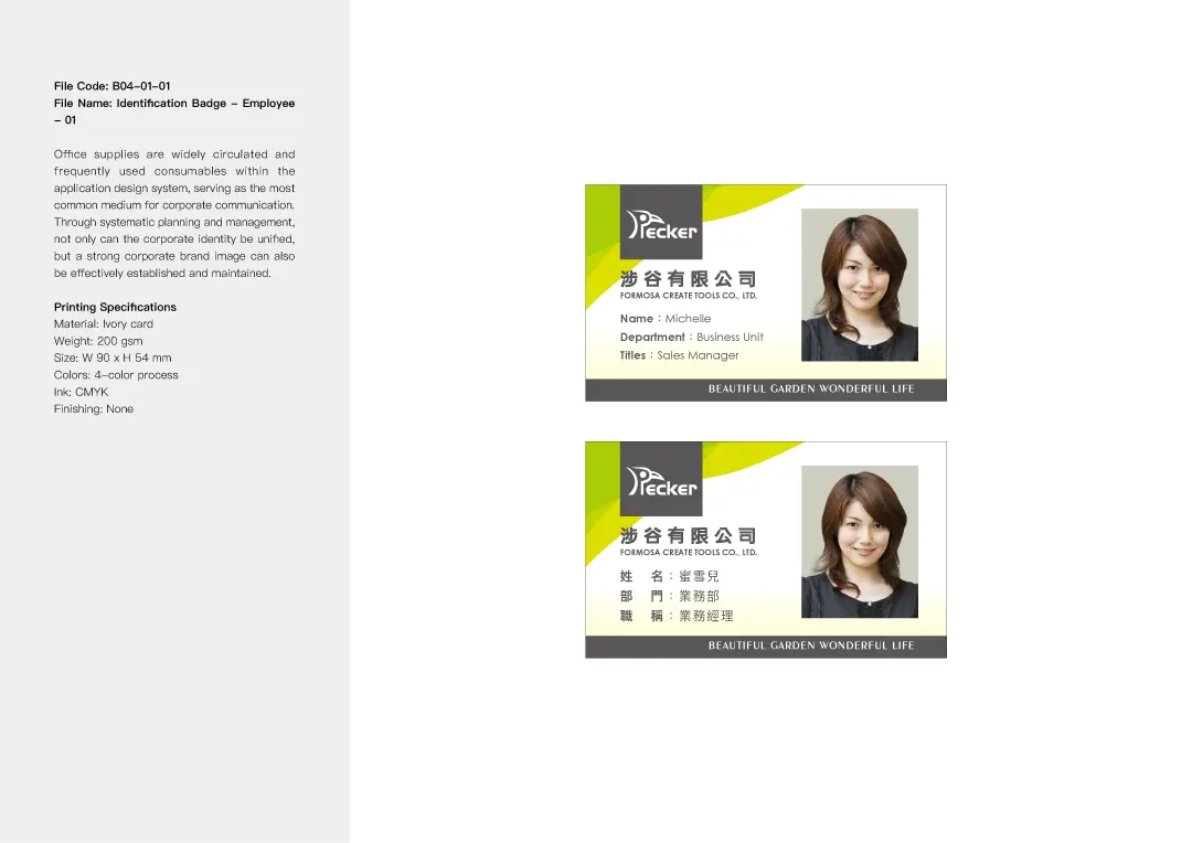
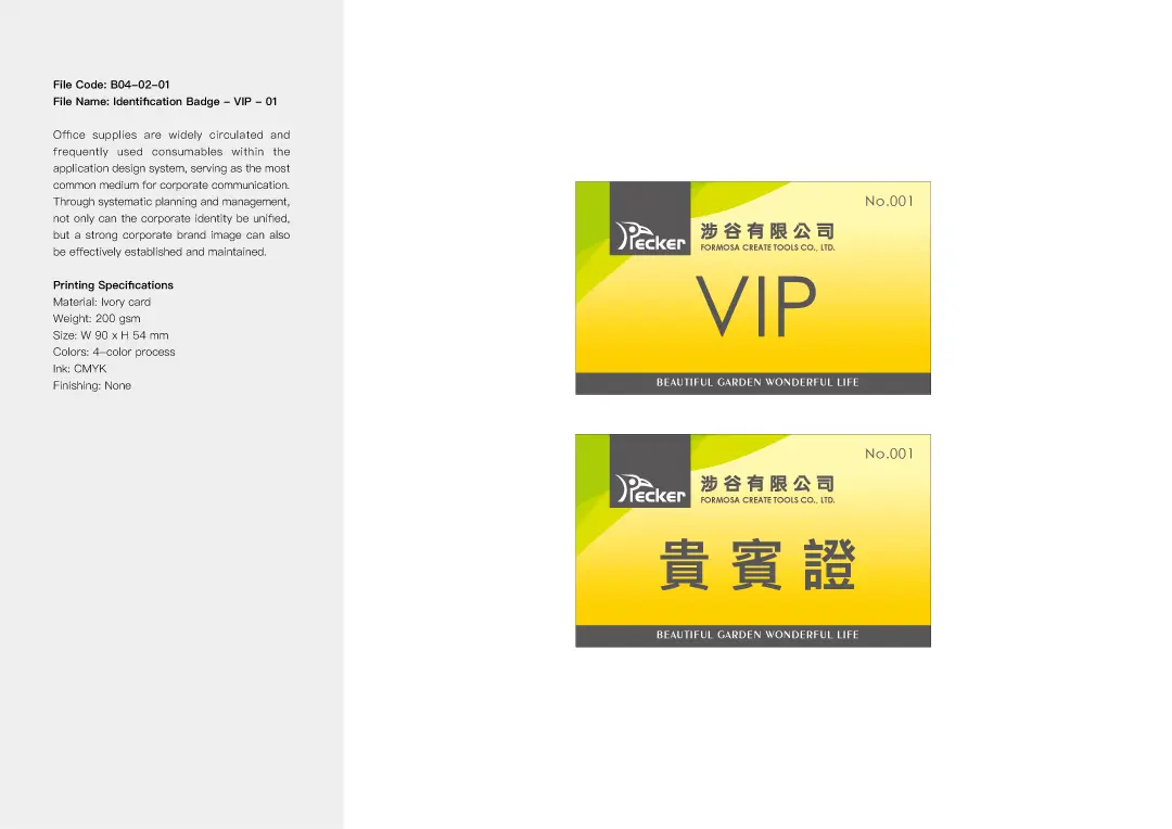
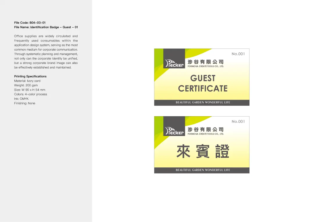
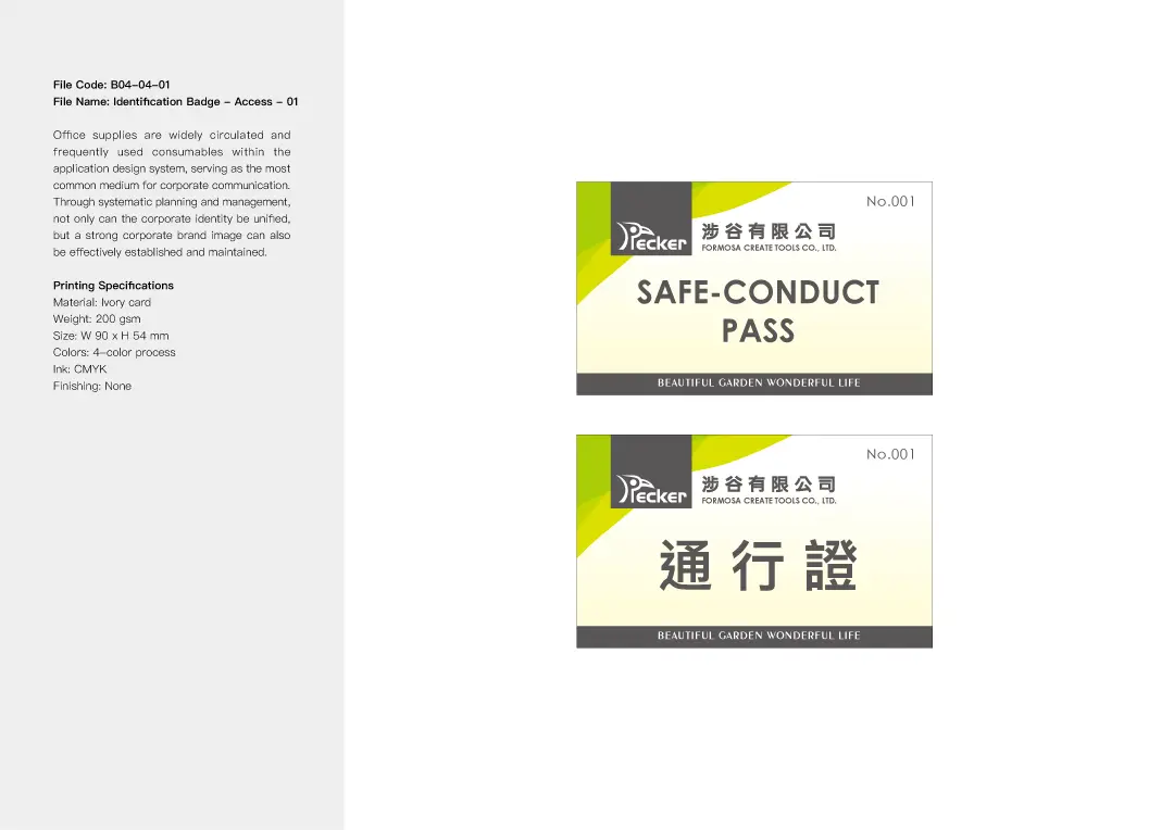
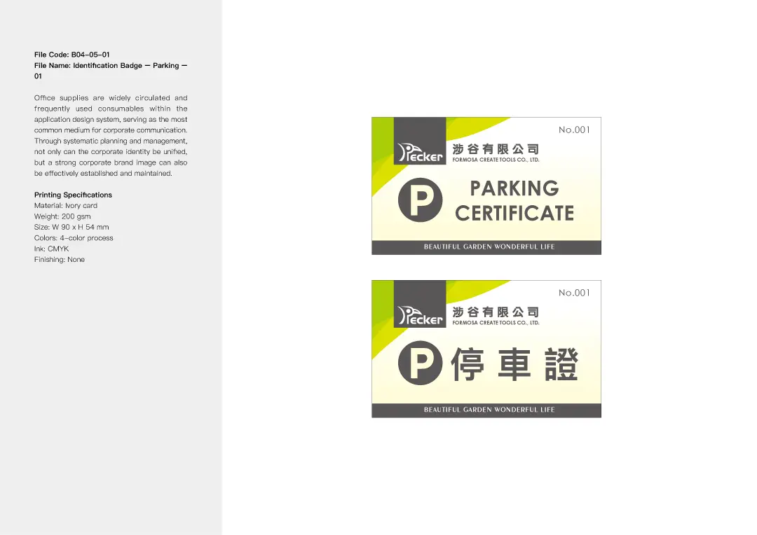
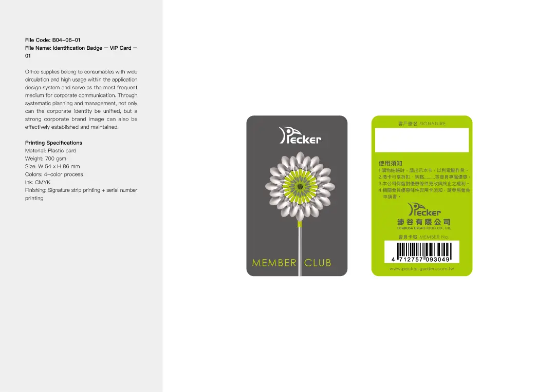
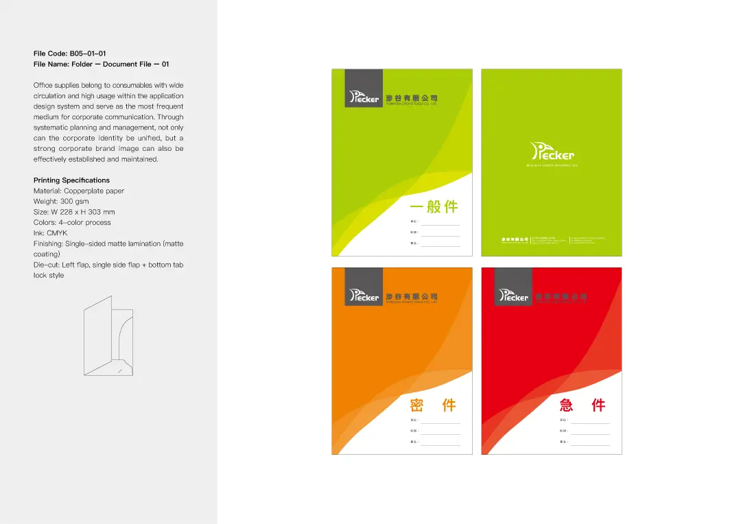
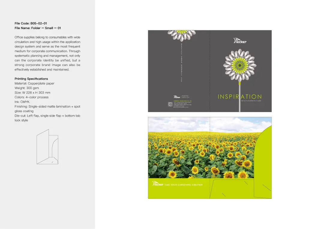
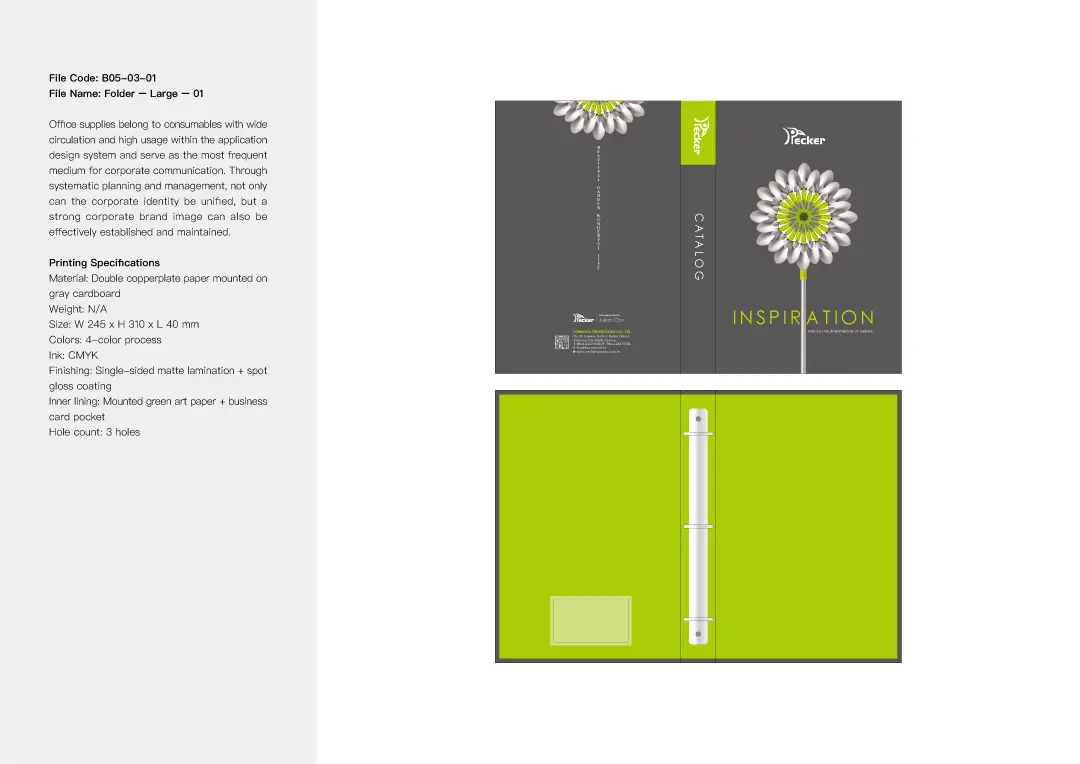
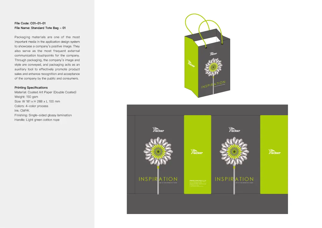
Stationery Design Highlights
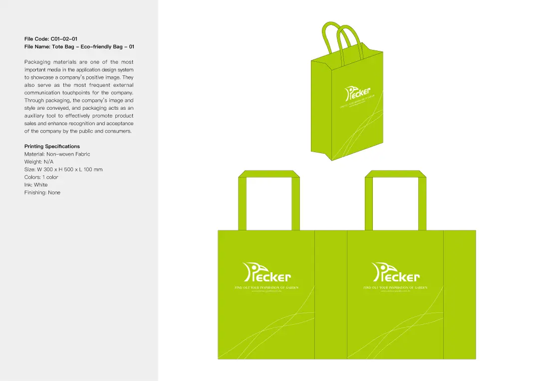
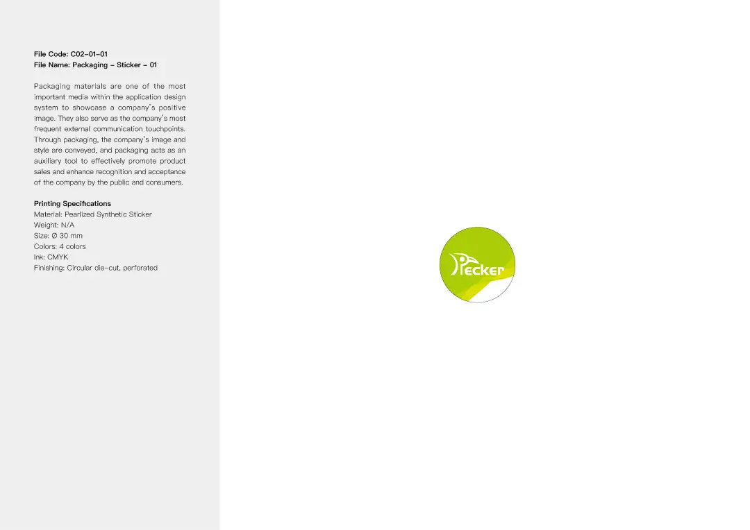
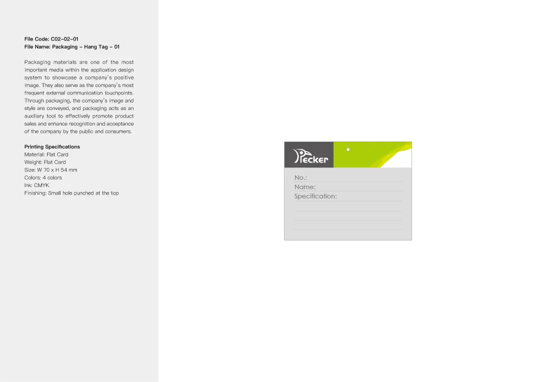
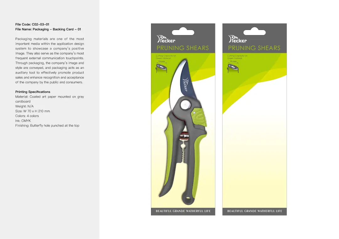
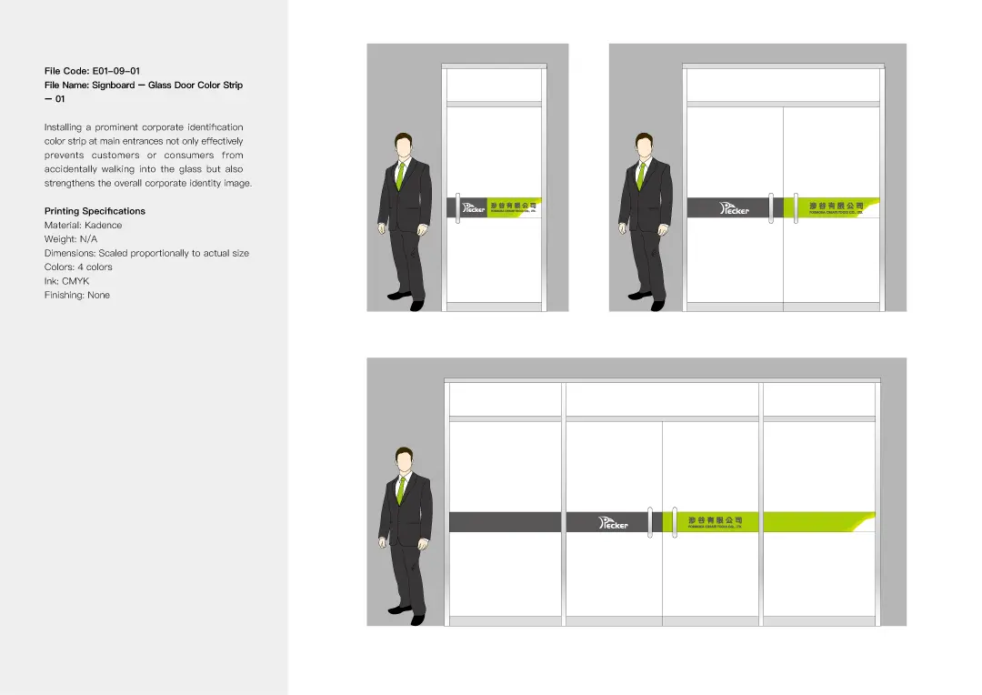
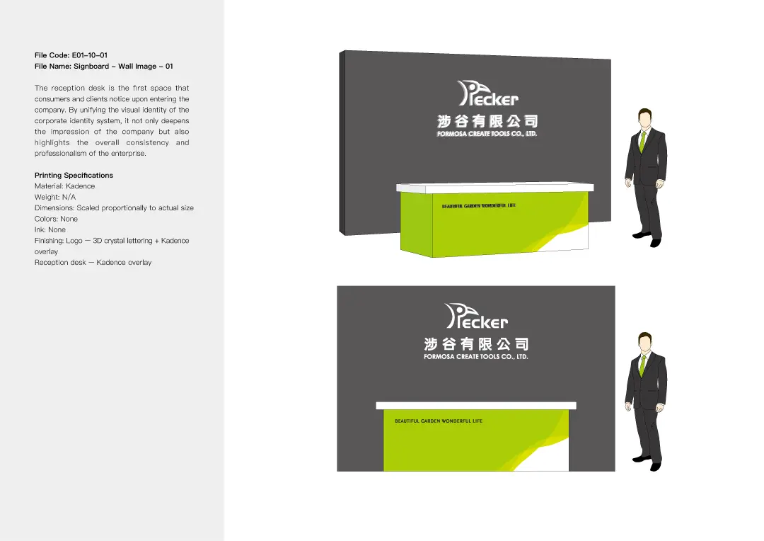
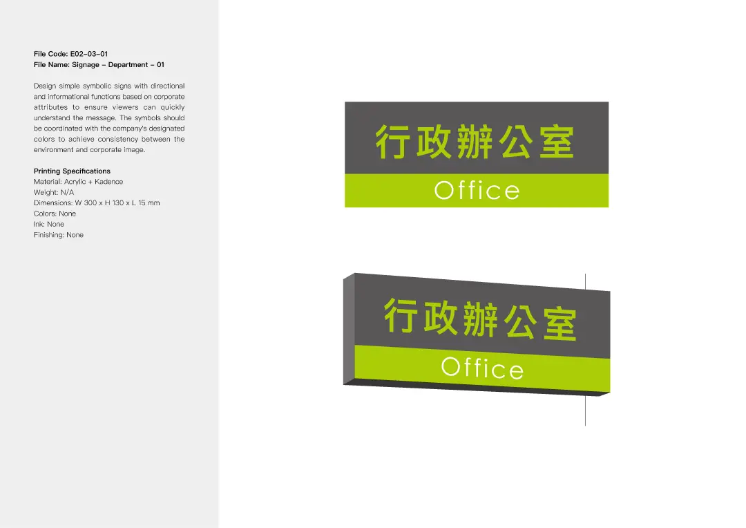
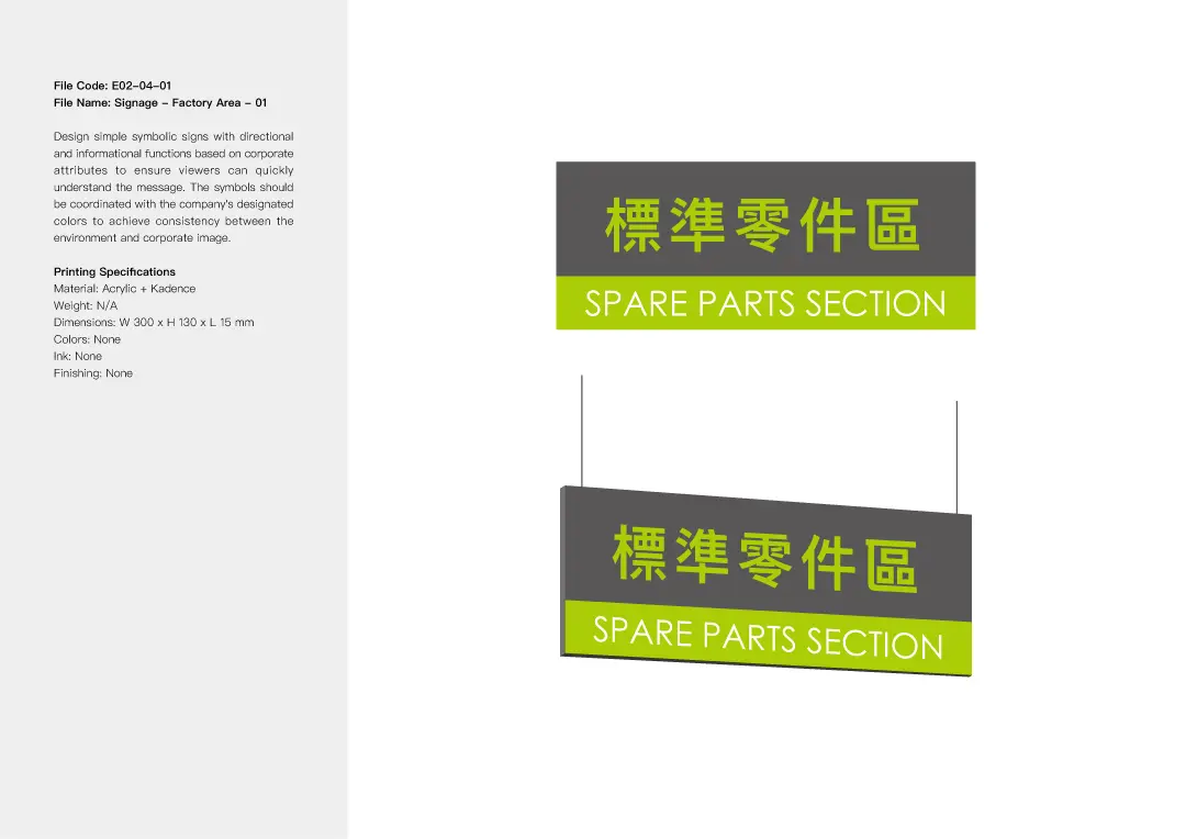
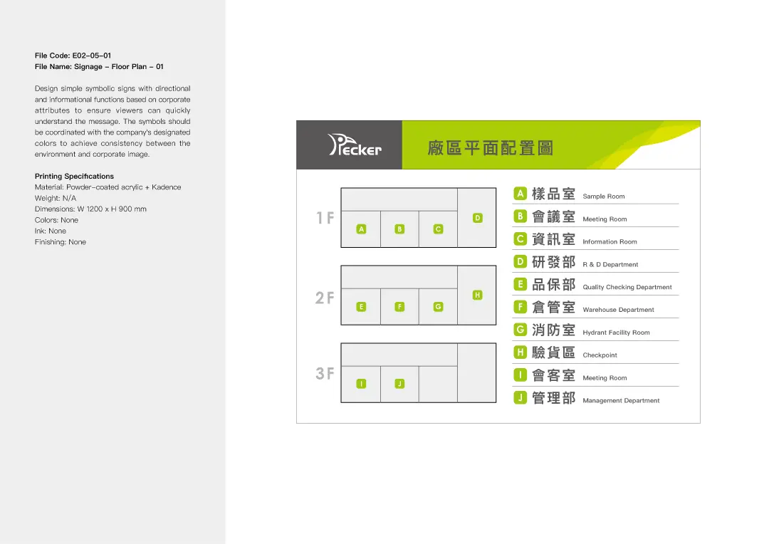
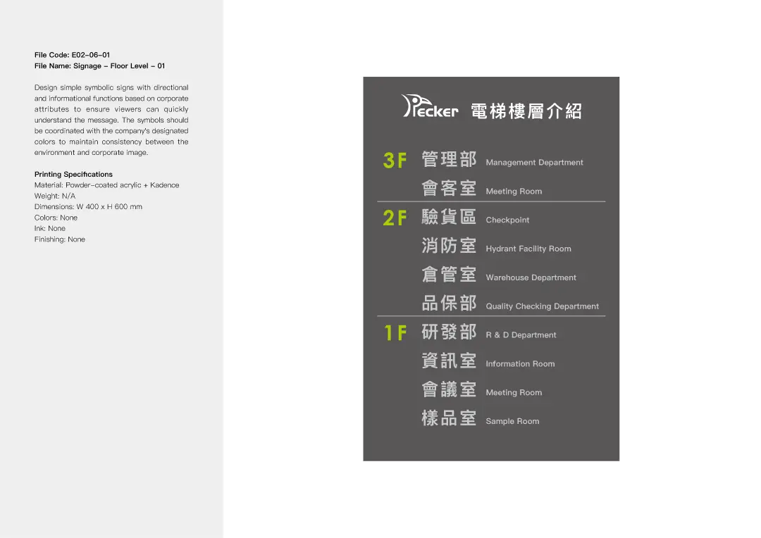
We combined the logo, standard colors, typography, and creative graphics into a unified visual identity system. This system is applied across various brand materials, including business cards, envelopes, backing cards, and posters. The design aims to highlight PECKER’s creative brand image and enhance overall brand consistency.

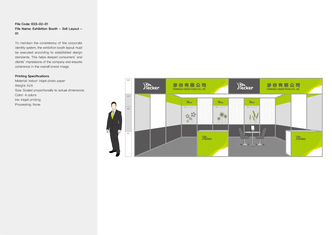
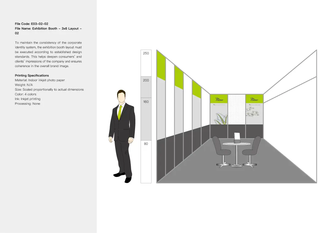
Exhibition Poster Design


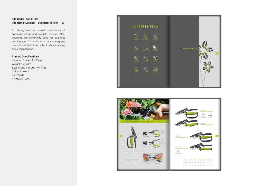
Catalog Design Highlights
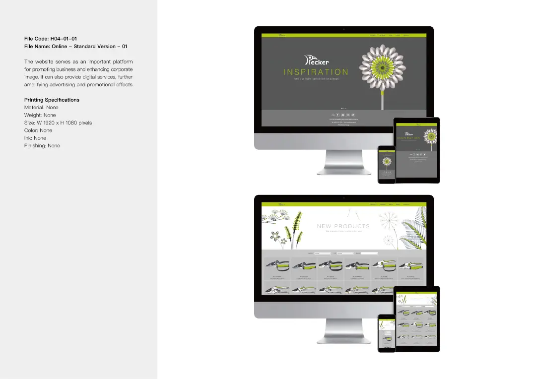
We skillfully incorporated photography, logo, standard colors, typography, and creative graphics into the catalog and website design. These elements work together to establish a distinctive brand style and identity for PECKER, showcasing its creative spirit and professional value.


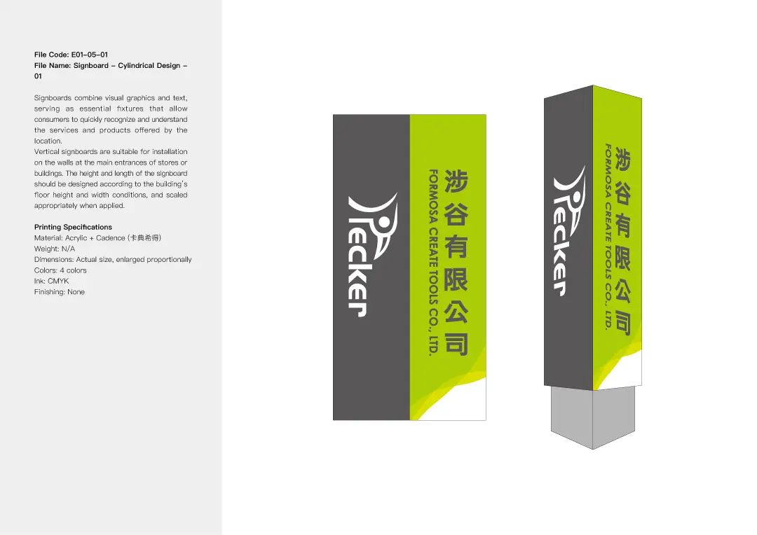
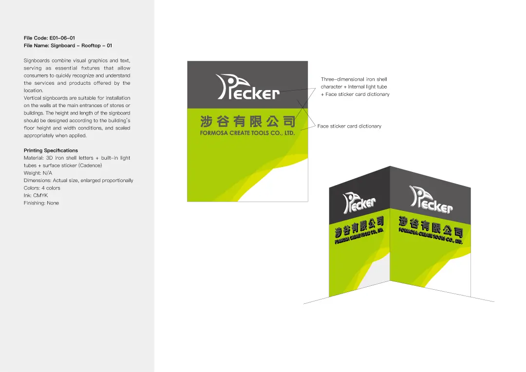
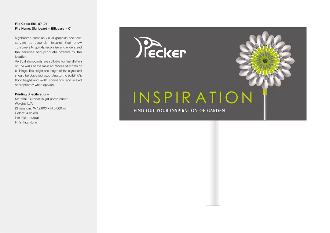
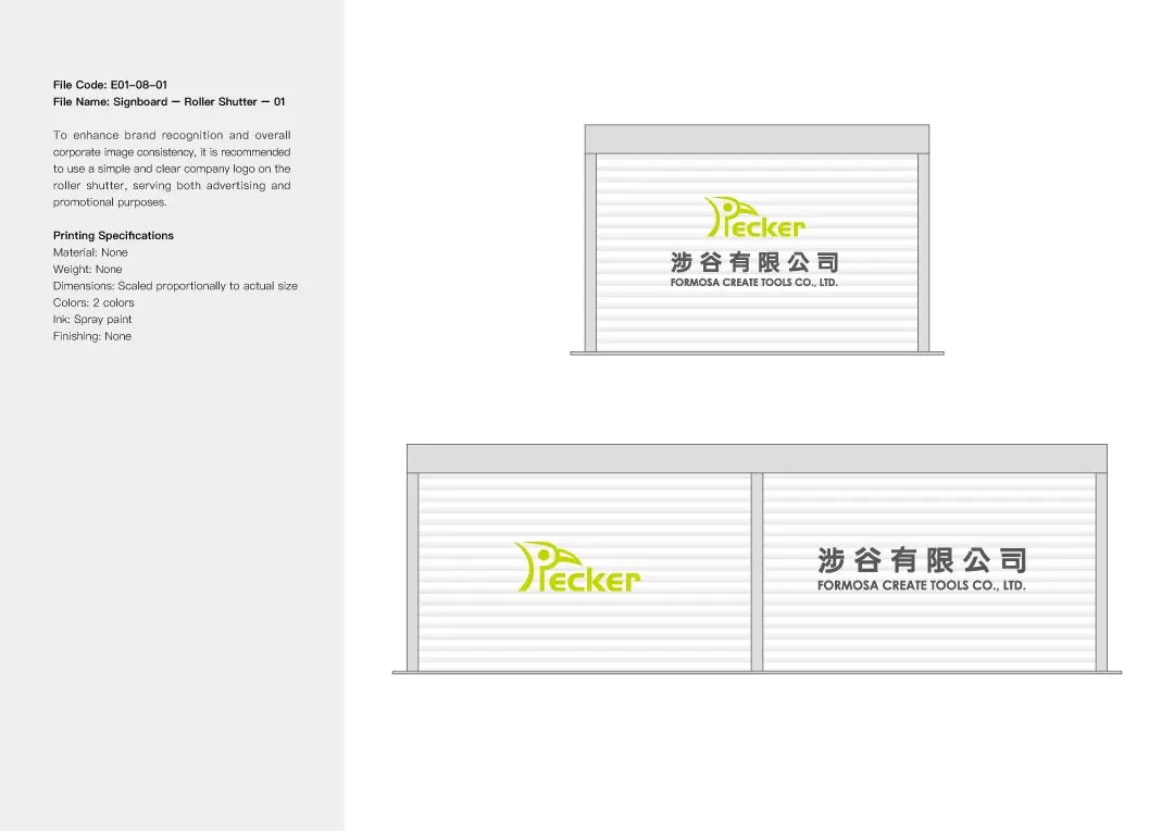
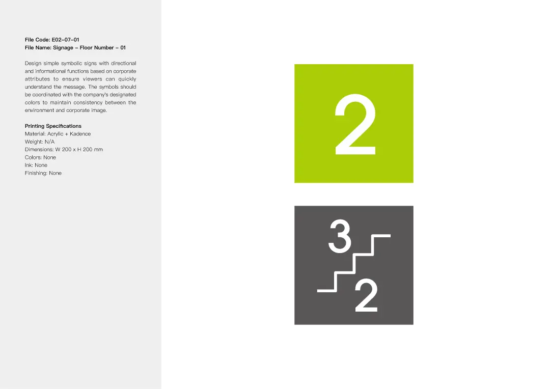
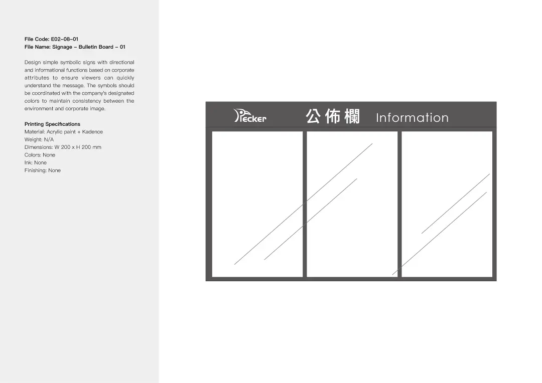
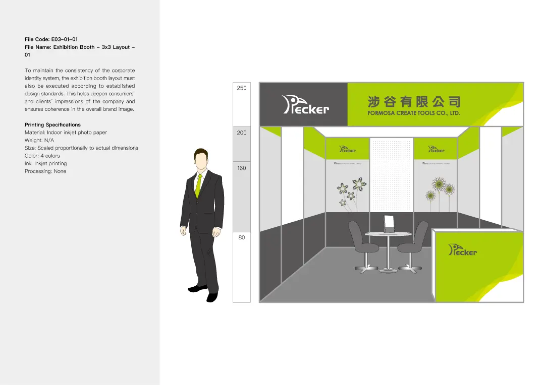
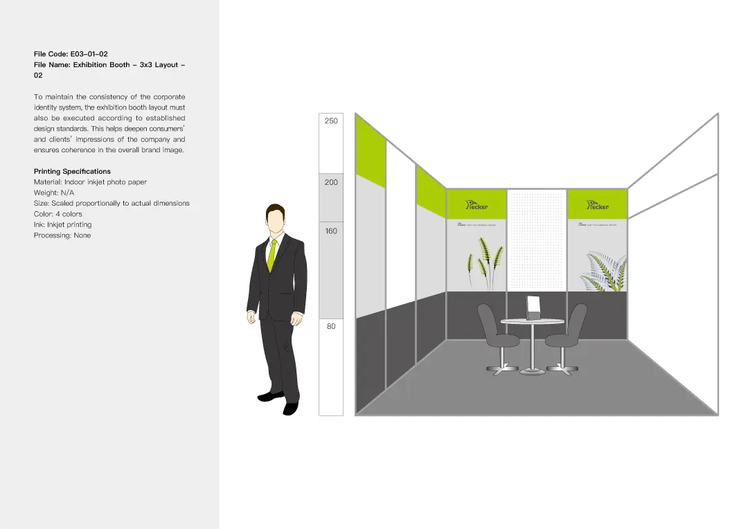
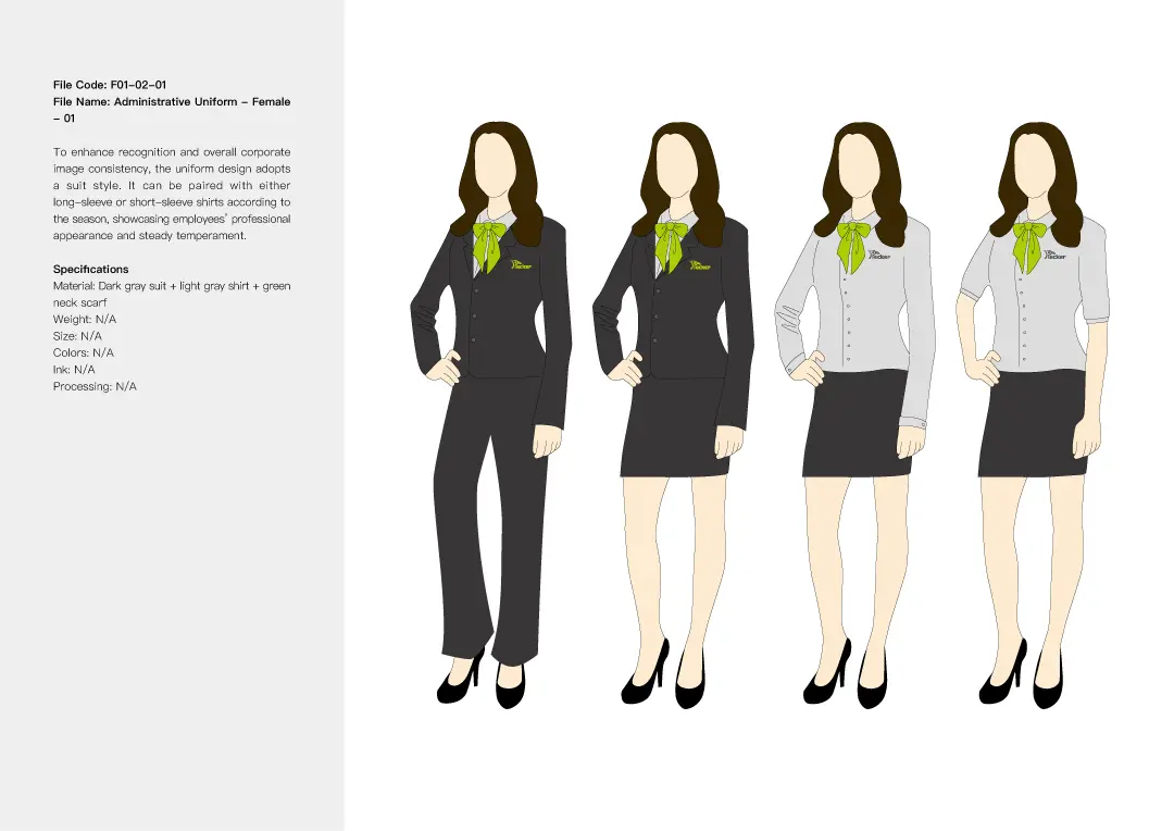
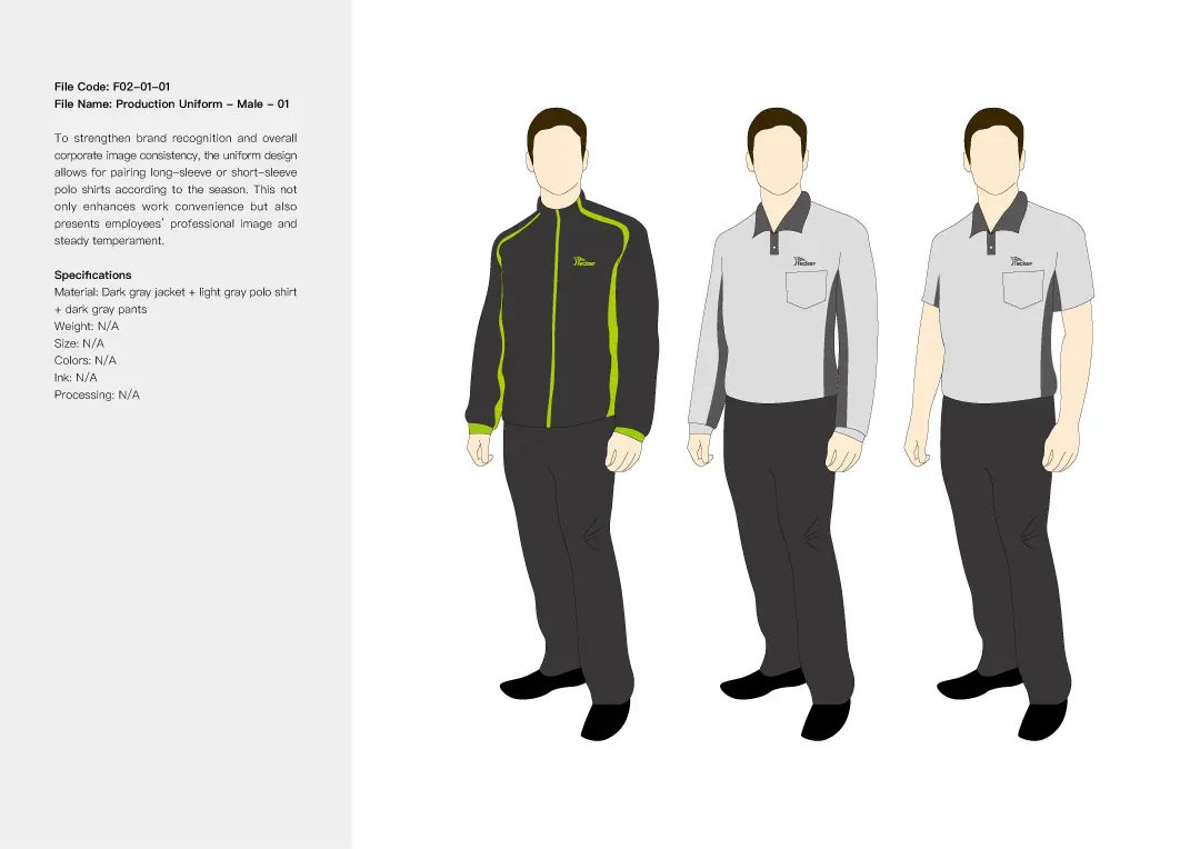
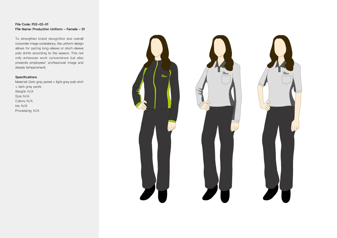
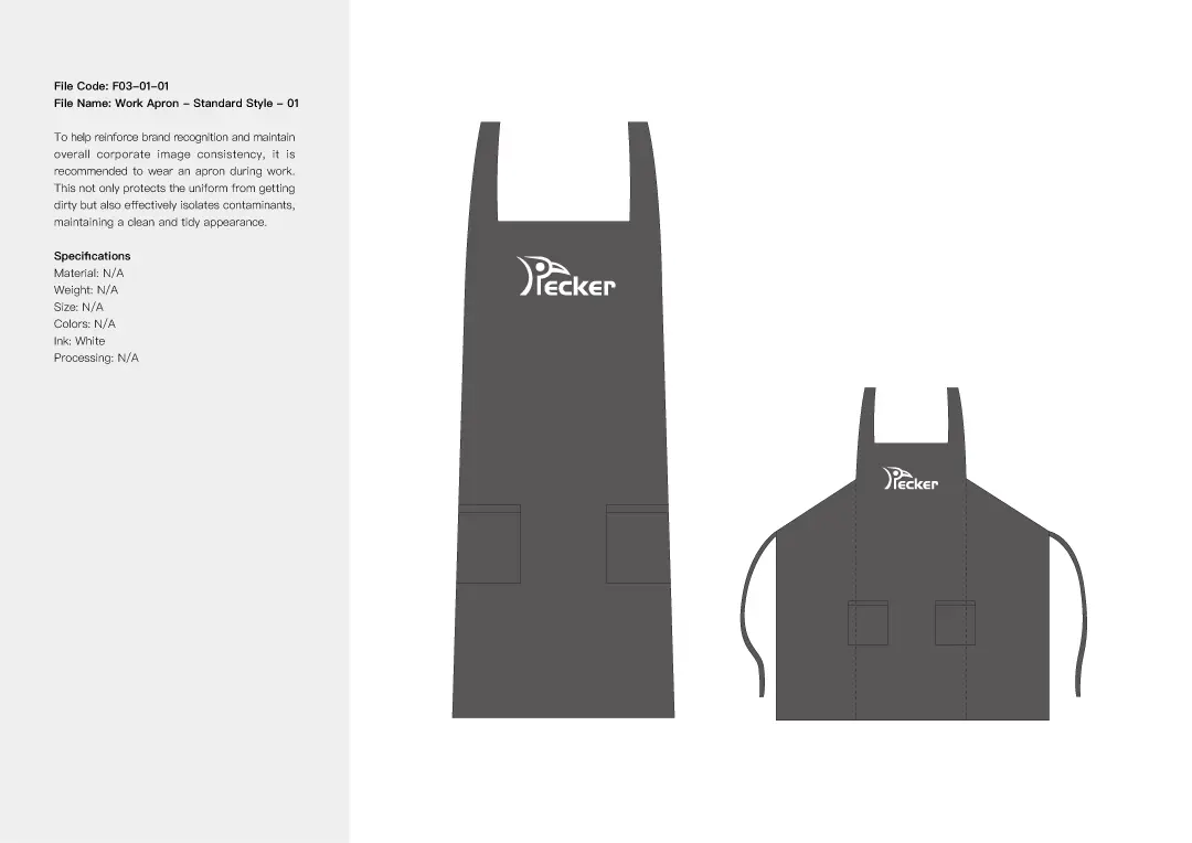
Corporate Identity System

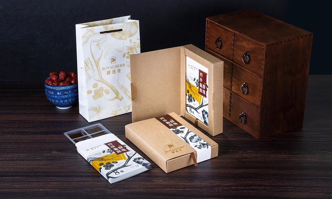
2. ROYALHERB: Overturning Traditional Herbal Impressions with a Cultural Sketch Style
Brand Positioning and Design Strategy
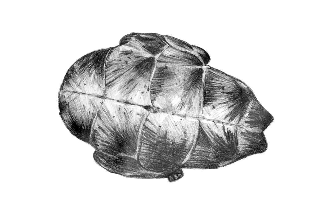
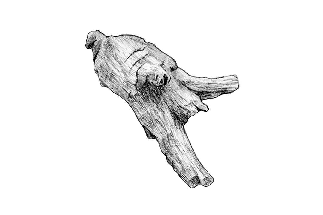
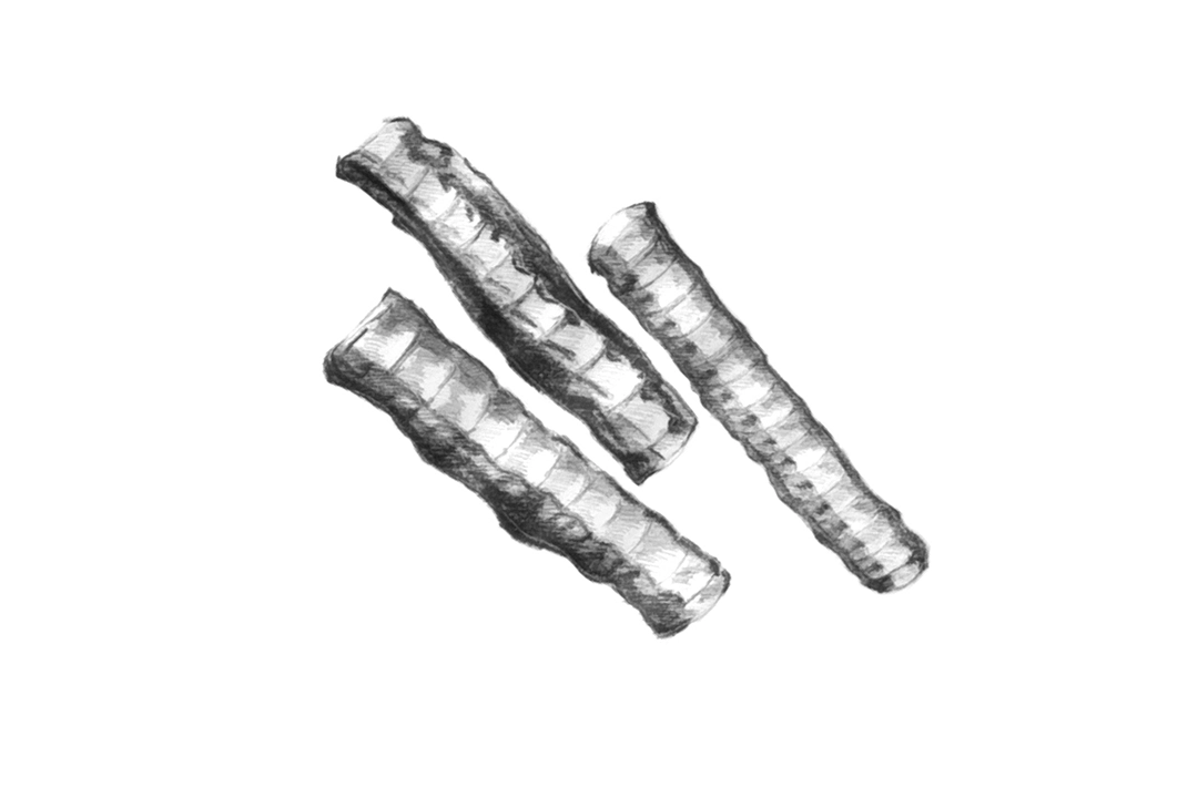
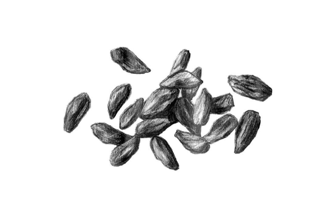
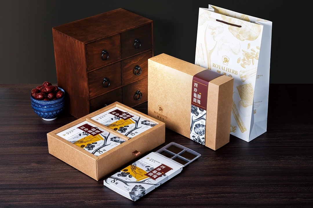
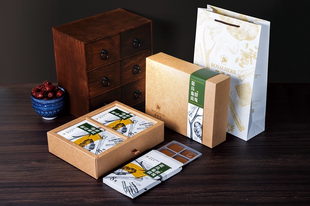
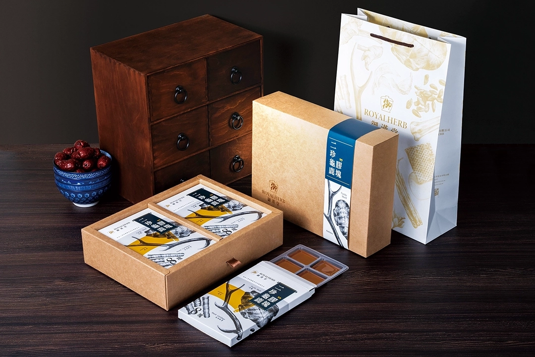
ROYALHERB Health Corporation specializes in Guilu Erxian gelatin and traditional Chinese medicinal herbs. The conventional image of Guilu Erxian gelatin has long been perceived as outdated and overly traditional. In this design project, we used sketch-style illustrations to present the herbs and production process, aiming to create a more refined and artistic brand identity. Our goal is to reshape public perception of Guilu Erxian gelatin and broaden its appeal across different age groups. We believe that this refreshed brand image will attract a wider audience and open up greater market opportunities for ROYALHERB Health Corporation.
Logo Design Highlights
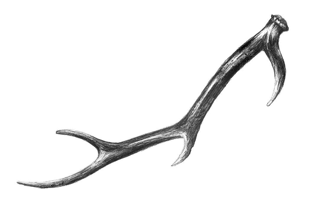
ROYALHERB Health Corporation is a long-established traditional Chinese herbal brand specializing in the production of Guilu Erxian gelatin. For the logo design, we incorporated elements such as medicinal herbs, herbal jars, traditional Chinese medicine aesthetics, turtle shells, deer antlers, and calligraphy. In total, we created 16 distinct design styles, each carrying its own unique concept and meaning.
Standard Font Design Highlights
In the end, we selected a final logo and custom-designed a unique hand-drawn typeface to achieve optimal visual harmony. At the same time, we developed it into a comprehensive visual identity system, establishing consistent guidelines and standards for future designs such as business cards, envelopes, promotional materials, and packaging. This system aims to highlight the distinctive charm of ROYALHERB Health Corporation and enhance the consistency and professionalism of its brand image.


Visual Design Highlights
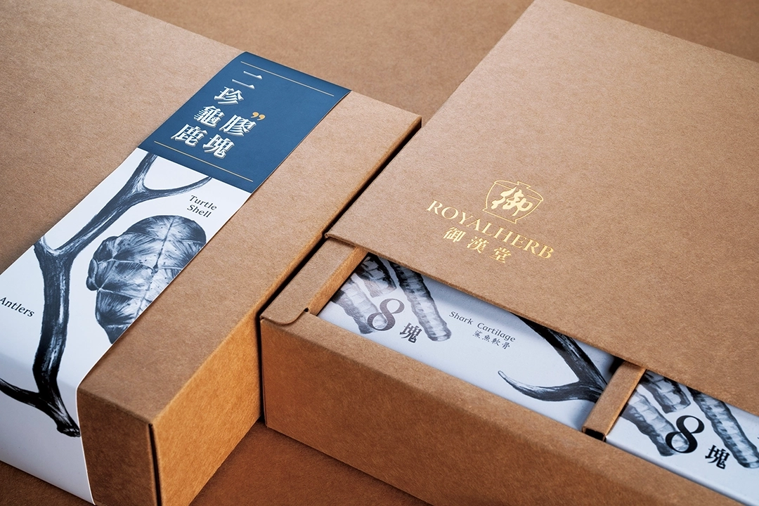
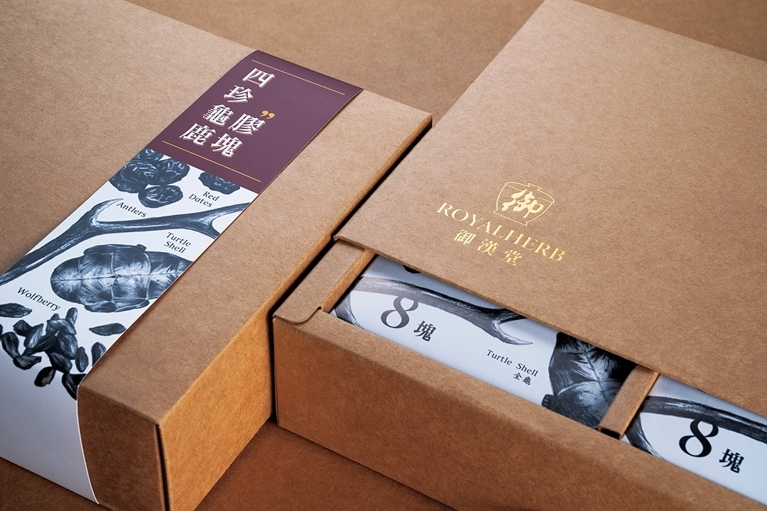
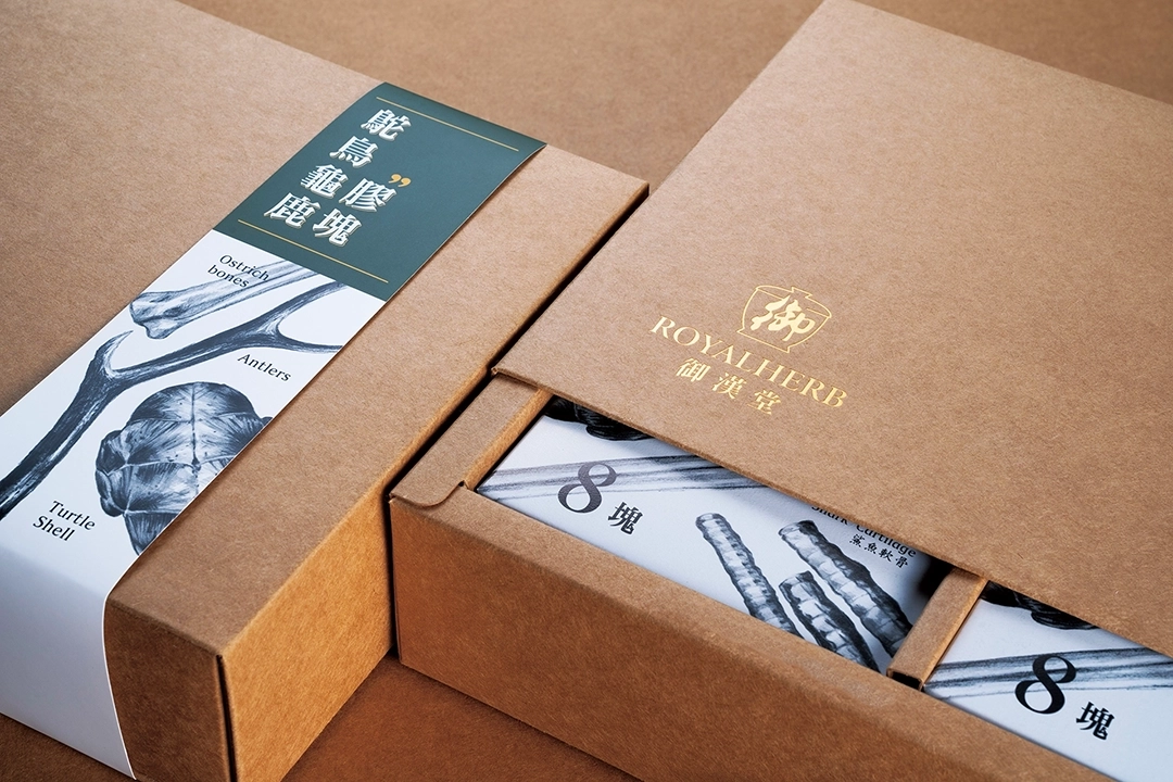
The packaging and promotional materials for Guilu Erxian Jiao traditionally use actual photos of medicinal herbs to showcase the products, presenting a conventional and old-fashioned image of Chinese herbal medicine. However, this approach may limit the brand's ability to attract a broader consumer base, especially younger customers. Therefore, this time we chose to depict the medicinal herbs using sketches. This not only adds an artistic and literary feel to the packaging and promotional materials but also injects new vitality into the brand. This design style aims to create a more modern and appealing image that captures the attention of younger consumers. Through this approach, we hope to bring Guilu Erxian Jiao closer to the lifestyles and preferences of contemporary consumers while preserving its traditional Chinese medicine cultural heritage.

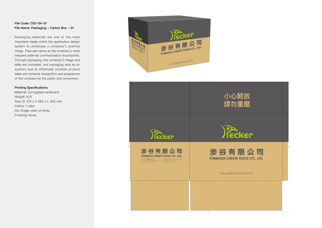
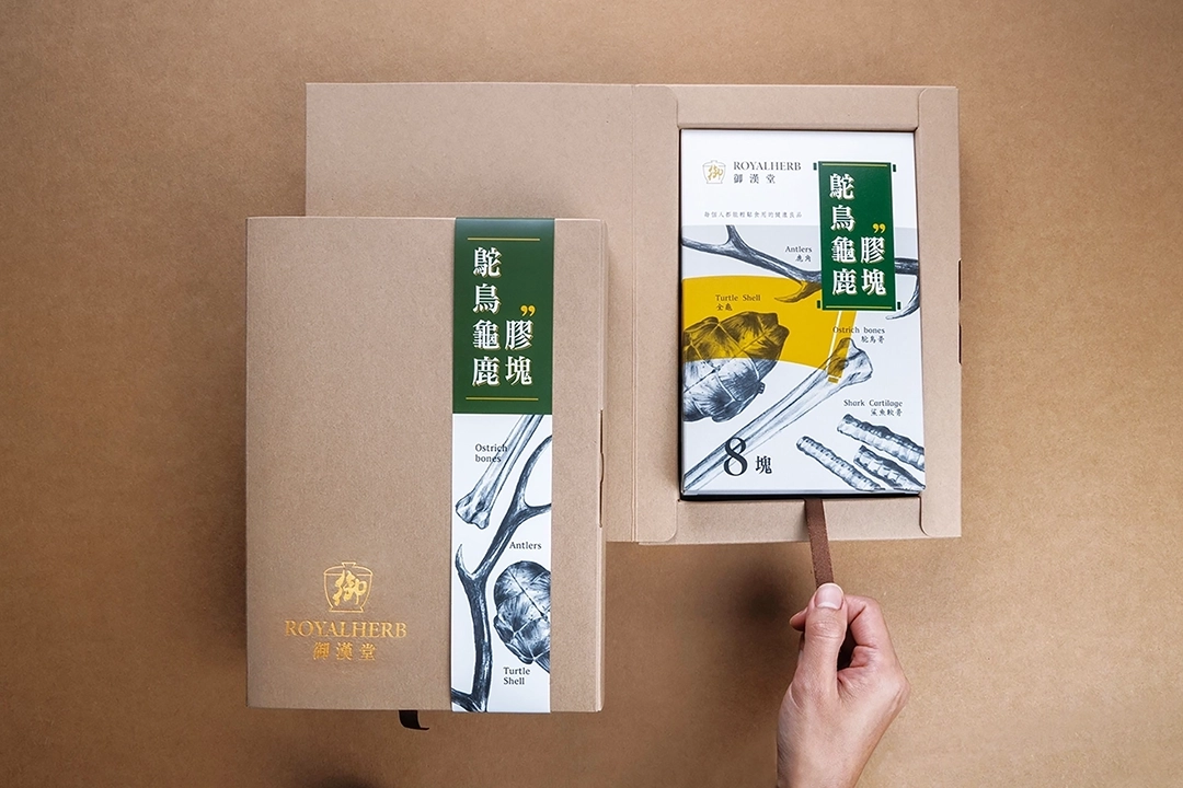
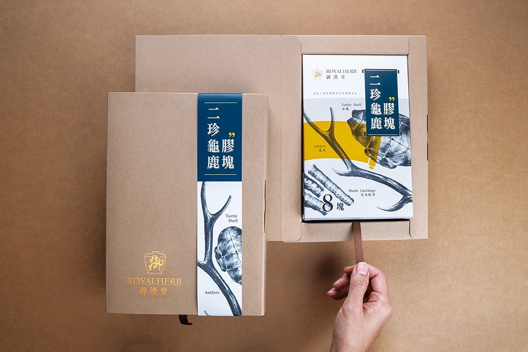
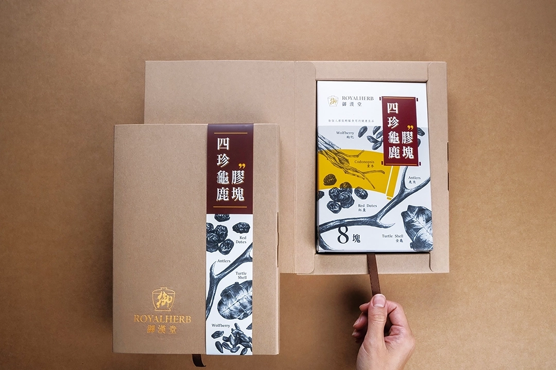
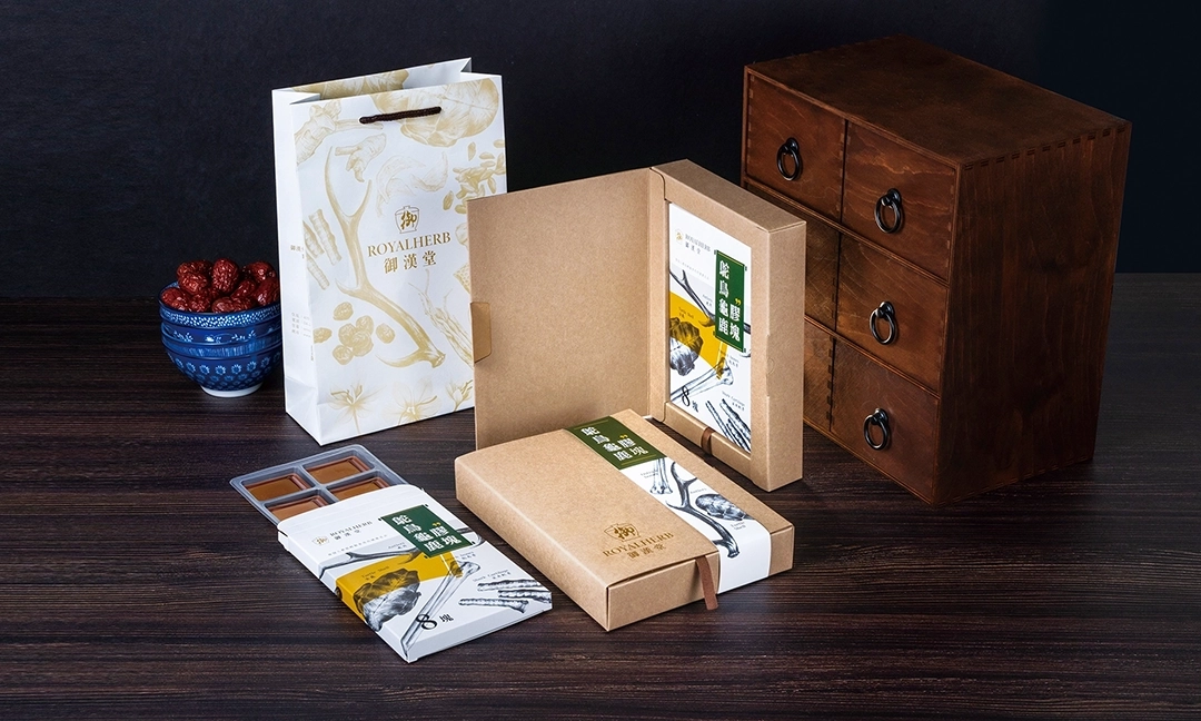
Packaging Design Highlights
When designing packaging, multiple aspects need to be considered: visual appearance, packaging structure, packaging materials, mixed media, and printing methods. This packaging design involves three different product types, each with three identical quantities. Therefore, key considerations in the design include how to effectively share packaging materials, simplify the structure, facilitate packaging, and reduce storage space for packaging materials when not in use.


3. HOCHIN: Showcasing Zen and Cultural Depth through Agarwood Imagery
Brand Positioning and Design Strategy
HOCHIN has long been dedicated to promoting the cultural traditions of incense appreciation and tea ceremony. With profound academic knowledge and emotional connection to agarwood, the brand continues to offer only the highest quality products. In this collaboration, our goal was not only to enhance the brand image but also to reach a broader audience across different age groups. In the design, we creatively incorporated the flowing lines of incense smoke, forming various auspicious symbols to represent blessings for the consumer. This approach not only highlights the product’s unique characteristics but also brings a fresh perspective to traditional culture.
Logo Design Highlights
HOCHIN is a brand dedicated to promoting the culture of agarwood. With a long-standing focus on the art of incense appreciation and tea ceremony, HOCHIN seeks to share the depth and beauty of these traditions. In our logo design, we aimed not only to convey the profound meaning of agarwood but also to infuse a sense of Zen and artistic aesthetics. To achieve this, we carefully crafted 16 unique logo variations, each with its own form and symbolism, for the client to choose from. Every design embodies the brand’s pursuit of a Zen-inspired lifestyle and artistic sensibility, reflecting HOCHIN’s rich cultural heritage and brand spirit. Through these designs, we hope that consumers can not only experience the allure of agarwood but also be inspired by the tranquility and insight offered by a Zen way of life.
Standard Color Design Highlights
The chosen standard color is Rose Gold (PANTONE 8640 C), complemented by gray, black, and white. These colors are selected to convey the brand's calmness and elegant temperament. We applied this color scheme to the logo and logotype, laying a solid foundation for the future identity system.


Standard Font Design Highlights
For the typography, we ultimately selected a logo and designed a custom hand-drawn typeface to achieve optimal visual harmony. This unique typeface not only complements the logo but was also further developed into a unified visual identity system. The system provides clear guidelines for future applications across business cards, envelopes, promotional materials, packaging, and the website. The purpose of this system is to highlight the cultural depth of HOCHIN and enhance the consistency and professionalism of its brand image. Through a cohesive typographic style and well-defined design standards, we aim to infuse HOCHIN with a greater sense of elegance and character—allowing consumers to more deeply connect with the brand’s cultural essence and values.


Visual Design Highlights
In the visual design, we thoughtfully incorporated the flowing lines of incense smoke to create four symbolically rich graphics: “Zen,” “Dragon,” “Crane,” and “Ruyi” (a traditional symbol of good fortune). Each of these designs represents a heartfelt blessing to the consumer. These meaningful graphics were applied across various brand materials, including stationery, posters, and packaging. Through this approach, we aimed to infuse HOCHIN’s brand image with a distinct sense of cultural depth. We hope that every time consumers use HOCHIN’s products or encounter its designs, they can feel the serene beauty and rich heritage of the Zen-inspired values the brand represents.


Stationery Design Highlights
We applied the logo, standard colors, typography, and creative graphics to stationery items, including business cards, envelopes, and posters. Through the design of these materials, we integrated HOCHIN’s brand image into everyday business activities, allowing the brand to showcase its professionalism and unique charm across various occasions.

Packaging Design Highlights
The main focus of this packaging design project was incense sticks and incense coils. Since these products are fragile, special attention had to be given to cushioning and protection in the design. Additionally, the project involved over 30 different product items, divided into four tiers, requiring us to consider cost-saving and inventory management solutions for the client.
To address these challenges, we developed a packaging system that shares the same structural design across all items, effectively differentiating the products using gold foil stamping. We concentrated on how to standardize packaging materials, simplify the structure, improve packaging convenience, and minimize storage space for packaging materials when not in use.
These considerations were key to the packaging design process. Our goal was to provide the client with a practical and efficient packaging solution that ensures safe delivery of products while reducing costs and space. Combined with unique creative graphics, we aimed to elevate HOCHIN’s professional brand image.


4. JADECELADON: Crafting an Artistic Brand Image with Wood-Fired Celadon
Brand Positioning and Design Strategy
JADECELADON is created by artist He Zhilong, who has long resided in the serene Taiyuan Valley of Taitung. He is dedicated to producing wood-fired celadon using the traditional natural ash glazing technique, aiming to revive the ancient culture of firing earthenware with full glazing practiced over two thousand years ago. To achieve this goal, he has devoted tremendous effort and has ultimately gained recognition and collection from many experts. Our design focus for this project was to deeply study the artist’s background, the traditional wood-firing methods, and the cultural significance of celadon. Based on this, we carried out planning, copywriting, and photography to portray the invaluable artistic value of this work.
Logo Design Highlights
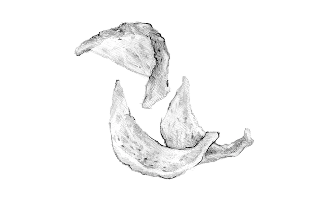
JADECELADON, created by artist He Zhilong, focuses on inheriting the ancient craft of natural wood-fired pottery and is dedicated to reviving the essence of the traditional culture of fully glazed earthenware. In designing the logo, we placed special emphasis on the crucial concepts of “fire observation” and “airflow” inherent to this craft, reflecting the unique artistic value of the fully glazed technique. We incorporated these ideas to create 16 different logo variations for the client to choose from. Each logo highlights a different focal point and conveys a distinct concept, which will bring a unique visual atmosphere to the future identity system.
Standard Color Design Highlights
The uniqueness of JADECELADON lies in the distinctive gloss of its pieces, which differs from the earthy tones of most wood-fired ceramics and the common sky blue of traditional blue-and-white porcelain. Therefore, in selecting the brand’s standard color, we specifically chose Peacock Blue Green (PANTONE 7467 C). This color symbolizes the elegance and excellence of JADECELADON, embodying the concept of “青出於藍” (surpassing the blue). We incorporated this standard color into the logo and typography, laying a solid foundation for the future visual identity system.


Standard Font Design Highlights
We finalized one logo and designed a custom hand-drawn typeface for it to achieve the best visual harmony.


Visual Design Highlights
In the visual design concept, we cleverly utilized the five distinct bottle shapes of JADECELADON to create five unique totems. These were presented as an elegant continuous pattern in a square formation.


Stationery Design Highlights
Ultimately, we integrated the logo, standard colors, typography, and creative graphics into a unified visual identity system. This system will be applied across business cards, envelopes, invitations, banners, catalogs, and the website. The design aims to highlight the cultural heritage of JADECELADON and enhance the consistency and professionalism of the brand image, allowing consumers to deeply appreciate the cultural meaning and artistic value the brand represents.


Catalog Design Highlights
In the catalog design for JADECELADON, we committed to thoroughly understanding and researching the artist’s background and the history of celadon. We planned and organized the content in a logical sequence, gathering relevant photographs and documents to support the artistic value of the works. This design approach allows readers to gain a comprehensive understanding of JADECELADON’s significant place and artistic achievements in the history of ceramics.


5. EARLYWINTER: A Unique Brand Blending Song Dynasty Poetry with Coffee Culture
Brand Positioning and Design Strategy
The owner of EARLYWINTER café is a retired Chinese teacher. The brand’s Chinese name, “橙黃橘綠時,” is inspired by a seven-character quatrain by the Northern Song Dynasty literary figure Su Shi, who expressed reflections on middle age in his poem about Liu Jingwen:
“The lotus has withered, no leaves to hold the rain, Yet chrysanthemums stand proud on frost-bitten branches. Remember well the best season of the year— When oranges turn yellow and tangerines green.”
The poem conveys that although the lotus has faded, the chrysanthemums remain resilient against the frost. It reminds us that early winter, when oranges turn yellow and tangerines turn green, is the season of ripe harvest. The owner draws encouragement from this poem for a successful entrepreneurial journey in midlife. Since “橙黃橘綠時” refers to early winter, the brand’s English name was chosen as EARLYWINTER.
Logo Design Highlights
EARLYWINTER café blends the sentiments of Chinese literature with Western coffee culture. In the logo design, we incorporated concepts such as literary symbols, East-West fusion, coffee cups, and Su Shi to showcase the brand’s unique style and atmosphere. The logo’s color scheme intentionally uses black and white to highlight the simplicity of the symbols and the essence of coffee. We provided 16 different conceptual designs for the owner to choose from, ensuring the final logo best fits their needs. These designs aim to express the distinctive cultural richness and elegant spirit of EARLYWINTER café.
Standard Font Design Highlights
After careful consideration, we ultimately finalized a meticulously designed logo inspired by the image and essence of Su Shi, a renowned literary figure from the Northern Song Dynasty. To complement the logo, we deliberately chose the "Slender Gold Script" calligraphy style popularized by Emperor Huizong of the Song Dynasty. This choice not only creates visual harmony with the logo but also enhances the cultural depth of the brand. Additionally, we established a unified typographic system, setting a consistent visual standard for all future promotional materials and packaging.


Visual Design Highlights
In our visual design, we drew special inspiration from a Song Dynasty painting depicting a gathering of scholars and literati enjoying a feast by a garden pond. In the original artwork, a servant is shown preparing tea utensils on a small table. We cleverly reimagined this scene by replacing the act of scooping tea powder with the process of brewing pour-over coffee. This thoughtful design not only highlights the brand’s product attributes but also elegantly blends the brand’s spirit of East-West beverage culture fusion. By bringing the modern pour-over coffee experience into the ancient literati’s lifestyle, we created a creative and engaging scene. This innovative graphic not only leaves a deep impression of EARLYWINTER café on consumers but also resonates with the brand’s connection to Song Dynasty cultural heritage.


Packaging Design Highlights
Ultimately, we integrated the logo, custom typography, and creative graphics into a unified identity system. This system will be applied across business cards, envelopes, and packaging, aiming to enhance EARLYWINTER café’s visibility in the market and strengthen the consistency of its brand image. It allows consumers to more deeply connect with the culture and uniqueness the brand represents.
Through this cohesive identity system, EARLYWINTER café will showcase a stronger brand presence across various media platforms, making the brand more eye-catching and influential. This integration weaves the brand’s story and core values into every detail, creating a rich and meaningful brand experience for consumers.


Stationery Design

Conclusion: Choosing the Right Taichung Brand Design Company Lets Your Brand Value Be Seen
A successful brand is more than just a beautiful logo; it enables consumers to recognize and remember it at a glance through a consistent visual system, clear brand positioning, and a story-driven design language. As seen through the 5 cases above, a professional Taichung brand design company not only helps businesses build their external image but also strengthens core brand values on a strategic level.
If your company is looking for a trustworthy Taichung brand design team, or hopes to regain market competitiveness through brand identity, packaging design, website design, and overall visual planning, then starting from the brand story and implementing it with design strategies will be the key to giving your brand more growth potential.
If you would like to learn more about design, feel free to contact us for the following services: Taichung Brand Design Company, Taichung Logo Design Company, Taichung Website Design Company, Taichung Web Design Company, Taichung Graphic Design Company, Taichung Visual Design Company, Taichung Advertising Design Company, Taichung Catalog Design Company, Taichung Packaging Design Company, Taichung Commercial Photography Company, Taichung Video Production Company, Taichung CI Design Company