Introduction: Starting from Taichung Graphic Design, Refining a Truly Valuable Brand Soul for You
If you are looking for a reliable Taichung graphic design company, besides checking if their work is aesthetically pleasing, it is more important to see if the design can accurately convey brand positioning, enhance recognition, and truly solve the enterprise's communication needs. Good Taichung graphic design is not just about visual packaging, but the integrated result of brand strategy, content planning, and market communication.
Below, we will share 5 representative graphic design success stories, covering aspects such as brand identity, visual image, stationery design, and catalog design. These works not only demonstrate the professional depth of Taichung graphic design but also show how design helps brands establish their unique characteristics, elevate their quality, and stand out in the market.


1. PECKER: Creating Brand Memory Points with Gardening Tools
Brand Positioning and Design Strategy
PECKER Shibuya Co., Ltd. is a gardening hand tool company. Its Chinese brand name, "琢木鳥" (Woodpecker), takes the character "啄" (peck) and transforms it into the imagery of "精雕細琢" (exquisitely crafted); the English brand name is PECKER. The overall brand concept symbolizes users who love gardening and beautifying plants and trees, conveying the brand's emphasis on creativity and details.
In this Taichung graphic design project, we used the shapes of gardening tools as a foundation and extended them into various plant graphics, closely integrating the brand's core products with visual concepts to successfully establish a unique and easily recognizable brand impression.
Visual Design Highlights
In terms of visual design, we utilized gardening tools such as shovels, watering cans, pruning shears, floral scissors, saws, and rakes, reconstructing them into plant shapes like sunflowers, sage, pine trees, flowers, palm leaves, and dandelions. This design approach is not only full of creativity but also clearly communicates the attributes of the products sold by the brand, highly aligning the visuals with the product content.


Stationery Design Highlights
We integrated the LOGO, standard colors, standard typography, and creative graphics into a cohesive identity system and applied it to stationery such as business cards, envelopes, backing cards, and posters. Through a complete and unified design language, PECKER Shibuya Co., Ltd.'s brand image becomes more professional and memorable.

Catalog Design Highlights
In the catalog and website design, we continued the brand's visual system, cleverly combining photos, the LOGO, standard colors, standard typography, and creative patterns to make the overall presentation more consistent and professional. This design not only strengthens the brand style but also allows PECKER's creative spirit to be conveyed more completely.


2. JADECELADON: Presenting the Beauty of Celadon Art Through Cultural Depth
Brand Positioning and Design Strategy
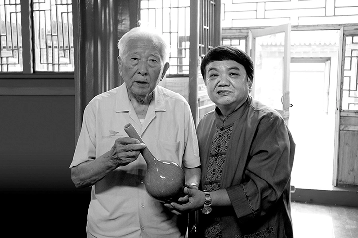
The artist behind JADECELADON is Ho Chih-Lung, who has lived in the Taiyuan Glen of Taitung for many years. He is dedicated to firing wood-fired celadon using a natural ash-glazing method, hoping to recreate the traditional craftsmanship from 2,000 years ago, where earthen bodies are fired and emerge fully glazed. This persistence in ancient methods and culture gives his works extremely high artistic and collectible value. In this Taichung graphic design plan, we deeply researched the artist's background, wood-firing techniques, and celadon culture. Through planning, copywriting, and photography, we concretized the craftsmanship spirit behind the brand and conveyed its cultural value in a more complete way.
Visual Design Highlights
In conceptualizing the visual design, we used the five bottle shapes of JADECELADON to extend into five totems, presenting them as elegant background patterns in a continuous four-way repeating manner. The overall visual not only retains the elegant temperament of celadon but also strengthens the brand's unique artistic identity.


Stationery Design Highlights
We integrated the LOGO, standard colors, standard typography, and creative graphics into a consistent brand identity system and applied it to mediums such as business cards, envelopes, invitation cards, flags, catalogs, and the website. This design makes JADECELADON's cultural heritage and professional image more distinct, allowing consumers to more easily perceive the artistic value the brand represents.


Catalog Design Highlights
In the catalog design, we focused on organizing the artist's background and celadon history, logically arranging the content structure while collecting photos and documentary data as supporting evidence. Through complete layout and narrative, readers can more fully understand the importance of JADECELADON in ceramic culture.


3. MAXCLAW: Improving Product Identification Efficiency Through Catalog Design
Brand Positioning and Design Strategy
Established in 1985, MAXCLAW (Yung Chi Industry Co., Ltd.) is a professional manufacturer of various pipe tools. Over the years, the brand has taken quality assurance and supreme service as its core philosophy, earning industry recognition with its diversified product lines. As the brand has developed for over forty years, the number of its products has reached the thousands, necessitating a catalog that can effectively integrate information and allow distributors to quickly search for what they need.
In designing the brand image, we took MAXCLAW's pipe cutter as inspiration and cleverly cut the word "IMPOSSIBLE" into "POSSIBLE," symbolizing the brand's ability to transform seemingly impossible tasks into viable solutions, fully reflecting its professionalism and functional value.
Catalog Design Highlights
In the catalog design, we valued not only visual aesthetics but also the clear communication of information and reading efficiency. To allow users to quickly find the products they need, we first deeply analyzed the uses of thousands of products, then further planned the most suitable shooting angles and product specification presentation methods, systematically categorizing the products within an 80-page catalog.
Furthermore, the catalog content also covers the company's history, business philosophy, equipment, and vision, making the whole not just a product directory, but a comprehensive brand display tool. This type of Taichung graphic design case is the best example of assisting an enterprise in enhancing its professional image and sales efficiency.


4. THOGCHAGS: Presenting Precious Tibetan Artifacts Through Cultural Classification and Photography
Brand Positioning and Design Strategy
THOGCHAGS (Sky Iron) is an extremely sacred item in Tibetan culture. According to legend, these special materials were bestowed by deities and are often made into amulets to be worn, symbolizing protection and blessings. In Tibetan religious beliefs, THOGCHAGS are regarded as precious artifacts with profound cultural and spiritual significance.
The shapes of THOGCHAGS are extremely diverse, including Gau boxes, scripture clasps, Tibetan seals, mandalas, vajras, kapalas, Jiu Gong Ba Gua, Buddha statues, tormas, mantra plaques, arrowheads, conch shells, stupas, treasure vases, initiation mirrors, animals, ornaments, and more. Such a rich cultural classification made this Taichung graphic design task highly challenging in terms of organization and layout.
Catalog Design Highlights
We were commissioned to produce a catalog featuring over 500 pieces of THOGCHAGS. During the design process, besides considering how to categorize the various shapes, we also had to deeply research their underlying cultural significance and historical background. This ensured the catalog is not just an image collection, but a cultural publication with context and depth.
To fully present the unique beauty of each THOGCHAGS piece, we conducted professional photography from different angles, meticulously showcasing its texture, shape, and preciousness. At the same time, we integrated Tibetan cultural elements and portraiture, giving the various pieces a stronger sense of story and cultural atmosphere.


5. TAES: Visual Image Design Combining Campus Features and Landmarks
Brand Positioning and Design Strategy
TAES (Taichung Xitun District Tai'an Elementary School) has a history of nearly 70 years and is located near the Central Park, with important surrounding landmarks including the Kě-Nǎn Love Bridge, the Green Museumbrand, and the Film Center. The school is renowned for its hand drum dance team, which has consistently won awards over the years, giving it a distinct campus culture and local characteristic.
When commissioned to design its visual image this time, we used the original TAES LOGO as the core and extended it into various graphics representing the school's culture and surrounding landmarks. This design not only preserves the spirit of the original identity system but also allows the campus brand to display uniqueness and approachability in Taichung graphic design.
Visual Design Highlights
In the visual design, we used the geometric lines of the LOGO to extend into postures of students performing the hand drum and dance, and integrated landmarks like the Central Park, Kě-Nǎn Love Bridge, Green Museumbrand, and Film Center into the graphic design. The overall style focuses on joy, festivity, and vitality, successfully conveying the campus characteristics and warm atmosphere of TAES.
These creative graphics can also be widely applied in promotional materials such as business cards, envelopes, certificates of merit, and invitation cards in the future, making the school's image more consistent and easier to remember.

Stationery Design Highlights
Ultimately, we applied the LOGO, standard colors, standard typography, and creative graphics to various stationery items, including business cards, envelopes, certificates of merit, and invitation card designs. These details not only showcase TAES's unique charm but also help the outside world more clearly understand the school's culture, spirit, and local characteristics.

Conclusion: Choose Professional Taichung Graphic Design to Ensure Every Ounce of Brand Value is Truly Seen
Through the 5 cases above, it can be seen that an excellent Taichung graphic design company does more than just complete visual works; more importantly, it comprehensively considers how design can create value for clients—from brand positioning, cultural context, and content planning to application scenarios. Whether it is a corporate brand, arts and culture, industrial products, or an educational institution, as long as the right design strategy is applied, brand features can be transformed into a more memorable and professional visual language.
If you are looking for professional Taichung graphic design services and hope to enhance your brand image and establish market differentiation through design, these successful cases will serve as an excellent reference. Good design is not just about looking good; it is the key to making a brand seen, understood, and remembered.
If you would like to learn more about design, feel free to contact us for the following services: Taichung Brand Design Company, Taichung Logo Design Company, Taichung Website Design Company, Taichung Web Design Company, Taichung Graphic Design Company, Taichung Visual Design Company, Taichung Advertising Design Company, Taichung Catalog Design Company, Taichung Packaging Design Company, Taichung Commercial Photography Company, Taichung Video Production Company, Taichung CI Design Company