Preface: Starting from Taichung Packaging Design to Create a Truly Valuable Brand Image
In a fiercely competitive market, packaging design is not just about beautifying the exterior; it is a crucial link in brand communication, product positioning, and building consumer impressions. As a packaging design company deeply rooted in Taichung, VALUESEE DESIGN has long assisted brands across various industries—from strategic planning and visual identity to packaging structure design—creating Taichung packaging design works that combine both aesthetics and commercial benefits.
This article selects 5 representative Taichung packaging design case studies, including ROYALHERB, HOCHIN, EARLYWINTER, KINLOCH ANDERSON, and TAIWANSTAR. These cases not only showcase brand uniqueness but also fully demonstrate the value of Taichung packaging design in brand transformation, product differentiation, and market communication. If you are looking for a Taichung packaging design company or hope to elevate your brand image through packaging design, these cases will provide you with practical reference directions.


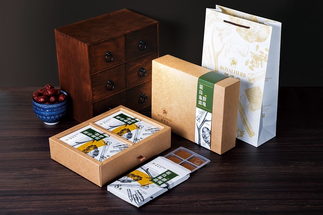
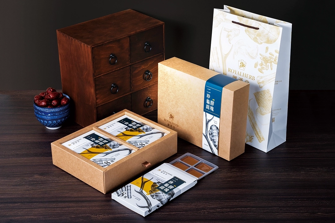
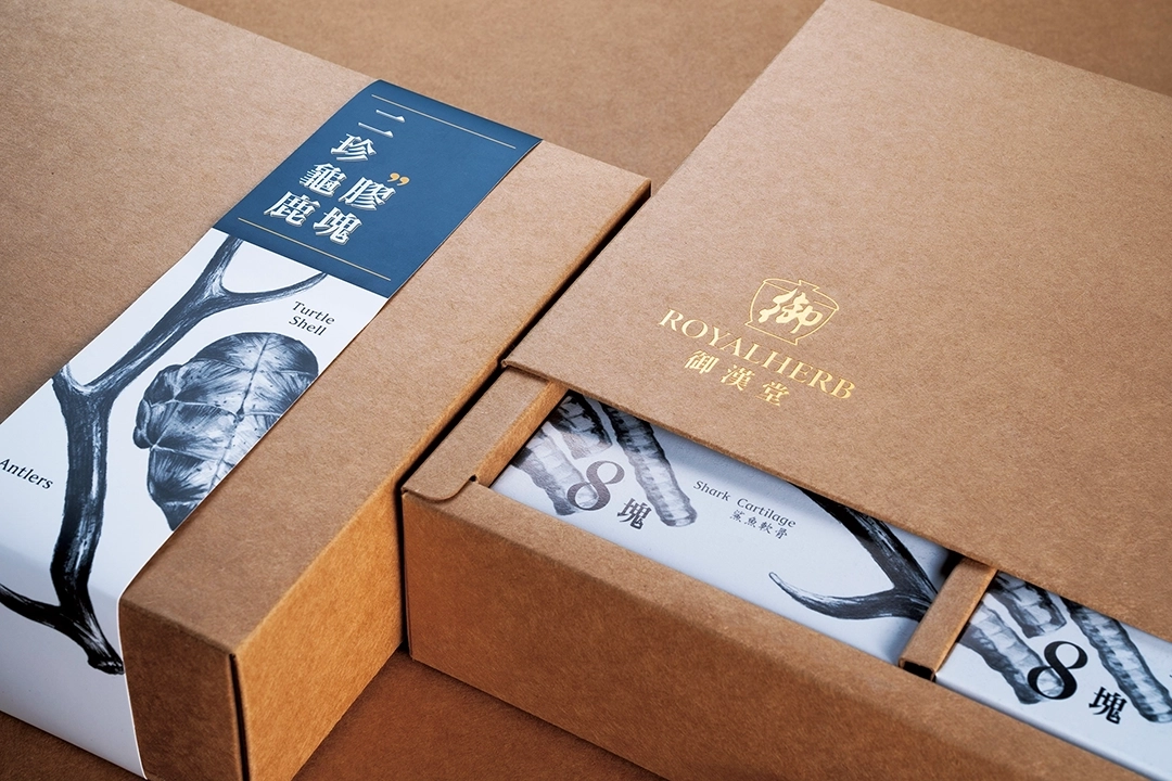
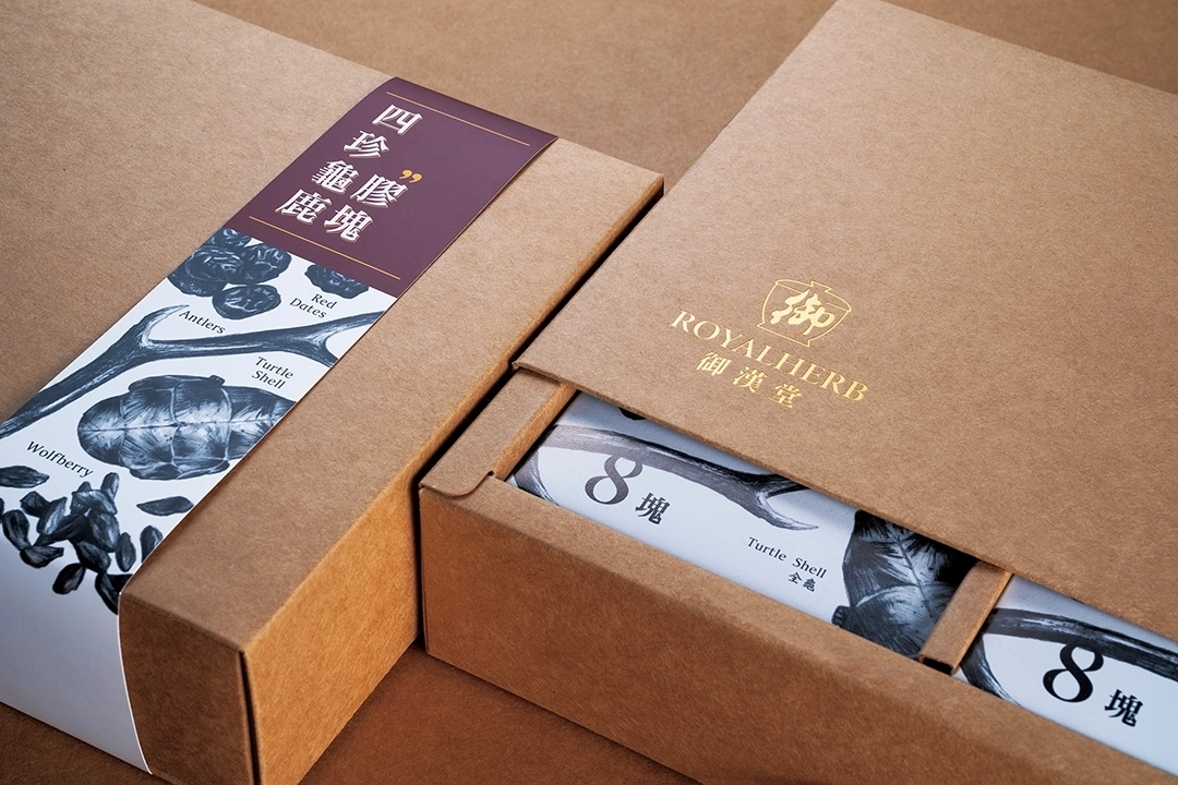
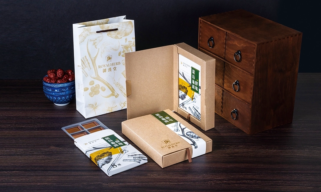
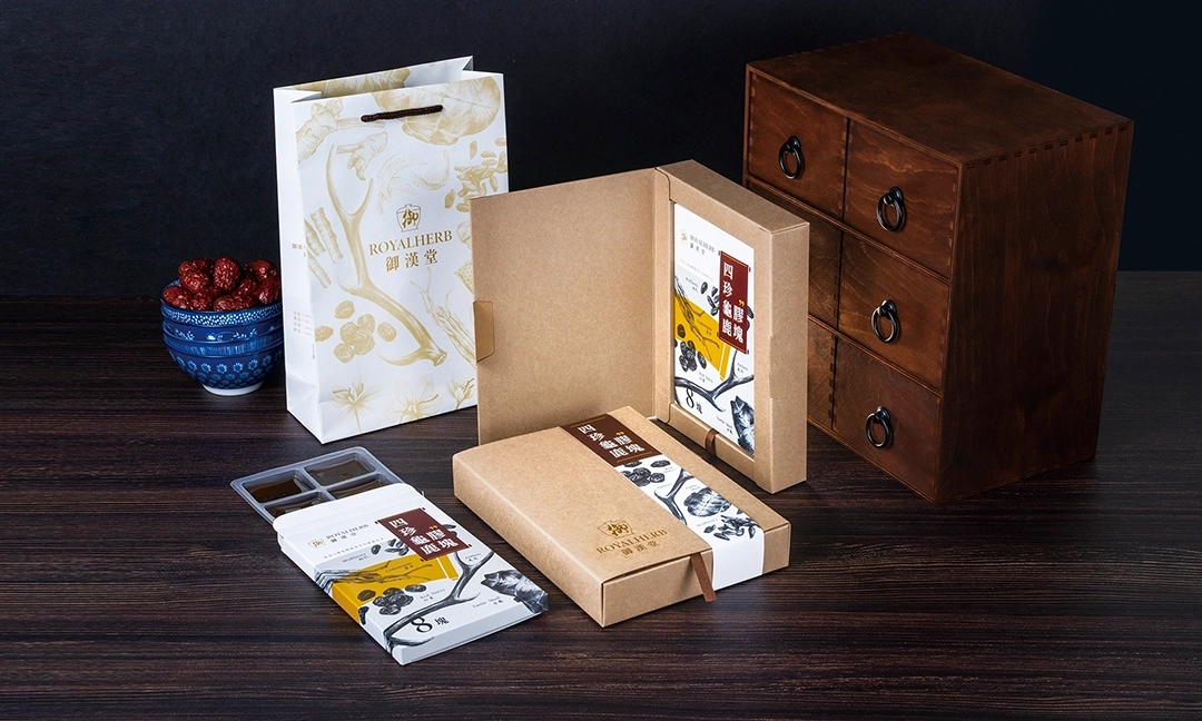
1. ROYALHERB: Flipping the Traditional Image of Guilu Erxian Jiao with a Sketch Style
Brand Positioning and Design Strategy
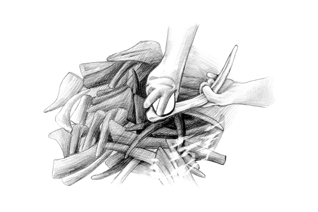
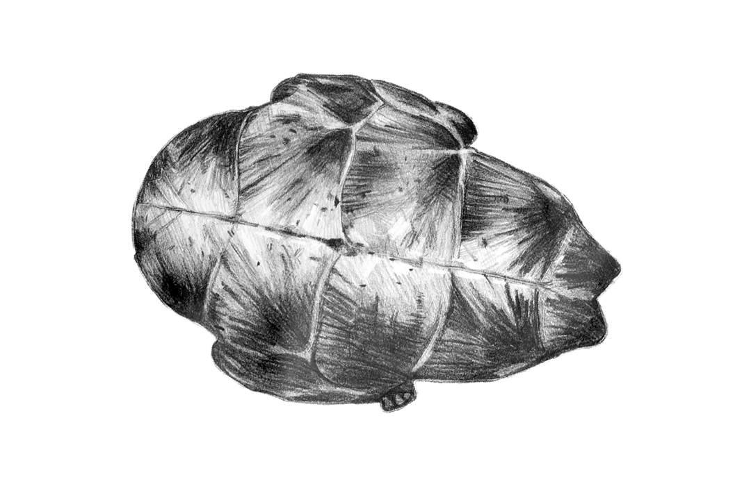
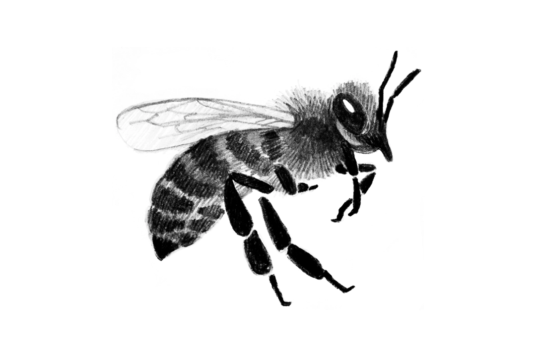
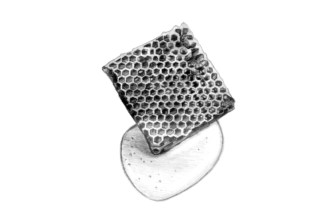
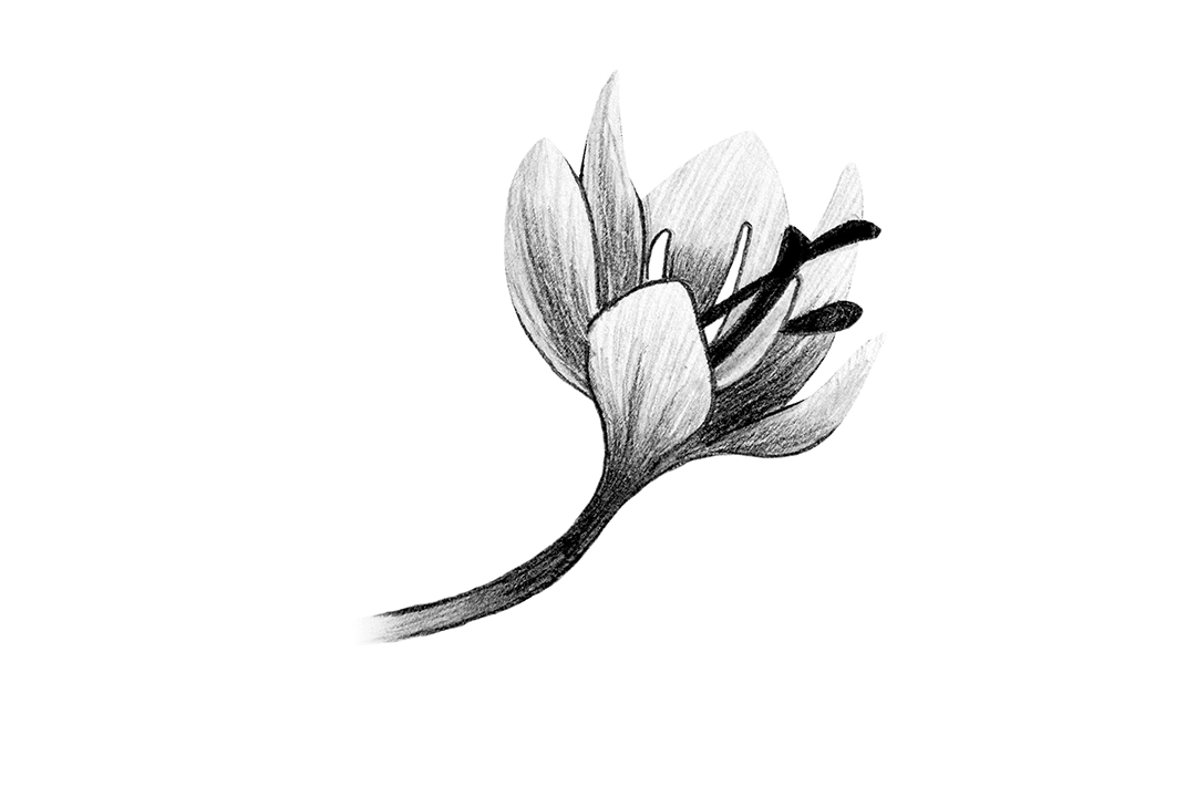
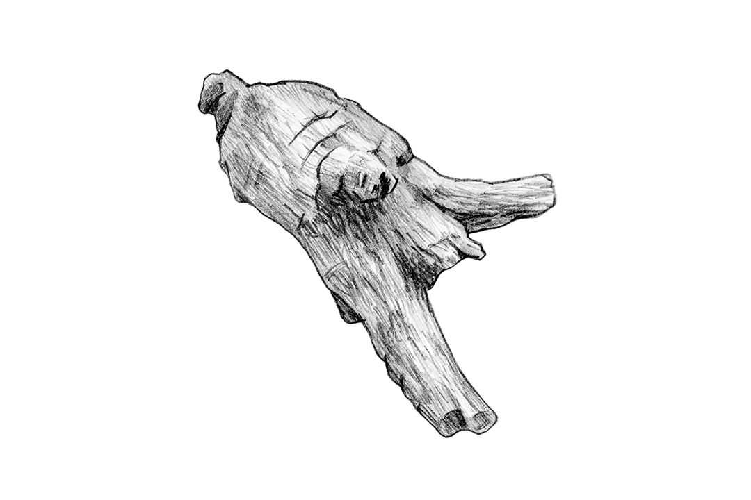
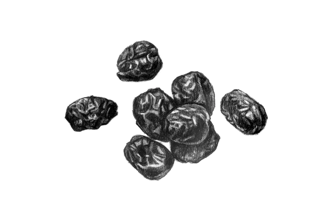
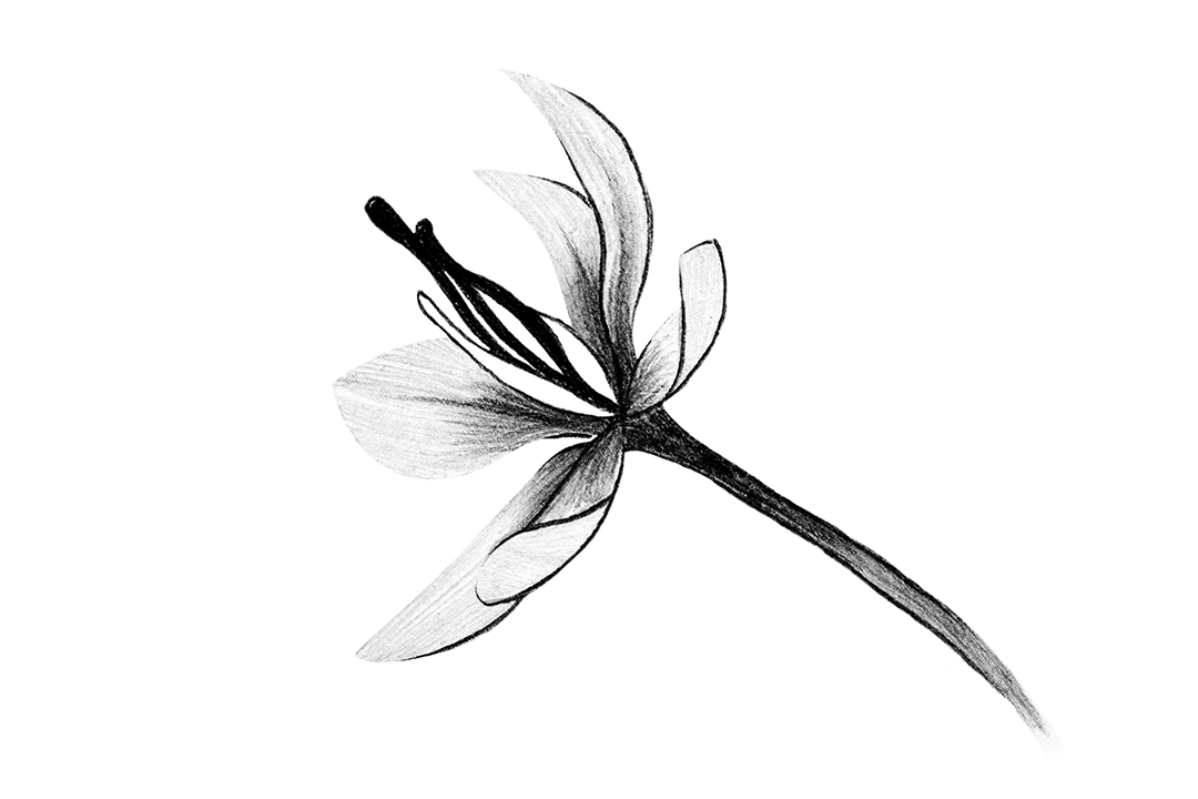
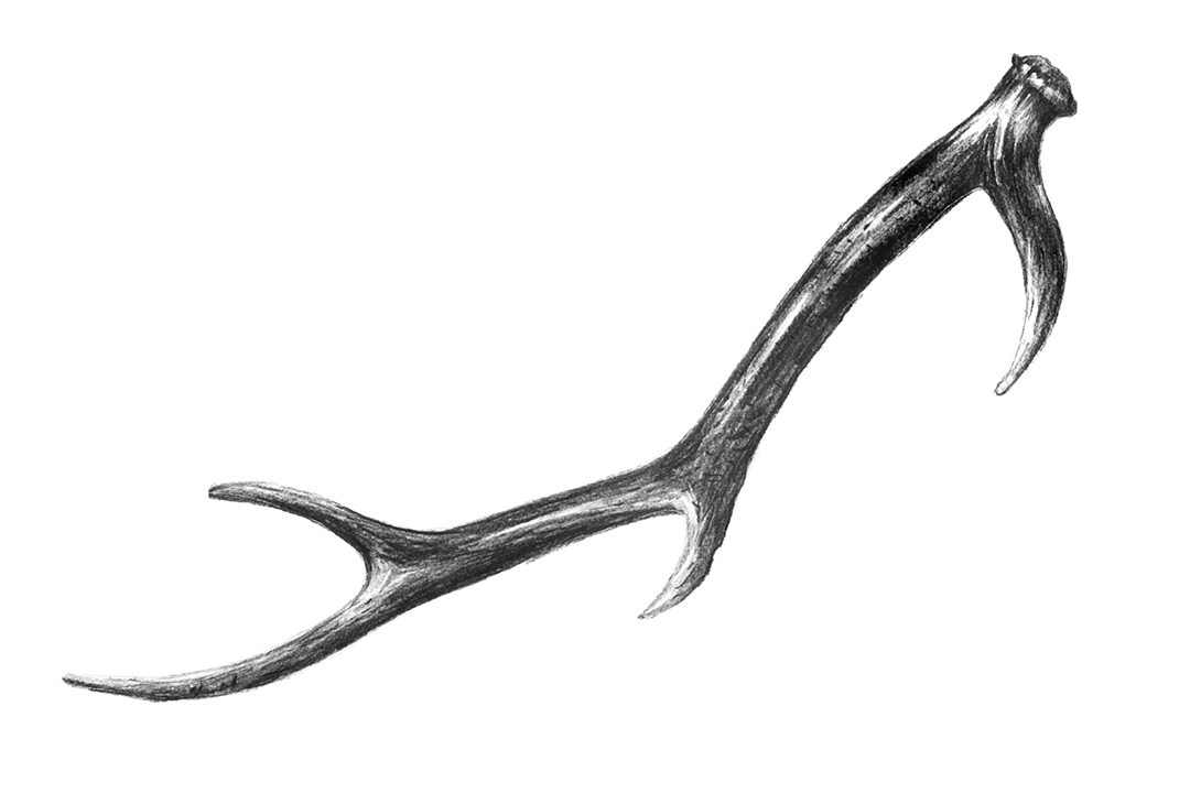
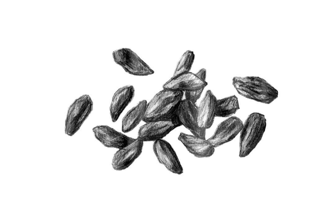
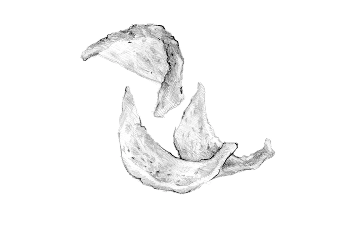
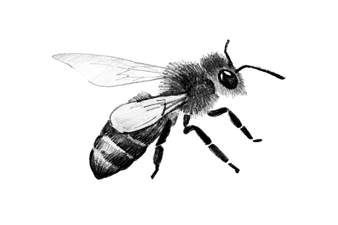
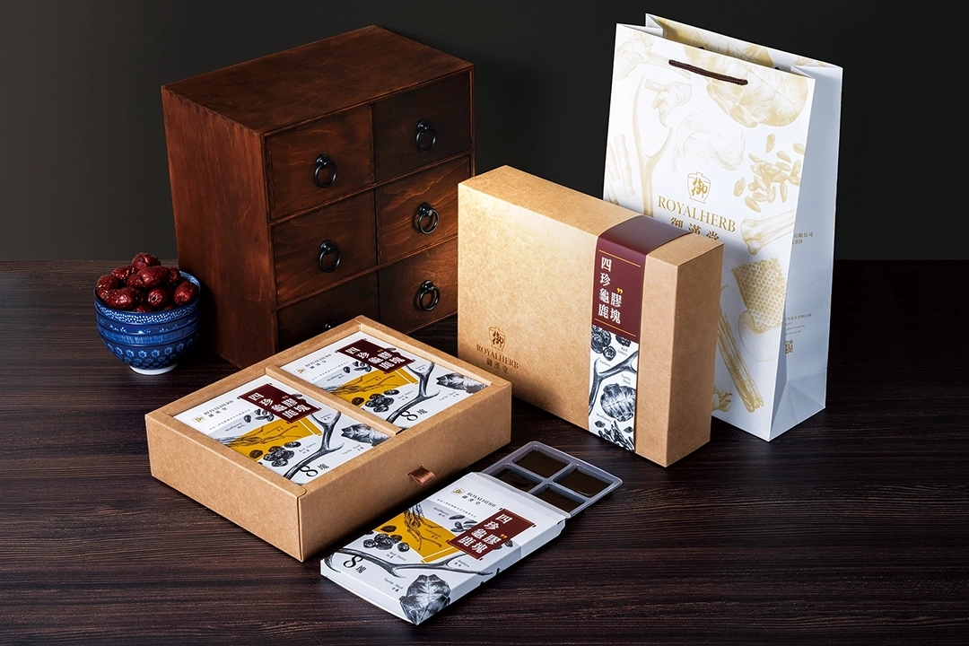
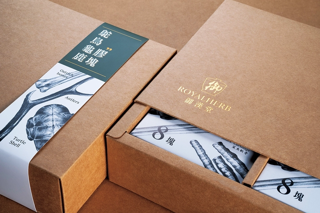
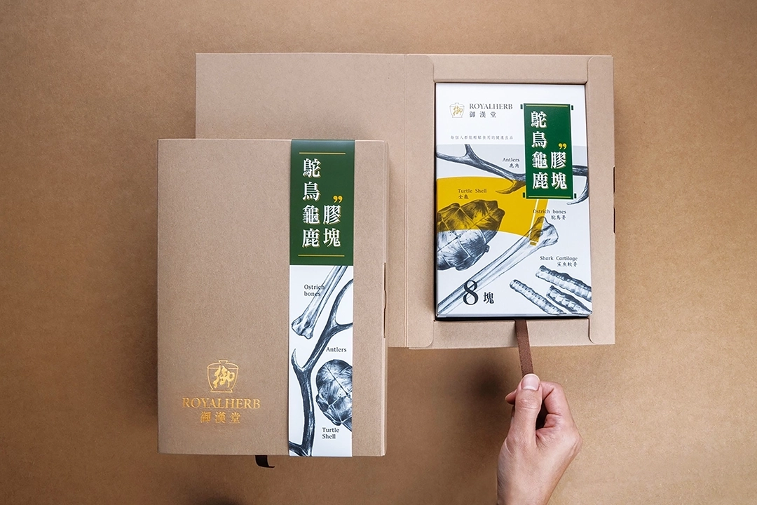
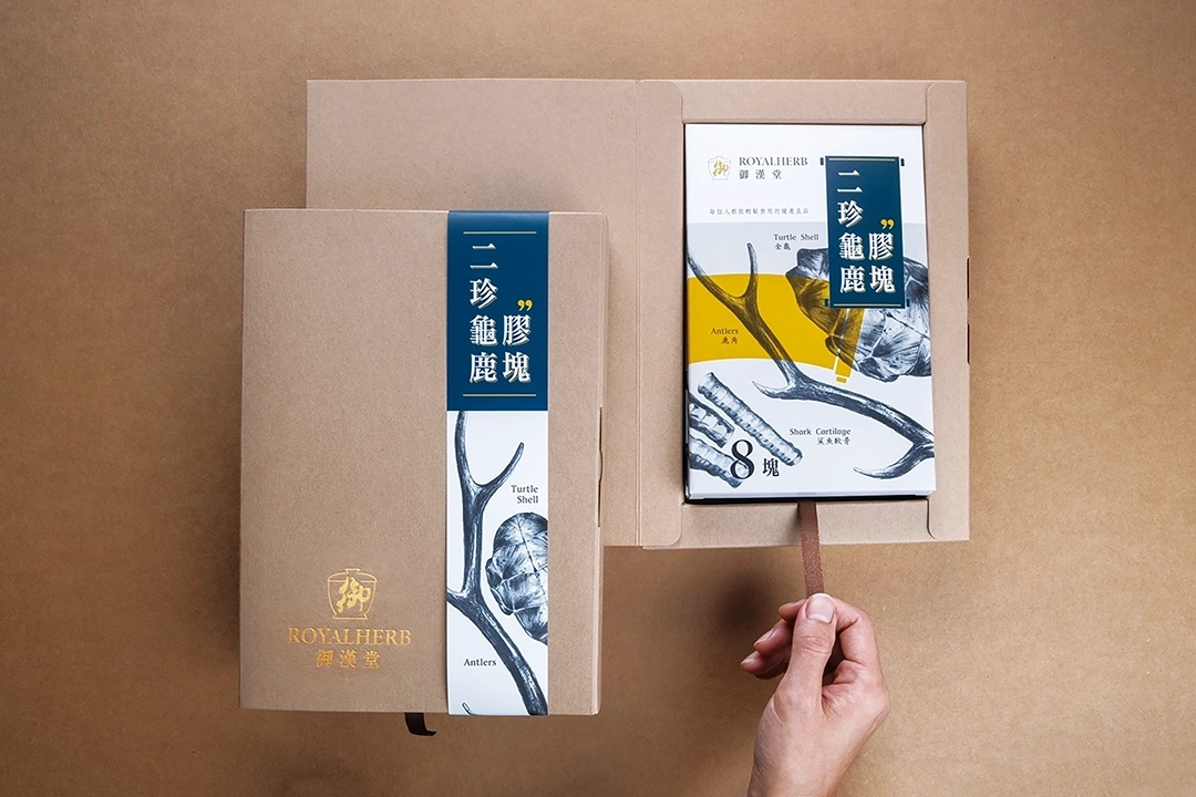
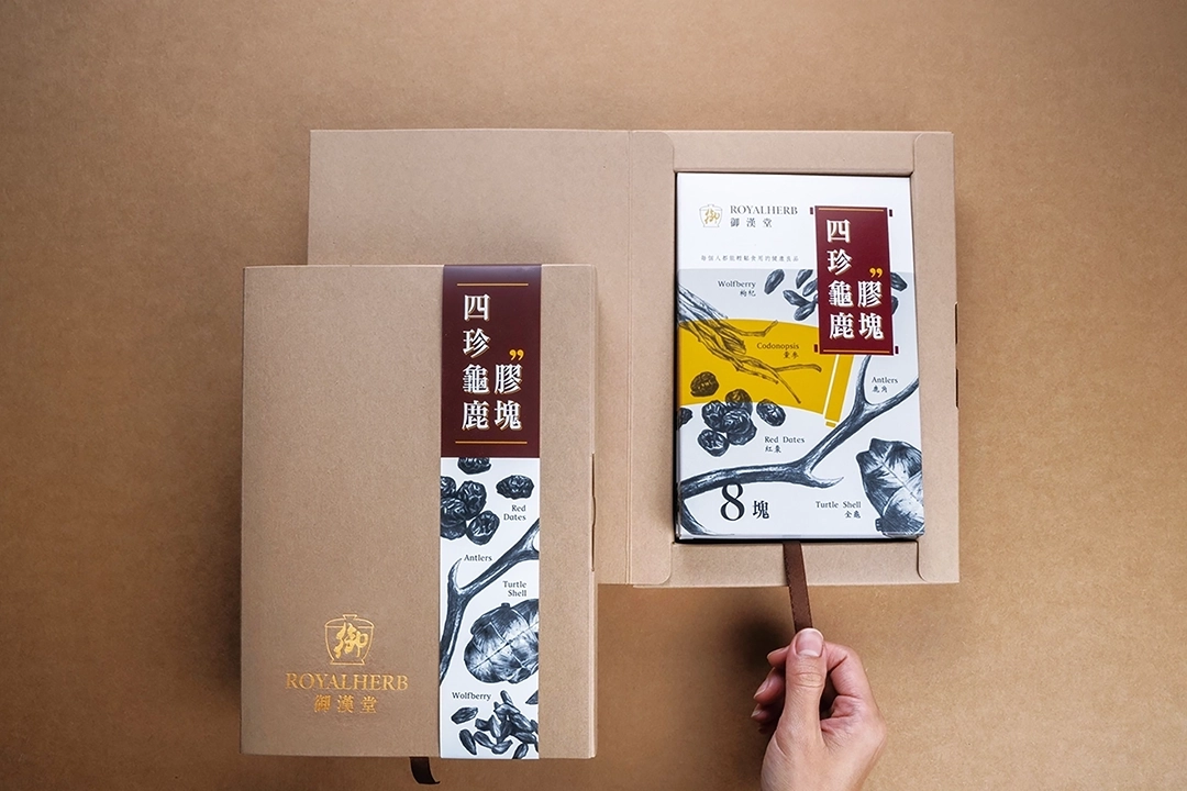
ROYALHERB (Yuhantang Health Co., Ltd.) focuses on Guilu Erxian Jiao (Tortoise Shell and Deer Antler Jelly) and traditional Chinese medicine products. In the past, such products often gave people a relatively traditional and rigid impression. Therefore, the goal of this Taichung packaging design was to reshape the brand image through a more hipster and artistic visual language, making more young consumers willing to pay attention to and accept this type of traditional Chinese health product.
Visual Design Highlights
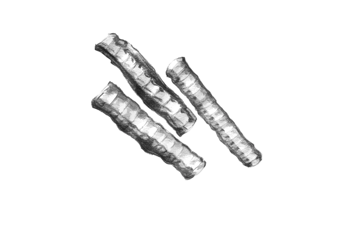
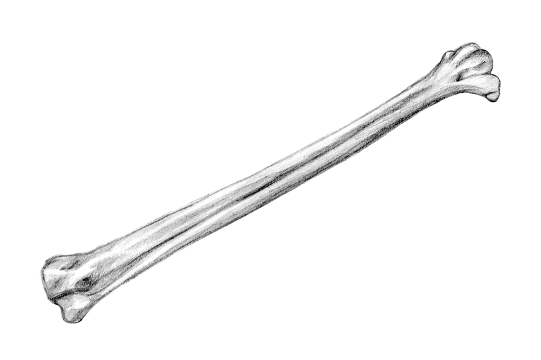
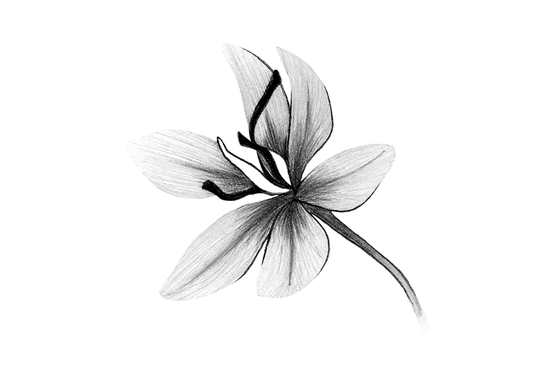
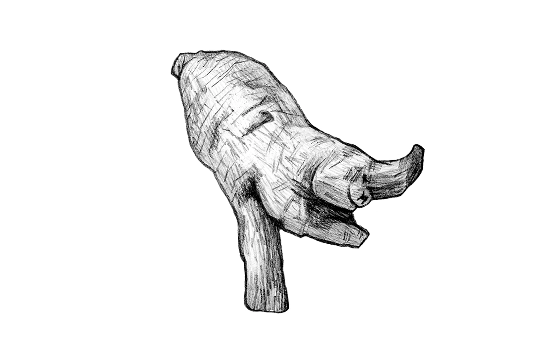
In terms of visual design, we abandoned the common use of real-life photographs and instead used a sketch style to depict the medicinal herbs and the manufacturing process. This approach gave the packaging and promotional materials a more artistic atmosphere and added a layer of modern texture to the traditional product. Such a design method not only preserves the profound culture of Chinese medicine but also makes ROYALHERB more recognizable and buzzworthy among numerous Taichung packaging design cases.

Packaging Design Highlights
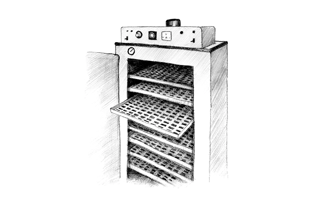
In packaging design, multiple aspects must be considered simultaneously, including visual appearance, packaging structure, packaging materials, composite media, and printing methods. This project involved three different items, each with the same portion size. Therefore, the design placed special emphasis on sharing packaging materials, simplifying the structure, maximizing packaging efficiency, and minimizing storage space when not in use, making the overall packaging more aligned with practical needs.


2. HOCHIN: Extending Brand Culture and the Imagery of Blessing with Incense Lines
Brand Positioning and Design Strategy
HOCHIN has long been dedicated to promoting incense appreciation and tea ceremony culture, possessing a profound academic background and cultural affection for agarwood. In this collaboration with the Taichung packaging design company, apart from hoping to elevate the brand image, the goal was also to expand to a broader age group and market demographic. Therefore, we transformed the wafting lines of incense smoke into visual graphics conveying blessings, allowing the brand culture to be seen in a more approachable way.
Visual Design Highlights
This visual design utilizes incense lines to extend into four deeply meaningful graphics: "Zen," "Dragon," "Crane," and "Ruyi" (auspiciousness). These elements not only became part of the brand identity but were also widely applied to stationery, posters, and packaging design, allowing HOCHIN to showcase a unique cultural texture and brand depth among Taichung packaging design works.


Packaging Design Highlights
This packaging design was mainly applied to incense sticks and coils. Because the products are fragile objects, special attention was paid to cushioning and protection in the structure. On the other hand, since there were over 30 items divided into four grades, how to control costs and reduce inventory pressure was also a crucial design issue.
To address this, we planned a sharable packaging structure and differentiated the various items using hot foil stamping techniques, balancing brand quality with production efficiency. Such a Taichung packaging design not only enhances the overall professional image but also makes the product packaging more practical and consistent.


3. EARLYWINTER: Extending Coffee Brand Aesthetics from Literary Imagery
Brand Positioning and Design Strategy
The brand concept of EARLYWINTER Coffee originates from the poetic imagery in Su Shi's "To Liu Jingwen," symbolizing the maturity and hope of the early winter season. The Chinese brand name "Cheng Huang Ju Lv Shi" (The Time of Orange and Green) is not only rich in literary heritage but also echoes the owner's spirit of starting a business in their middle age. The English name EARLYWINTER continues the early winter concept, forming a consistent bilingual brand language. Such a brand story is exactly one of the most valuable parts of Taichung packaging design in brand building.
Visual Design Highlights
The visual design inspiration comes from the Song Dynasty painting "Literary Gathering." The original action of scooping tea powder in the painting was reinterpreted into a pour-over coffee scenario, allowing ancient elegant gatherings and modern coffee culture to connect naturally. This design not only highlights the product attributes but also cleverly integrates the East-meets-West atmosphere found in the brand spirit, making EARLYWINTER a Taichung packaging design case that blends culture with a modern touch.


Packaging Design Highlights
Ultimately, we integrated the LOGO, standard typography, and creative graphics into a unified identity system, applying it to business cards, envelopes, and packaging to strengthen brand consistency and market recognition. Through such comprehensive Taichung packaging design planning, EARLYWINTER is no longer just a coffee brand, but a lifestyle proposal with storytelling and cultural depth.


4. KINLOCH ANDERSON: Creating Infant Product Packaging with a British Gentleman Bear
Brand Positioning and Design Strategy
KINLOCH ANDERSON is a century-old British clothing brand famous for its Scottish tartan and vintage British style, with an elegant and tasteful brand positioning. Commissioned to design packaging for infant cleaning products, during the Taichung packaging design process, we transformed the brand's original bear mascot into the primary visual character. This made the product both playful and premium, further strengthening the possibilities for brand extension.
Visual Design Highlights
This visual design centers around the bear mascot, setting the character as a child imitating the lifestyle and tastes of an adult gentleman. He enjoys listening to classical music, playing golf, playing the piano, tasting black coffee, and wears a fedora, Scottish kilt, and Oxford shoes, showing a yearning for a high-quality lifestyle. Through this contrasting design, the packaging retains a childlike charm without losing the brand's British elegance, making it a highly representative Taichung packaging design work.


Packaging Design Highlights
Ultimately, we designed 8 bear mascot illustration themes, including taking a shower, washing hair, taking a bath, doing a spa, applying lotion, playing golf, hanging clothes, and washing baby bottles. These were respectively applied to the packaging of body wash, shampoo, bubble bath, lotion, diaper cream, mosquito repellent, laundry detergent, and dishwashing liquid. The entire series was integrated through standard colors, standard fonts, and totems, creating a packaging series that is both recognizable and approachable.


5. TAIWANSTAR: Telling the Plum Essence Brand Story Through Four Seasons Illustrations
Brand Positioning and Design Strategy
TAIWANSTAR focuses on the research, development, and production of plum essence products. Because the appearance of plum essence products is often associated with traditional black medicinal pills, the brand wanted to break away from the standard medicine box image and instead present the product's value through a more story-driven visual approach. The core of this Taichung packaging design was to reinterpret the culture and product features of plum essence through illustration and brand narrative.
Visual Design Highlights
This project utilized printmaking techniques to draw illustrations of the four seasons: spring, summer, autumn, and winter, completely presenting the storyline of plum essence from harvest to production. Spring depicts the harvesting of green plums, summer shows the boiling of plum essence paste, autumn symbolizes the plum tree's rest and nutrient accumulation, and winter features falling plum blossoms as the prelude to a bountiful harvest. Such a four-season narrative gives TAIWANSTAR more cultural depth and emotional connection among the many Taichung packaging design cases.

SPRING
In spring, the farmer wears a bamboo hat and sleeves, standing in the morning light accompanied by birdsong, moving among the plum trees. The green plums hang heavily, emitting a sweet and tangy fragrance that makes one's mouth water. The farmer's taste buds are already stimulated by the aroma, eagerly anticipating the harvest of these plump, delicious fruits.

SUMMER
In summer, a refreshing breeze blows through the forest, and the farmer's favorite moment is to hide under the shade of the trees, dehydrating the plums and leisurely simmering the plum extract paste. Watching the plum juice transform from bright green to deep black, his mood relaxes with the rhythm of stirring. At this moment, humming his favorite song, he savors this peaceful tranquility.

AUTUMN
In autumn, the farmer steps on a ground covered with golden fallen leaves, gently touching the rough tree trunks. He knows well that this is just a brief rest for the plum trees. During this time, he spreads fertilizer to revitalize the trees, eagerly anticipating the next cycle of life, when the trees will bloom brilliantly once again.

WINTER
In winter, petals dance slowly in the wind, swirling gracefully among the plum groves. The farmer sits beneath the trees with a beaming smile, quietly admiring the plum blossoms as they fall like snowflakes. The faint, gentle fragrance softly soothes his year-long hard work, while also symbolizing the approaching season of abundance.
Packaging Design Highlights
Ultimately, we integrated the LOGO, standard colors, standard fonts, and creative graphics into the packaging and stationery, establishing a complete and consistent brand identity system. Through this design, TAIWANSTAR not only elevated its professional brand sense but also allowed consumers to better feel the cultural story and dedication behind the brand when interacting with the products. This is also the most important value of a Taichung packaging design company in brand upgrading.


Conclusion: Choose a Professional Taichung Graphic Design Company to Let Your Brand Truly Be Seen
Packaging design is not merely wrapping a product's exterior; it is an extension of brand value, sales strategy, and market communication. Through the 5 case studies above, it is evident that a successful Taichung packaging design must simultaneously consider aesthetics, strategy, structure, materials, and the brand story to truly create differentiation and market competitiveness for an enterprise.
If you are looking for a trustworthy Taichung packaging design company, or hope to create more recognizable packaging visuals for your brand, VALUESEE DESIGN can start from brand positioning and provide comprehensive Taichung packaging design planning to help your products stand out in the market and build deeper brand impressions and commercial value.
If you would like to learn more about design, feel free to contact us for the following services: Taichung Brand Design Company, Taichung Logo Design Company, Taichung Website Design Company, Taichung Web Design Company, Taichung Graphic Design Company, Taichung Visual Design Company, Taichung Advertising Design Company, Taichung Catalog Design Company, Taichung Packaging Design Company, Taichung Commercial Photography Company, Taichung Video Production Company, Taichung CI Design Company